In a competitive online environment websites must prioritize features that resonate with user needs and expectations. Clutch surveyed 612 people to find out which website features matter most to them and which ones they can do without. Trendy, intuitive design and user experience ranked among the top 6 most desired features for web browsing, coming in 2nd place.
New trends emerge frequently, and just as often, they are replaced by others. It’s crucial to find the right balance between the familiar and the new, carefully weighing the pros and cons.
To avoid making a misstep in distinguishing short-term trends from long-term ones, it’s important to develop a trained eye, understand the specifics of the business, and have knowledge of the design services market.
In this article, Rubyroid Labs, experts in UI/UX design audit services, has gathered the key web design trends that we’re already seeing and that are expected to gain even more traction in 2025.
Contents
- Is It Important to Follow Latest Trends in UI/UX Design
- Minimalism
- Bento Box
- Newspaper Style
- Brutalism
- Scrollytelling
- Expressive Typography
- Gradients & Incongruous colors
- 3D Elements & Complex Filter Images
- Handmade
- Custom Cursors
- AI and Automation in UX
- Animation
- Spacial Design
- Voice Interfaces
- Conclusion
Is It Important to Follow Latest Trends in UI/UX Design
If you already have a website or are just planning to create one, you’ve probably asked yourself: how can I make my site up-to-date so it attracts users and stands out from the competition?
People’s tastes are changing rapidly, forcing businesses to constantly adapt. But it’s worth considering whether chasing every new trend is the right approach to make your website convenient and in demand.
We spoke with our Head of Software Design Hanna Maroz, to get her perspective:
We follow trends and love them — they bring inspiration and spark creativity. However, blindly following the latest trends in UI/UX design would be a mistake. We always base our decisions on the business’s goals, its specifics, niche, and target audience.
There are different types of websites. For example, promotional landing pages are short-lived and designed to attract maximum attention within a specific time frame. In this case, we rely more heavily on trends. On the other hand, there are websites with complex interfaces, such as CRMs or CMSs, which are tools people use daily.
For these types of websites, usability principles, simplicity, and functionality are our main focus when designing. Our goal is to create an interface that is intuitive and user-friendly, allowing users to concentrate on their tasks without distractions.
Such products need to be durable and remain relevant for five years or more because their development is complex and resource-intensive. For businesses, it makes little sense to redesign extensive interfaces without a compelling reason.
The longer the lifecycle of a project, the less relevant micro-trends are likely to be. Any trendy design choices need to be balanced with time-tested solutions to ensure the end product remains functional and relevant over time
We also asked how to distinguish between short-term UX/UI design trends and long-lasting ones, as well as how to decide what’s worth implementing:
A trained eye is one of the most essential skills for a designer. It’s what enables us to anticipate trends and assess whether they’ll have a brief or lasting impact.
At our company, we’ve historically focused more on products where functionality takes priority. However, when we developed our own website four years ago, we created it to be “ahead of its time”, so much so that it still aligns with 2025 UI/UX design trends.
Trends should be used with long-term relevance in mind. It’s important to ensure they can be easily updated or replaced if they become outdated
Rubyroid Labs has experience working on projects across various industries, including automotive, food, e-commerce, health and beauty. We provide UX UI design services for both large and small businesses, and understand the key factors to focus on when determining which design solution is best for making your website user-friendly, profitable and stylish.
Let’s take a closer look at what will be trending in UX/UI design in 2025.
Minimalism
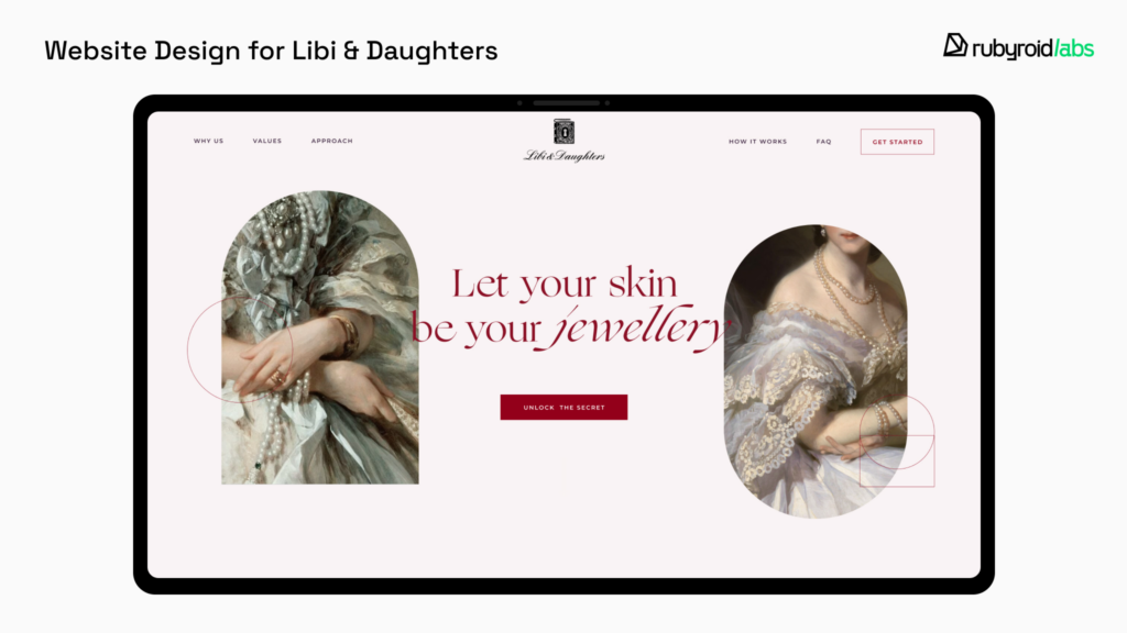
Minimalism has been a cornerstone of UX/UI design for years, and its appeal shows no signs of fading in 2025. Minimalism stands apart from the ever-changing digital trends, its essence is best captured by the phrase: “Less is more”.
Simplicity and functionality are the hallmarks of minimalist websites. This approach focuses on removing unnecessary elements that draw attention away from what’s truly important.
Typical features of minimalism include:
- Negative (or white) space surrounds every element on the page, naturally drawing attention to them.
- The color palette typically features black, white, pastel tones, and muted shades. Visual hierarchy is kept clean and uncluttered, you won’t find an overload of information on minimalist websites.
- Layout of the interface elements ensures that content doesn’t feel cramped, but instead is thoughtfully arranged across the screen.
- With so much open space, typography often takes center stage. Unique font pairings become a focal point, setting the tone and mood of the site. However, it’s important to note that this isn’t a strict requirement, and the main text font should always be simple and easy to read.
- Images and videos break up the white space and text, naturally drawing more attention. This makes it essential to select them carefully — they must align with the minimalist style in both composition and color scheme. For videos, even the audio track should complement the clean and refined aesthetic of the website.
Its popularity stems from its ability to streamline navigation, reduce cognitive load, and enhance accessibility across devices. Many luxury brands and top companies use minimalist design on their webpages to convey elegance and sophistication.
Why Choose Minimalism
By reducing the number of elements on a page, minimalist websites tend to load faster, especially on mobile devices.
The simplicity also translates to easier development and maintenance. Clean layouts with fewer components are quicker to build and debug, it saves time and resources for developers.
Minimalist styles lead to better compatibility across devices and browsers, thanks to their straightforward structure. This simplicity makes them more adaptable to future updates and ensures a longer lifecycle for the design.
Bento Box
The Bento style takes inspiration from japanese lunch boxes, known for their sections that keep different foods separate.
This same principle is applied in web design, where elements on a page are arranged in distinct sections. This structured layout makes it easier and faster for users to find the information they need.
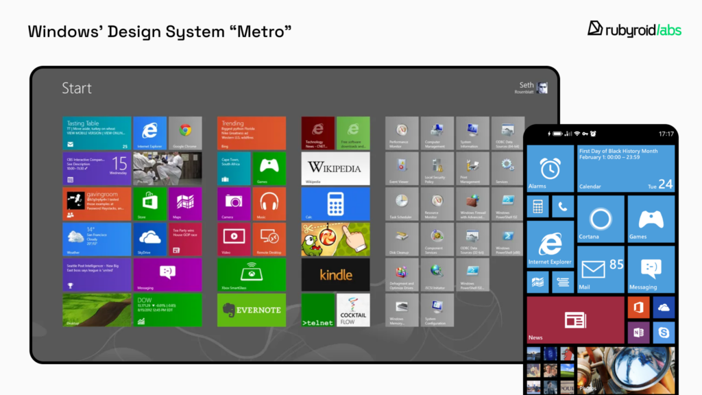
The origins of the bento style can be traced back to Windows, which introduced a similar concept under the name Metro, although Windows wasn’t inspired by lunch boxes. Metro was Microsoft’s design language characterized by a focus on flat rectangular “tiles”. Initially it was developed for Windows Phone, but later influenced the design of products like Xbox and Windows 8.
Years later, in 2019, Apple launched its own Bento-style website, sparking a surge in popularity for this approach that continues today.
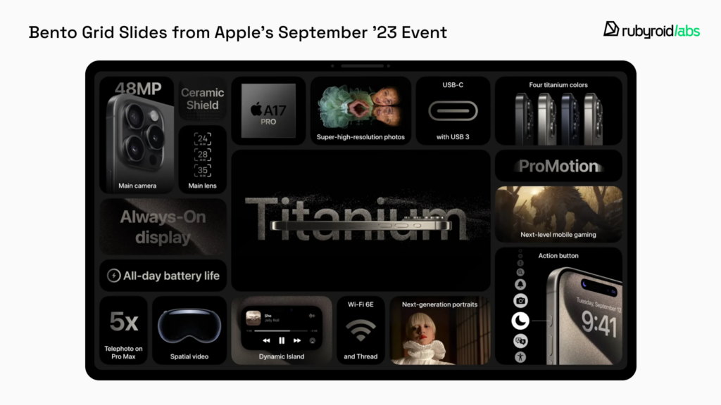
The key elements of creating a Bento-style site are:
- Grid. Break down the information into blocks and arrange them into a cohesive layout. Pay attention to symmetry and balance to avoid overloading one side. The composition should not only be visually appealing but also functional and user-friendly.
- Clear hierarchy. Arrange blocks based on their importance, using size to emphasize key elements. Larger elements should stand out, and related blocks should be placed close to each other for clarity.
- Separation between sections. Avoid cramming blocks together, and leave enough whitespace to prevent them from blending into one mass. Rounded corners can visually separate elements, but keep the effect subtle — stick to rectangles and squares with softened edges rather than fully circular shapes.
- Color for emphasis. Highlight blocks with muted, non-intrusive colors, avoiding harsh neon tones that strain the eyes. Limit the color palette to maintain focus — too many accents can overwhelm users, making it hard for them to concentrate on a specific element.
- Minimalism. Only create blocks for truly essential information. Overloading the page with too many sections can confuse or intimidate users, defeating the purpose of the Bento style.
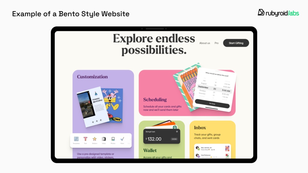
Why Choose Bento Box Style
The Bento style is ideal for industries like tech, e-commerce, and media, because its compartmentalized layout allows users to find all essential elements on a single page, without the need for extra clicks. We love the Bento Box style for its convenience in designing CRM systems.
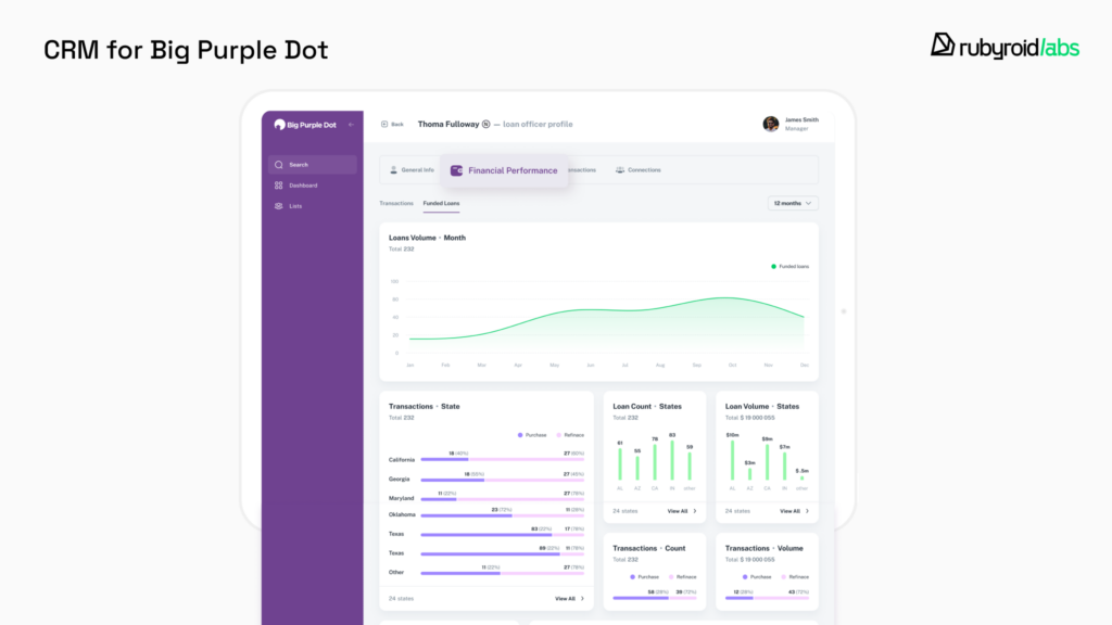
You don’t need to sacrifice usability for a trendy design or vice versa. If you’re looking to improve your application’s functionality and user attraction, consider a UI/UX design audit. Our skilled designers will analyze your interface and provide strategic recommendations that serve your business needs, satisfy users, and reflect market trends.
Newspaper Style
There is nothing new under the sun, which is why the newspaper-inspired style for website design remains relevant today. The primary goal of a website is to share information, whether for commercial, educational, or other purposes.
Before the Internet, this role belonged largely to newspapers, making their design principles the foundation for this web style.
Header. Just like every newspaper features a fixed masthead at the top with details about the publisher like logo, motto, or founding year, websites use headers for similar purposes.
A website’s header typically includes the logo and menu. Since users often land on pages other than the homepage, the logo serves both as a branding element and as a clickable way to navigate back to the homepage.
Above the fold rule. In newspapers, the most important content is placed above the fold, as folded papers on newsstands had to showcase their best stories to attract readers.
Web designers follow the same rule today, they place the most engaging and valuable content in the visible area of the screen without scrolling. This section acts as a calling card and must be meticulously crafted.
Z and F patterns. Newspapers structure their content based on the Z-pattern, where the reader’s eyes naturally focus on the top-left and bottom-right corners — areas of high attention.
Similarly, websites position their most important elements in these zones. Additionally, the F-pattern describes how users scan pages, often skipping over parts of the content as they scroll. To address this, designers emphasize key points with bold text, headings, subheadings, lists, clear anchor links, and strategically placed call-to-action elements.
Structure. Great content only matters if it’s presented effectively. Newspapers handle large amounts of information by structuring it into columns or sections, often accompanied by images.
In the same way, informational websites use multi-column layouts or blocks to organize content, ensuring that users can quickly find what interests them most.
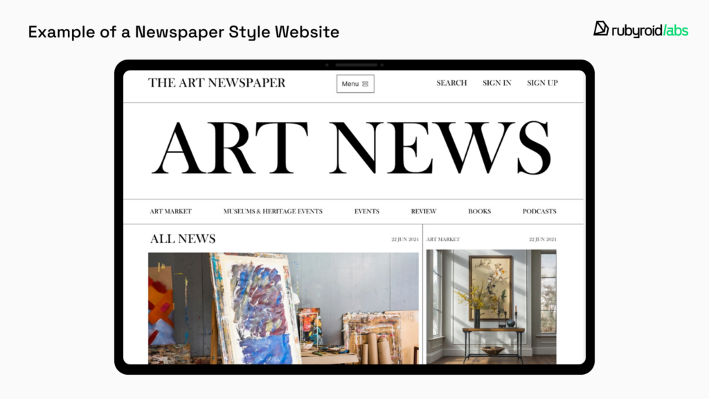
Why Choose Newspaper Style
The newspaper style is a suitable option for websites with large amounts of textual content — informational and news portals or digital versions of print publications. This approach is also ideal for blogs, educational websites, research archives and even government websites. The familiar structure evokes a sense of credibility and tradition, which can build trust with the audience, especially older generations.
A landing page is also a perfect fit for this format. The use of headlines, subheadings, and columns helps highlight the most important information and calls to action.
Brutalism
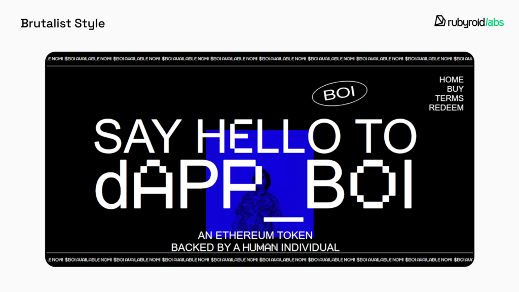
Brutalism is the complete opposite of “clean and polished” minimalist websites. This style originally emerged in architecture. After World War II, cities needed to be rebuilt quickly and cheaply, resulting in raw, somber buildings that lacked elegance.
In web design, brutalism began gaining traction around 2019, and in 2025 we’ll still see brutalist websites, although it remains a niche style.
How to recognize brutalism:
- Unconventional hierarchy. Elements, for example menus, may have an unusual appearance or placement. It often takes a few seconds to “get your bearings” on such websites.
- Asymmetry and uneven spacing. This doesn’t mean that any poorly designed site qualifies as brutalist. In this case, asymmetry comes together to form a cohesive picture with a certain logic, even if it’s not immediately apparent.
- Overlapping elements. For example, text may overlap with images, creating a layered effect.
- Abundance of text in different scales. Expect oversized headlines with smaller text peeking out from beneath them.
- Fonts. You won’t find cursive fonts with elaborate flourishes on brutalist websites. These go against the concept of simplicity and the rejection of excess.
- Bright, loud colors. Bold colors often play a key role in building the asymmetrical composition.
- Monochrome images. These aren’t always black and white — bright colors and their shades may also be used to create a stark, striking effect.
Why Choose Brutalism
Brutalism is highly distinctive and far from universally applicable. This style has the power to both attract and repel an audience. For many, its “unconventionality” might feel off-putting, and some may find it challenging to interact with. In certain industries, it can come across as unprofessional, for example, it’s definitely not a good fit for clinics, government or banking institutions, or multi-page websites with long-term content.
However, there’s an audience for everything. Thanks to its originality, brutalism can work exceptionally well for promoting events, products, or services offered by individual creators. Landing pages, in particular, are a great space for such experimentation. Since redesigning a single-page site doesn’t require much time, you can afford to get creative and explore the latest UX/UI trends to grab attention.
Scrollytelling
Scrollytelling is a narrative revealed as you scroll through the page. It’s effective because scrolling is the most frequently performed action when using mobile phones. However, it works just as well on desktop devices, as people find it easier to process information in small portions, especially when engaging visual elements are used alongside the text.
Parallax Scrolling
Parallax scrolling is when some elements move as you scroll while others remain static, creating a sense of depth. It’s impressive and encourages users to keep scrolling because they’re curious about what will happen next. The key here is not to overdo it. The effects should complement the content, not overshadow it. Animations shouldn’t be too fast or abrupt, as this can distract users and even cause physical discomfort.
Horizontal Scrolling
Horizontal scrolling is intriguing and unexpected because, by default, scrolling is vertical, and everyone is long accustomed to it. It works particularly well for showcasing visual content like portfolios, lookbooks, or timelines, as it allows users to explore content in a more interactive way. We use this solution on our website to demonstrate case studies.

What to Keep in Mind
Complex effects can slow down page loading, leading to user dissatisfaction and potential loss of revenue. Horizontal scrolling is best suited for desktop versions of websites, while it’s better to replace it with traditional vertical scrolling on mobile devices. Both solutions shouldn’t be implemented across all pages of the website. It’s better to limit them to specific pages or elements where they make the most sense.
Expressive Typography
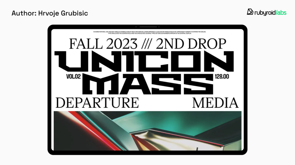
Text serves not only as a means of conveying information but also as a decorative element. The choice of font, size, and placement plays a crucial role in creating a visually appealing composition.
- Full-screen headers. Large text on the main screen can be seamlessly integrated into almost any design style. It looks visually striking, but careful consideration is needed for how it will translate to the mobile version of the site.
- Lowercase. A trend borrowed from social media and messaging apps, websites are increasingly skipping capital letters. It creates a more casual, less formal tone.
- Mixed font pairings. As always, unique font combinations will be highly valued.
- Cyberpunk. Bold, futuristic, and often edgy, featuring sharp angles, neon effects, and a high-tech aesthetic. Perfect choice for futuristic designs.
- Distorted fonts. Typefaces that break rules, featuring irregular shapes, stretched or compressed elements and unexpected angles. They should be used sparingly, it’s easy to overwhelm a design or hinder readability if overused.
- Vintage fonts. Vintage evokes a sense of nostalgia, calmness, and comfort. They are perfect for portfolios, interior design websites, event pages and for brands related to handmade goods.
- Doodles. With the rise of AI and its outputs, handcrafted work has gained value and stands out. Handwritten fonts are one element that conveys a sense of care and a human touch, showing that the site was created with heart.
Gradients & Incongruous Colors
In 2025, the trend of combining seemingly clashing colors continues to evolve. According to our lead designer Hanna:
We used to rely on the color wheel to find harmony, but now we’re discovering new harmony in places we once overlooked
Gradients will also remain in demand, aligning with the ongoing design trends in color experimentation.
3D Elements & Complex Filter Images
3D elements are not only visually stunning and modern but also incredibly practical. They allow for an immersive experience, giving users the ability to explore products in detail from multiple angles, which can build confidence in their purchase decisions.
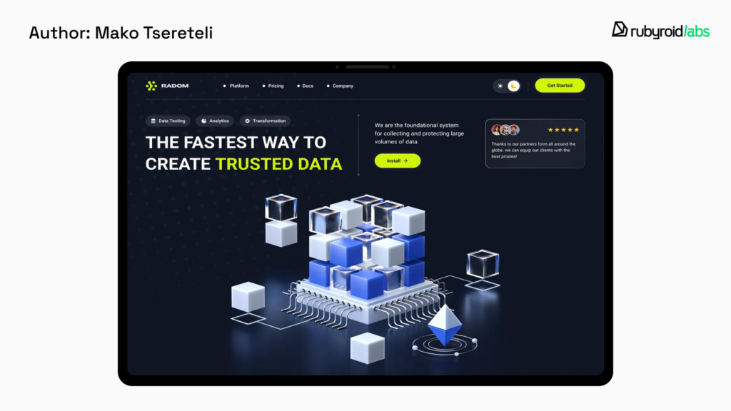
Complex filters have become popular for their ability to transform ordinary images into striking, stylized artwork that conveys a specific mood and aesthetic. They combine multiple effects: color grading, grain, textures, lighting and thus effectively evoke specific emotions, whether it’s nostalgia, modernity, or surrealism.
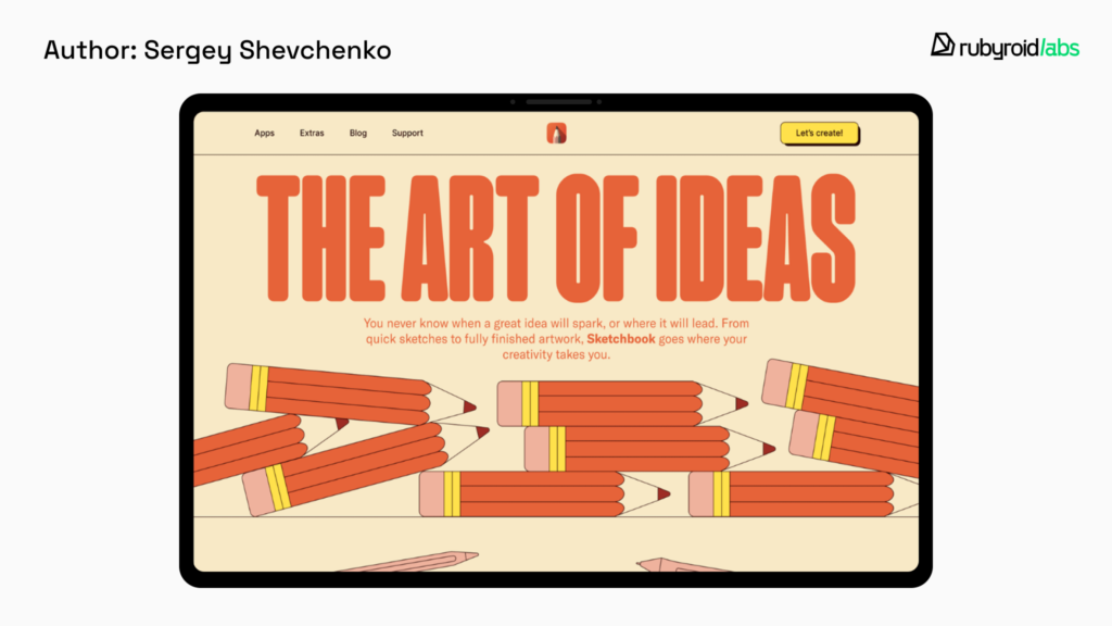
Handmade
People love to indulge in nostalgia — remembering how they used to jot down their thoughts in paper notebooks, take notes with highlights or circles around important points, and capture moments on film to place in photo albums. In 2025, creating a handcrafted aesthetic for websites will gain popularity. This type of design evokes warm, positive emotions and a sense of comfort.
Custom Cursors
The primary role of custom cursors is to entertain the viewer, leave a lasting impression and offer a chance to showcase originality. A cursor can reflect a business concept or simply add an intriguing visual effect.
On the Rubyroid Labs homepage, for example, you can see a highlighting effect where the cursor acts as a window, revealing parts of a hidden image.

AI and Automation in UX
The Contentsquare 2025 CX Trends report states that 34.2% of digital professionals will prioritize AI in the coming year. Let’s clear this up right away: AI isn’t here to replace designers — it’s here to make their work faster and easier. AI can generate multiple layout options based on prompt. Designers can then pick the best one and refine it, rather than starting from scratch. It’s also possible to learn what users love, using AI tools, and offer them personalized recommendations.
Animation
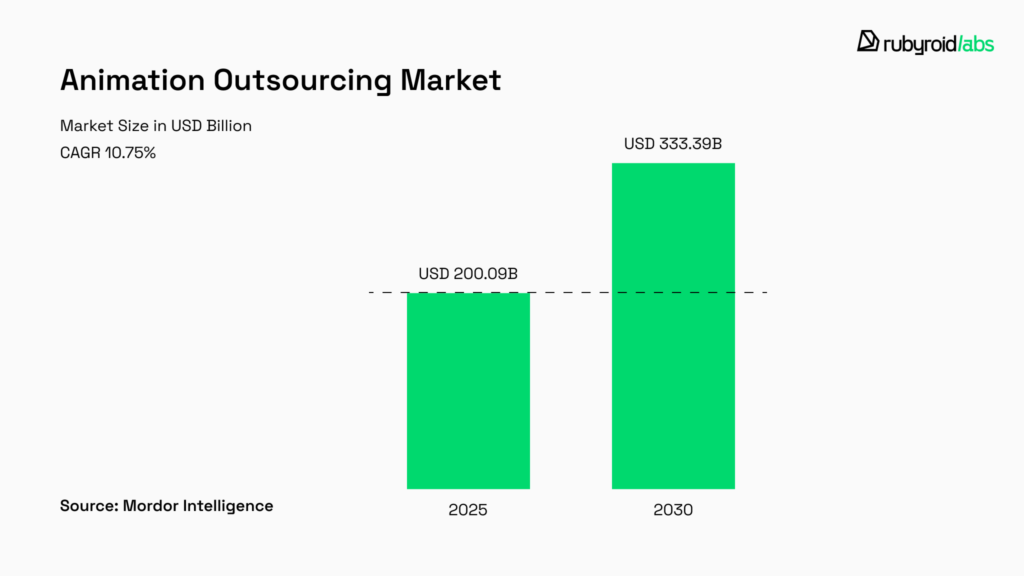
According to Mordor Intelligence, the Animation Outsourcing Market is projected to grow from USD 200.09 billion in 2025 to USD 333.39 billion by 2030. This growth is driven by the rising demand for high-quality content in the entertainment, gaming, and advertising industries.
Apps and web pages use creative animations when users refresh their feeds, employ guided animations to introduce new features, and display animated logos or progress bars during loading, turning waiting time into an enjoyable experience. Motion design brings static interfaces to life, creating memorable “peak” moments that impress people.
Spacial Design
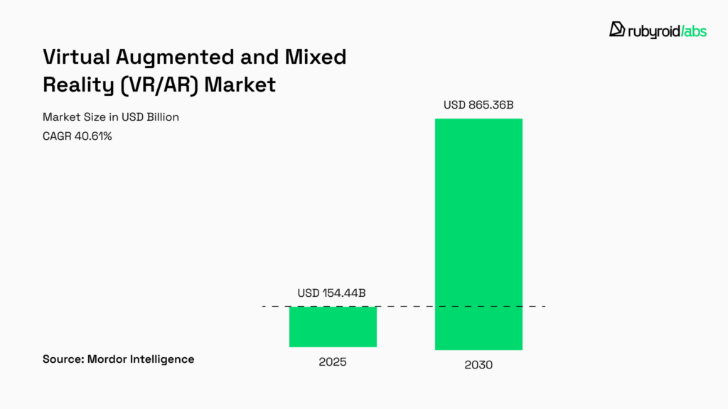
The Virtual, Augmented, and Mixed Reality market is also projected to grow. The commercial sector is rapidly adopting these technologies. For example, in October 2023, Walmart launched AR tools for 300 furniture and home décor items.
Interaction design lets users virtually “try on” products like clothing, glasses, or makeup, or see how furniture would look in their homes. This reduces uncertainty and makes buying decisions easier, which boosts conversion rates. With the launch of Apple Vision, designing for AR and VR has become even more relevant. It requires rethinking traditional navigation and interaction patterns to work seamlessly in 3D spaces.
Voice Interfaces
Voice User Interfaces (VUI) is a new way to interact with technology through voice commands. Unlike graphical user interfaces, VUIs lack visual cues, so users cannot rely on seeing their options.
The Interaction Design Foundation shares some tips on how to avoid confusion.
- It’s essential to provide users with clear verbal guidance about available actions. For example, a weather app might say: “You can ask for today’s weather or the weekly forecast”. It’s also important to clarify what functionality users are engaged with, stating: “Today’s weather forecast is mostly sunny” to prevent disorientation.
- Keep commands clear and concise, limiting options to three at a time to avoid overwhelming the user.
- Use visual feedback, like a light indicator on devices, to reassure users that the system is listening.
Voice User Interface (VUI) technology is still in its early stages, but it is already making a significant impact. Currently VUI is widely used in virtual assistants like Amazon’s Alexa, Apple’s Siri and Google Assistant. It is also integrated into smartphones for voice input and is increasingly found on websites to enable hands-free interactions. This is especially convenient when hands are occupied, such as when driving or cooking or for people with disabilities.
Conclusion
There’s nothing new under the sun — what we see in 2025’s UX/UI trends is often a reimagining of concepts we’ve encountered before. Minimalism, with its clean and functional appeal, continues to thrive. Bento-inspired layouts remind us of structured, modular designs from the past, brutalism harks back to an era of raw, unapologetic aesthetics. Even custom cursors and handmade elements evoke the nostalgia of earlier digital experiments.
Technological advancements, such as animations, 3D visuals, voice interfaces, and AI integration, are new tools to refine old ideas. Bold typography, vibrant gradients, and intricate filters echo design choices that have cycled in and out of fashion for decades.
Ultimately, while visual trends may change, the core principles of UX/UI design remain timeless: usability, functionality, and the creation of meaningful experiences for users. Rubyroid Labs strikes a balance between innovation and the needs of its audience.


