Everyone knows quality assurance (QA) helps catch bugs in software. But did you know it’s just as important for design?
A designer makes a mockup showing how everything should look. Then a developer uses that mockup to build the actual product. But just like copying a painting, the final result often doesn’t quite match the original design.
To fix any differences between the intended design and the implemented version, it is necessary to integrate quality assurance into the design workflow. And that’s exactly what this article is about.
We’ll explain what design process quality assurance is, how it differs from a UX/UI audit, and why it matters for product quality. You’ll also learn how we manage this process at Rubyroid Labs, see our practical methods and best practices for QA in design, and get a behind-the-scenes look at a real case from one of our recent projects.
Contents
- What Is Design QA & How Is It Different from a UX/UI Audit?
- Why Is QA Important in UI/UX Design?
- How Do We Do Design QA at Rubyroid Labs? Methods & Best Practices
- Real Project Example of Design QA
- Conclusion
What Is Design QA & How Is It Different from a UX/UI Audit?
In the design process, quality assurance (or simply QA) is the practice of reviewing a product to ensure it aligns with the original design mockups.
Let’s walk through the process to get a better understanding.
Designers create mockups for a website or application and share them with the client for approval. Once the client has approved, developers begin coding.
They access the design files, stored in Figma, switch to developer mode, and start implementing the designs in code. During this process, developers may miss certain details, misunderstand the designers’ concepts, or face technical limitations that make implementing some ideas challenging. When this happens, developers have two options: either reach out to the designers for clarification or make decisions on their own.
When the technical side of the product is ready, it’s time for design process quality assurance (or, as we often call it, a design review). Before the product is released, designers review the final implementation to ensure everything matches the mockups.
In reality, discrepancies are always found, which makes this step essential. Any issues are documented and sent back for corrections. This cycle continues until all parties are satisfied with the product.
Design QA vs. UX/UI Audit: What’s the Difference?
At first glance, it might seem like we’re talking about a UX/UI audit, but design QA and UX/UI audits are two very different things.
A UX/UI audit is conducted on an existing, live product. For example, if conversions start to drop over time, a business owner might suspect something is wrong with the website or app and request a professional audit to get to the bottom of it.
The purpose of an audit is to find and document problems and bugs, then suggest ways to make things better. Design QA focuses on making sure the final product matches the original design mockups exactly, before it goes to the client.
Why Is QA Important in UI/UX Design?
For many people, QA is something deeply technical, something that lives in the backend and only concerns code. But that’s a common misconception. Effective quality assurance goes beyond just code review and includes checking all external aspects: design, layout, and how pages display on laptops, tablets, and smartphones with different screen sizes.
If you skip design process quality assurance during development, you might end up with something that works, but not in the way it should, and that’s the best-case scenario. In worse cases, visual and usability issues go unnoticed until after release, forcing you to go back to development, redo parts of the interface, and spend extra time and money fixing things that could’ve been caught much earlier.
The bottom line is: skipping design QA can cost you. Here are the main reasons why this process should be part of the design workflow.
Fewer Slip-Ups
Even with the detailed mockups, things can get lost during handoff. Developers might misinterpret spacing, apply slightly different font styles, or implement interactions like hover states and animations in ways that don’t fully match the original design intent.
For example, when we were redesigning our own website, we sometimes found that after development, certain elements behaved unpredictably, some buttons were missing, or hover effects didn’t match the design guidelines. There were also mismatches in sizes, and the spacing was either too tight or too wide. We documented these issues, categorized them by priority, and then sent them back to the developers for revision.
The image below clearly shows the difference between a design mockup of one of the screens and its implemented version.
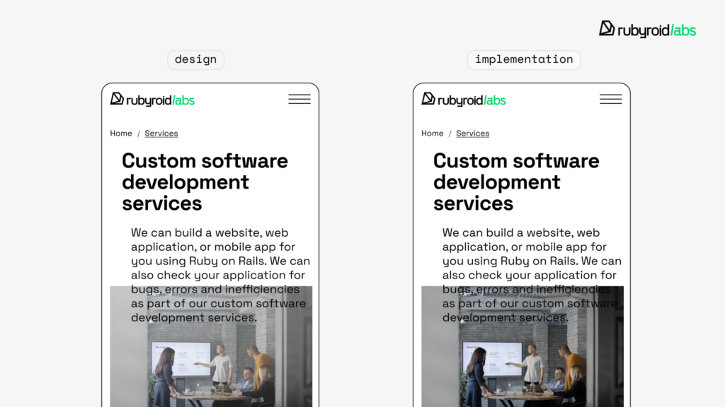
You can see that the text capitalization in the heading doesn’t match, and the text over the image is hard to read. This happened because the developer didn’t apply the gradient overlay that was meant to lighten the image and improve text readability.
QA in design workflow ensures that what gets built matches the intended user experience pixel by pixel. It’s the final check to make sure your product not only functions but also looks and feels the way it was meant to.
Pre-Development Testing Saves Time and Budget
Post-release fixes require reopening closed tickets, adjusting code that’s already been QA’d, and sometimes rolling back features or temporarily disabling parts of the UI. All of these eat up time and budget.
In the early stages of development, components are still modular and relatively isolated. That means changes made to layout, styles, or logic usually affect a limited scope. Once the product is fully integrated with APIs, third-party services, and other components all interconnected, fixing even a small design bug might trigger unexpected side effects in other parts of the system.
Moreover, after the release even a minor fix becomes a release task. It needs to go through staging environments, QA validation, and version control which adds time and coordination effort. Pre-release fixes don’t come with that kind of logistical weight.
Consistency = Better Brand Perception
Users notice when something feels “off ” and this affects how people perceive your brand. Every digital product is its extension. Paul Rand, a renowned graphic designer and the creator of logos for major companies like IBM, once said:
Design is the silent ambassador of your brand.
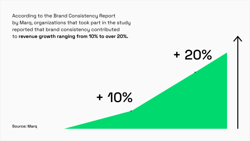
Design process quality assurance helps maintain visual consistency across pages and devices, thus reinforcing brand identity. This consistency makes products feel more cohesive and reliable, which directly contributes to user satisfaction and retention. According to the Brand Consistency Report by Marq, organizations that took part in the study reported that brand consistency contributed to revenue growth ranging from 10% to over 20%.
How Do We Do Design QA at Rubyroid Labs? Methods & Best Practices
QA methodologies for design, as well as the team responsible for it, can vary significantly from one company to another. Every organization structures it in a way that works best for them. Here’s how we do it at Rubyroid Labs.
Who Is Responsible?
At Rubyroid Labs, we have a dedicated QA team that handles the technical side of things – the “under the hood” stuff. And we also have a Design team that takes charge of design QA, or as they like to call it, design control. In other words, the main responsibility for checking the visual side of the product lies with our designers.
But that doesn’t mean they’re the only ones keeping an eye out for issues.
We spoke with Marianna Klimenko, Lead QA Engineer, to understand how responsibilities are shared between QA engineers, designers, and developers to ensure a high-quality product.

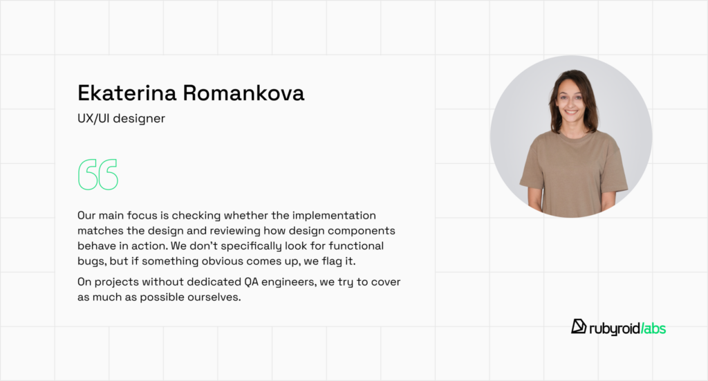
Here’s what Ekaterina Romankova, a UX/UI designer, has to say on the topic:
This collaborative approach helps catch issues from multiple angles: visual, functional, and technical before they reach the user.
How Do Designers Check the Product?
The designers carefully examine various aspects to make sure the final version matches the original design. They typically look for:
- Visual inconsistencies. These are any stylistic discrepancies between the implementation and the design mockups. They include issues with text styles, colors, sizes, spacing, etc.
- Functional inconsistencies. This refers to minor or major interaction errors or functionality that is not correctly implemented.
- General issues. Checking core user flows. Designers follow the user paths and look for any logical errors.
Next, all identified issues are documented (we’ll explain how below) and sent for revisions. After developers fix the bugs, designers conduct a recheck, but most often, this is handled by the QA engineers.
In What Format Do Designers Leave Feedback for Developers?
The reporting documentation is created based on the team’s internal agreements.
It could be Google Sheets or Docs, or even a thread in Slack where designers send identified bugs, described in text and accompanied by screenshots or screen recordings.
All issues are categorized by urgency, which helps developers focus on the most critical tasks first.
What Tools Are Used?
As Hanna Maroz, Head of Software Design, points out:
We test websites in the browser, sometimes using responsive design mode to check the implementation of the design on mobile devices from the desktop. We also use the browser’s inspect mode to read the CSS properties of elements and browser plugins to check properties like text styles and spacing. For apps, we test them in TestFlight and Android Studio before they are released in the app stores.

Real Project Example of Design QA
To back up our point and show what a product can look like before design quality assurance, we’ll walk you through a real case, one of our current projects.
On one of our projects, the design process quality assurance is referred to as UAT (User Acceptance Testing). During this stage, designers review the implemented functionality to make sure it matches the design mockups, while also checking it against the ticket requirements.
A ticket is a document where the project manager outlines the product owner’s expectations. For example, if the client specifies that a page should include input fields for name, email, and other details, designers make sure those fields are present and functioning properly.
On project N (let’s call it that), every new feature that involves design goes through this QA process. Designers check the behavior of UI components in dynamic scenarios and review elements from the design system that developers build in Storybook, a tool used to organize and display UI components like buttons and inputs.
The process here is similar to what we described earlier: designers leave comments for developers in Slack, often accompanied by screenshots, screen recordings, and a note about the issue’s priority level. For some apps, they also maintain dedicated pages in Confluence.
Let’s take a look at some inconsistencies the designers have spotted:
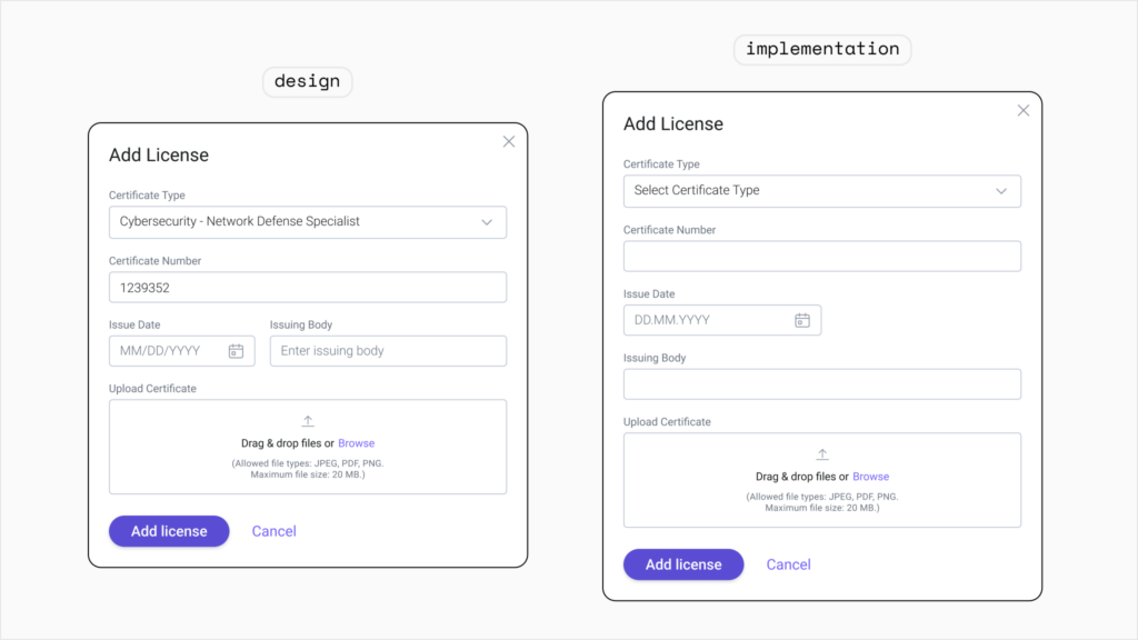
In the design mockup, the input fields feel balanced and comfortable. But in the actual implementation, the padding is noticeably tighter. As a result, the fields look cramped and lose the clean, polished feel intended by the design.
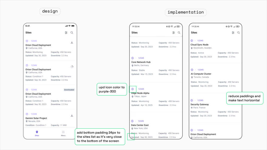
Here, we can see a few clear mismatches in the implementation. The icon color doesn’t match the intended shade from the design, the bottom padding of the site list is uncomfortably close to the edge of the screen, and the text wraps into two lines instead of staying on one as originally planned. These issues make the interface feel inconsistent, which can reduce the user’s confidence in the product’s quality.
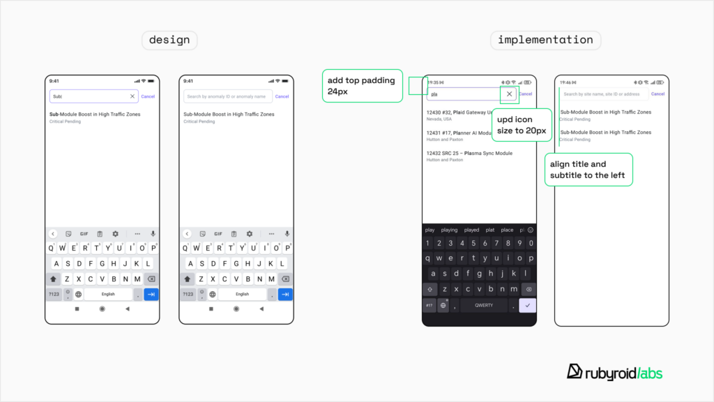
The padding is smaller than intended, the “X” icon is noticeably oversized, and the search placeholder text doesn’t match what was specified in the mockup. This affects the visual balance of the screen and can make interactions feel unintuitive.
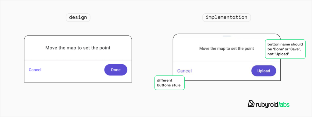
The button is named incorrectly, and different button styles have been used. Inconsistent labeling and styling confuse users and disrupt interface predictability.
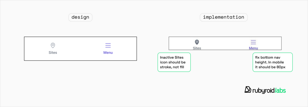
The height of the bottom navigation bar doesn’t match the design, and the Inactive Sites icon should use a stroke style instead of a fill. These visual inconsistencies break the harmony of the UI and can make navigation feel uncomfortable.
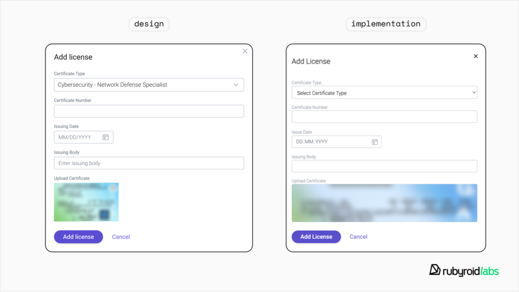
The size and proportions of the image preview don’t match the design mockup. When images are displayed incorrectly, it affects both the visual appeal and clarity of content presentation.
These examples are just a small sample, but they’re more than enough to show why these checks are essential.
Once the designers’ comments are addressed, they conduct another round of UAT. Since there are no QA engineers on this project, the designers go through every page as thoroughly as possible. The project manager is also involved in the design system quality control.
Conclusion
Design process quality assurance is one of those behind-the-scenes processes that quietly makes a huge difference. It ensures that every screen, button, and interaction aligns with the original design vision, which helps products look polished, work as intended, and deliver a consistent, professional experience to users. And while it might seem like a small thing, those tiny details have a direct impact on user satisfaction, brand perception, and ultimately, business results.
At Rubyroid Labs, we’ve been building and launching digital products for over 12 years, and we never skip this step. Integrating QA in product design is a non-negotiable part of our workflow because we’ve seen firsthand how much smoother projects run and how much better the final product turns out when this process is in place.
Clean, consistent, and well-tested design is part of a product your users can trust. No matter what stage your project is at, whether you’re refining the last details before launch or just starting to build your design system, we’re always happy to step in and help.


