You invested in a beautiful design, but conversions aren’t improving? Users are dropping off without completing key actions? You might be missing analytical data in your design process.
Designing user interfaces that actually meet user needs requires more than just asking people what they think. As usability expert Jakob Nielsen famously put it, you should “pay attention to what users do, not what they say”.
A data-driven approach helps teams prioritize what matters, optimize usability, and align business goals with real user behavior.
In this article, we’re going to break down what it means to take a data-driven approach to UI design, why it’s so valuable for your product, and how you can start leveraging different types of UI/UX metrics to make better, more informed design decisions.
Contents
- What is Data-Driven UI Design, and Why Should Your Business Care?
- The Key Metrics Your Team Can’t Afford to Ignore
- Which Tools to Use (And for What Tasks)
- A 5-Step Framework for Getting Started
- The 3 Most Common (and Costly) Mistakes to Avoid
- Conclusion
What is Data-Driven UI Design, and Why Should Your Business Care?
Data-driven UI design is the practice of making design decisions based on real user behavior analytics rather than fleeting visual trends or intuition. This doesn’t mean aesthetics or design trends are disregarded. Visual appeal still plays a crucial role. The difference is that every stylistic choice is grounded in how it supports usability.
Instead of relying on intuition alone, designers turn to analytics, A/B test results, heatmaps, user recordings, feedback, or other sources of information on how people actually interact with an interface. The goal is to enhance creativity with evidence.
For businesses, this shift is not just a matter of design quality. Interfaces built and iterated based on user data tend to perform better: they convert more efficiently, guide users with less confusion, and adapt faster to changing needs. In short, data-driven UI design helps align product aesthetics with business goals, and makes sure the interface effectively achieves business goals.
What Benefits Does It Bring to Business?
While data-driven UI design is often discussed in the context of usability, its true impact runs much deeper: it touches on conversion, retention, brand perception, and operational efficiency. Here’s how incorporating data into the design process delivers real business value:
Early Detection of Costly Problems
Analytics often comes into play when a business notices that something isn’t working: conversion is lagging, users are dropping off, or key features go unnoticed. Data-driven design process allows teams to spot these red flags earlier.
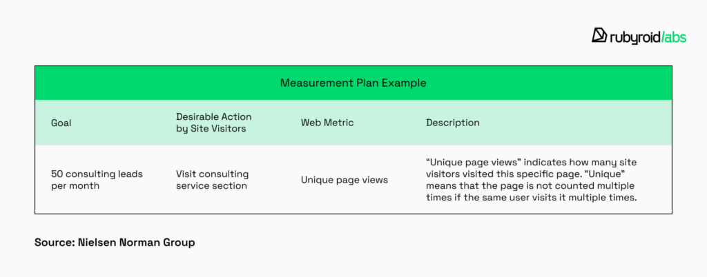
With a structured measurement plan in place, UX/UI teams can monitor how well the product meets its goals and identify areas for improvement before they become costly problems. This proactive approach helps reduce risks and keeps the product aligned with performance expectations.
Better Decisions Through Targeted Investigation
Once a problem is detected, the next step is understanding why it’s happening and guessing won’t cut it. Data gives design teams the ability to test hypotheses around drop-offs or user confusion and trace issues back to specific causes: unclear content, distracting visuals, broken UI elements, or ineffective navigation.
This investigative approach saves time and resources by making design decisions more precise and grounded in evidence, not assumptions.
Stronger Alignment With Business Goals
One of the most overlooked benefits of analytics in UI design is how it bridges the gap between product teams and business strategy. Every interface should help users take the actions that support company growth, whether that’s signing up, making a purchase, or engaging with content.
Design informed by user data is far more likely to support these goals because it reveals what actually drives behavior. It also makes it easier to demonstrate ROI of your design efforts to stakeholders.
Stronger Brand Perception Through Better User Experience
Every digital interaction contributes to how people perceive a brand. When a product feels intuitive, fast, and helpful, users don’t just appreciate the interface – they develop trust in the company behind it. As mentions our UX/UI designer:
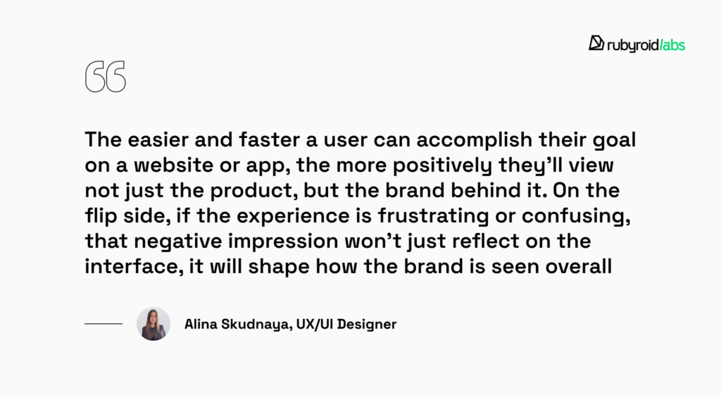
By using analytics and user feedback to fine-tune the UI, you show customers you respect their time. That care builds loyalty, encourages repeat use, and makes users more likely to recommend the product, not because they love the design, but because they trust the brand.
But to truly unlock these benefits, you need access to the right data.

Who Provides Data?
There’s no shortage of articles that describe idealized versions of how to collect user data, but they often feel disconnected from the messy realities of actual projects. That’s why we wanted to approach this topic from a more grounded perspective: by drawing on our own experience.
We asked our designers how they gather insights on real projects. That’s what our UX/UI designer, Alina Skudnaya, says about it:
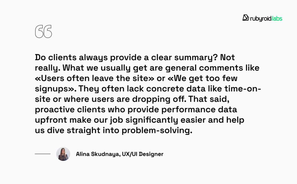
In some cases, getting the right data requires collaboration with developers.

When it comes to analytics tools, Google Analytics remains the most popular choice among our clients. It’s free, relatively easy to set up, and even its advanced features come at a modest cost. Other platforms may offer similar capabilities, but they’re often pricier or don’t include a free version at all.
The Key Metrics Your Team Can’t Afford to Ignore
Unlike usability testing, analytics collects data passively using tracking tools that monitor clicks, scrolling, time on page, and other user actions. This helps designers see what users actually do, not just what they say they do. However, not all UX/UI metrics are equally useful. To understand how data truly informs design decisions, we turned to our UX/UI team.
What we found is that the most valuable insights tend to cluster around a few key categories.
User Metrics
Understanding who your users are is the foundation of good design. That’s why our designers pay close attention to user-focused metrics: number of visitors, bounce rate, gender, age groups, geographic distribution, browser and device usage. Many tools also show how many people are on the site in real time and which pages they’re currently viewing.
Even surface-level metrics like these can raise critical questions: are we speaking to the right audience? Is our message getting across? Is the value proposition clear within the first few seconds? For example, if bounce rates are unusually high among mobile users, that could signal a usability issue on smaller screens.
Device data, in particular, plays a pivotal role in shaping layout decisions. As UX/UI designer Maria Uskhopova explains:

This kind of usage data gives teams the confidence to invest in the right priorities. In Maria’s case, analytics directly influenced a shift toward mobile-first design – a strategic decision that aligned the product more closely with user behavior and business goals.
Session Metrics
Metrics related to user sessions offer a closer look at engagement quality. Designers monitor average session duration, time on page, and return frequency to assess how users are interacting with specific sections of a site or app.
Short dwell times on key pages are often red flags – they may indicate confusing UI, lackluster content, or unclear calls to action. If users are abandoning a flow early, it might mean they don’t know where to go next or aren’t seeing a compelling reason to continue. These signals help designers prioritize redesign efforts based on areas of friction.
One powerful subtype of analytics is clickstream analysis. This method examines the exact paths users take as they move through a website or app. Heatmaps are among the most visually intuitive tools for UX evaluation. They reveal where users click, how far they scroll, and how they interact with different interface elements. This data allows designers to assess visual hierarchy, content discoverability, and attention hotspots.
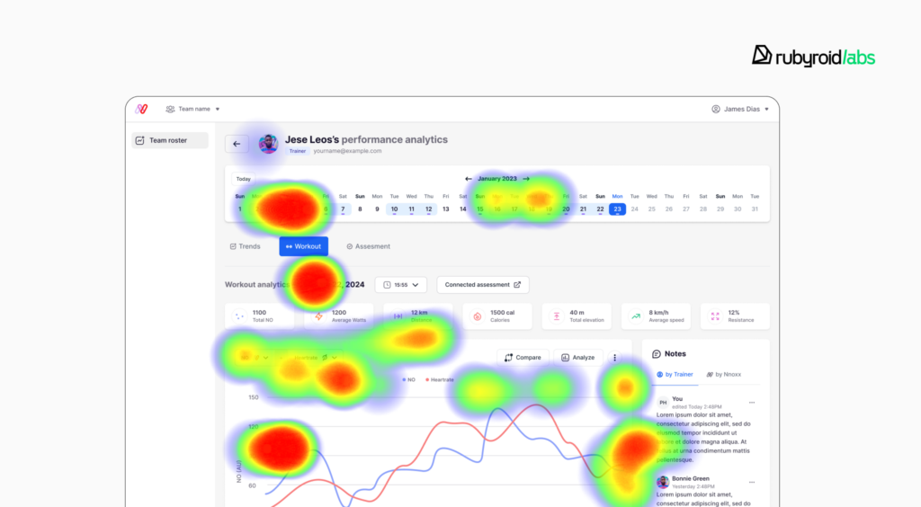
For instance, if users routinely ignore a CTA button in favor of a different area of the page, it could signal that the button’s styling, placement, or labeling needs attention. Heatmaps are also useful in color testing – they can reveal which button color variations are more likely to draw the eye and invite interaction.
Maria shared a case where heatmaps helped uncover a critical flaw in the checkout experience:
Numbers alone don’t show the full picture. UI analytics tools like heatmaps and session recordings help explain why a problem occurs. They help uncover usability issues by showing real behavior, like hesitation, backtracking, or misclicks during complex flows.
Conversion Metrics
For business and marketing teams, the most critical UI/UX metrics are those that directly reflect whether the product is achieving its intended outcomes. These include the number of completed purchases, account registrations, newsletter subscriptions, contact form submissions, demo requests, and other high-value actions that define conversion success.
These metrics provide a clear indication of how well a product meets business goals. When users reach the end of a process (order placement, price request, or subscription to a paid plan), it indicates that the user experience was convincing and didn’t cause any difficulties.
Conversely, low conversion rates may suggest more serious issues with usability, trust, content clarity, or performance. By closely tracking these KPIs, designers can identify where users are dropping off and why, and also prioritize areas for UX modernization.
Due to analytics, designers are able to present clients with data-backed explanations: why users drop off at certain points, which content goes unnoticed, or which UI elements attract the most attention.
These insights also allow designers to validate or challenge client assumptions, for example, when the data shows that users actually prefer the less obvious CTA color or navigate differently than expected.
During our UI/UX audit design services, we use all these metrics to better analyze website usability problems and identify key improvement points when offering redesign solutions. This data-driven approach ensures our recommendations address real user behavior rather than assumptions.

Which Tools to Use (And for What Tasks)
With a wide range of UI analytics tools available on the market, selecting the right one depends heavily on the specific goals and context of each project. To provide a more practical perspective, we’ve compiled a list of the top 5 tools commonly used by our UX/UI designers, along with the tasks they help to address.
Google Analytics 4 (GA4)
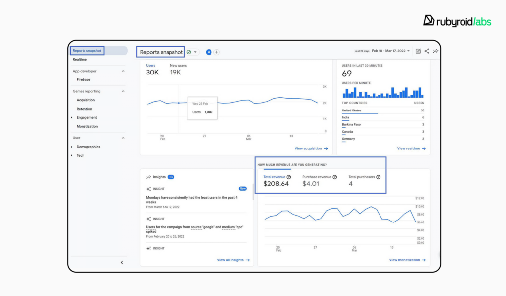
Google Analytics 4 (GA4) remains the most commonly used analytics platform among our clients, largely because it has a free version, relatively easy to set up, and its premium features come at a reasonable cost. For UX/UI designers, it serves as a foundational tool for collecting essential data points that help evaluate how users interact with digital products.
Our design team frequently uses Google Analytics to track basic yet crucial metrics:
- Sessions. Tracks the number of individual user visits, helps to understand overall traffic trends.
- Engaged sessions. Reflects meaningful user interactions, like scrolling or clicking, and gives a clearer picture of real engagement versus simple visits.
- Average engagement time. Offers more accurate insight into how long users are actively interacting with a page.
- Bounce rate. The percentage of sessions that were not engaged, useful for identifying pages where users leave quickly.
- User demographics. Includes country, device category, language, browser, and more. This helps designers assess performance across different user segments.
- Traffic acquisition. Shows where visitors are coming from (organic search, social, direct, or referral) which can influence how content is designed or positioned.
- Pages and screens. Offers page-level insight into which screens users view most often, helps to prioritize design decisions.
- Event tracking. Custom events like button clicks, form submissions, and scroll depth help designers understand what users are actually interacting with.
FigPii
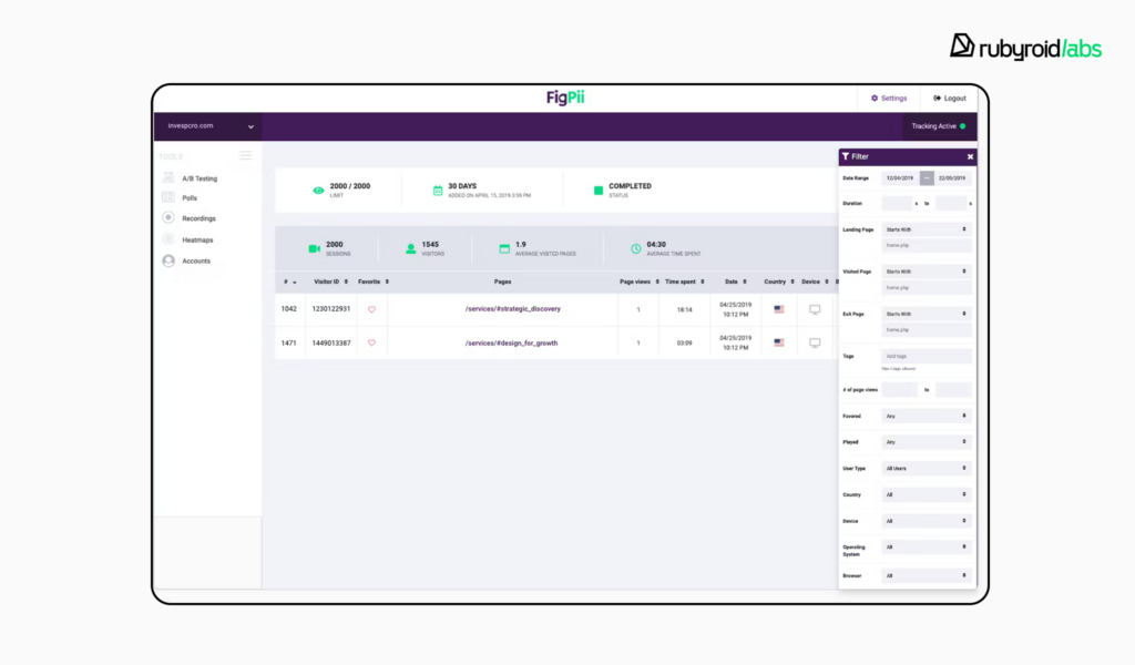
FigPii is a conversion rate optimization tool that combines heatmaps, session recordings, on-site polls, and feedback collection in a single, easy-to-implement package. As an all-in-one solution, it supports heatmapping (click, move, and scroll maps), one-click session replay, targeted surveys, and qualitative feedback tools.
FigPii is particularly valuable for validating assumptions and gathering qualitative insights at scale. Our designers have used its heatmaps to see where users are most likely to click or lose interest, and its survey tools to collect direct feedback.
Hotjar
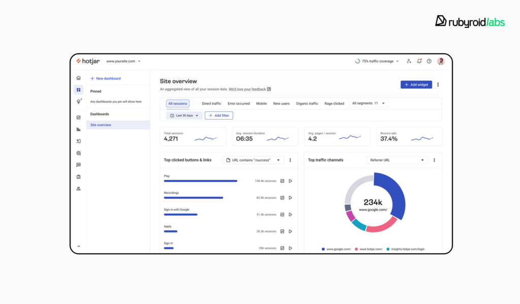
Hotjar is an analytics and feedback platform that provides teams with deep insights into user behavior. Its main features include heatmaps, session recordings, conversion funnel analysis, on-site surveys, and feedback polls. These surveys allow teams to ask contextual questions at just the right moment in the user journey.
Advantages include ease of setup (a simple tracking snippet) and a visual-first approach that supports both quantitative trends and qualitative insights in one view. Limitations may include session-recording thresholds on lower-tier plans, lack of support for certain dynamic elements (e.g., nested dropdowns), and pricing that scales with site traffic.
Maria Uskhopova shared a practical use case that highlights Hotjar’s potential:
I was working on a website that offered professional photo retouching services. To place an order, users needed to be either professional photographers or experienced retouchers, because the interface was packed with technical terminology unfamiliar to casual users.
We needed to understand who the users really were. Hotjar’s on-site surveys helped us gather that insight. We learned that 40% of users were creative directors from e-commerce businesses, 35% were hobbyists, and only the rest were pro photographers.
Based on this data, we restructured the order flow. We introduced a step where users could choose their path. Each group was then guided through a tailored experience that matched their knowledge level.
Chameleon
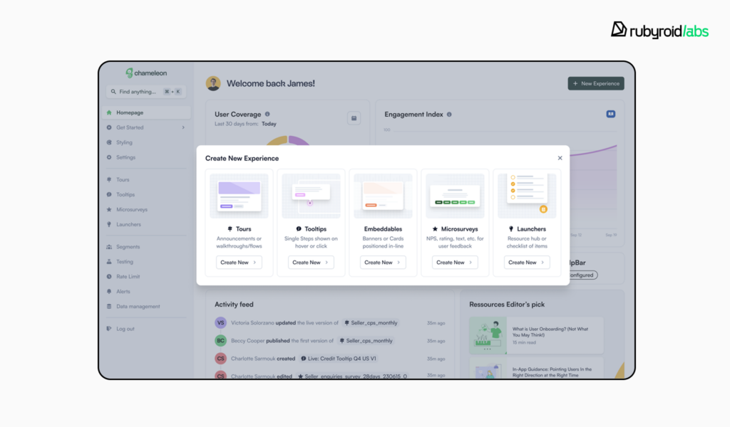
Chameleon is a no-code solution for building in-product UX elements such as banners, announcements, tooltips, modals, and surveys. It enables design and product teams to deploy contextual UI components that support onboarding, feature adoption, and user feedback without engineering dependencies.
The platform provides granular analytics on user interactions. Teams can measure engagement with specific elements (e.g., banner click-through rates or tooltip visibility) and collect qualitative input via embedded surveys. AI-generated summaries help process open-ended responses at scale.
Here’s how Ekaterina Romankova describes the team’s approach to using this tool:
For example, after the NPS survey period ends (we usually publish it quarterly and leave it open for three weeks), we check the average product score, read through the feedback if users left any, and then discuss the results with the PM or PO.
LogRocket
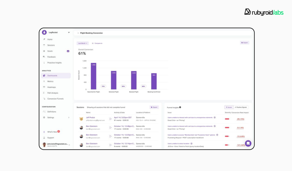
LogRocket is an analytics and session replay tool. It records sessions in high fidelity, captures not just clicks and scrolls, but also console logs, network activity, and even performance metrics.
Designers can replay user sessions to see how people navigate flows, track usage of specific interface elements (like buttons or forms) to analyze how often they’re used and whether they’re working as intended. The tool may require some technical setup to unlock its full potential.
There’s no universal solution. Each platform serves a different purpose. For example, Google Analytics excels at quantitative UI/UX metrics and high-level performance tracking. FigPii focuses on visual analysis, user feedback, and A/B testing. Chameleon is built for enhancing UX through contextual onboarding and in-product guidance.
All the tools are valuable, but they serve different functions. What truly makes a difference is not just having the data, but knowing how to interpret it and turn it into actionable decisions.
A 5-Step Framework for Getting Started
Adopting a data-driven approach in UI/UX design requires thoughtful planning, consistent communication between teams, and a willingness to act on insights. Below are the key stages businesses should follow to integrate analytics into their design process in a meaningful and effective way.
Step 1. Define Business Questions First
Most successful analytics initiatives start with a clear problem or opportunity. Businesses often turn to data when something isn’t working: low engagement, high bounce rates, confusing user flows. But instead of diving straight into tools, start by asking the right questions:
- What behaviors are we trying to understand?
- Where are users struggling or dropping off?
- What outcomes matter most?
According to our team, research should always begin with a well-crafted set of business-driven questions. These guide both the data collection process and the design interventions that follow.
Step 2. Choose the Right Tools
You can decide which tools will help you answer your queries once they are clear. Google Analytics is a good option for tracking conversion funnels and traffic trends. Heatmaps and session recordings provided by FigPii and LogRocket offer further qualitative insight. Chameleon can assist you in measuring the performance of embedded UI elements if your goal is to enhance user onboarding or retention.
No single tool is objectively “the best”, the right choice depends on the kind of data you need and the decisions you plan to make with it. Business owners should ensure their design teams have access to tools that match project goals and budget.
Step 3. Collaborate and Discuss Insights
Data should spark discussion, not end it. Our team often organizes internal brainstorming sessions once initial data has been reviewed. These meetings bring together designers, developers, business analysts, and project managers to evaluate the findings and prototype solutions. Business owners should be part of these conversations. Ask your team:
- What’s not working and why?
- What hypotheses are we testing?
- What solutions are we ready to try?
Step 4. Present Findings and Act
After ideas are generated and refined, we bring clear, visual summaries to stakeholders. We explain why users may be leaving, what parts of the flow feel confusing, and what information users fail to find.
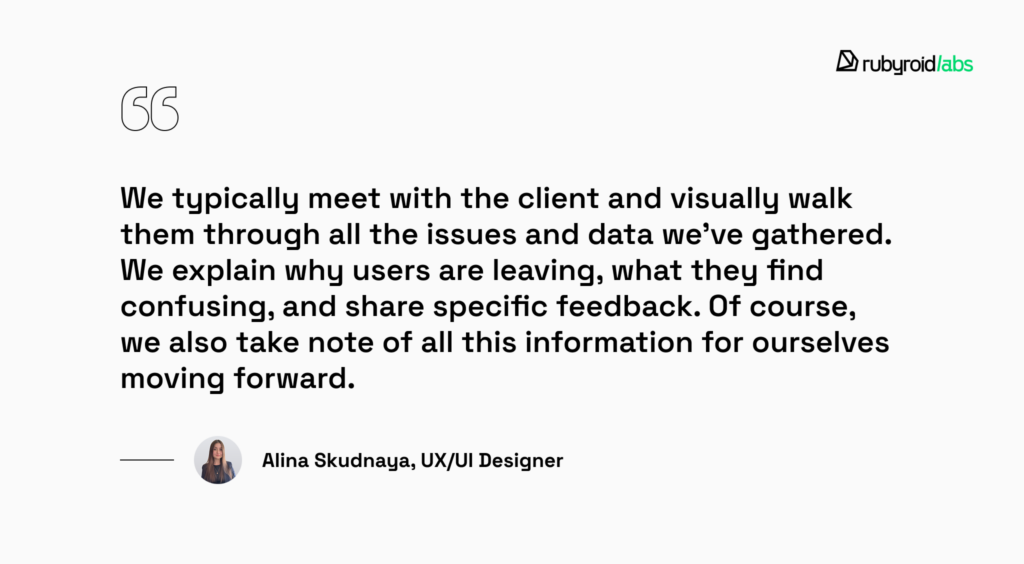
This stage is critical for buy-in. When clients see the connection between data, user experience, and business outcomes, they’re far more likely to support iterative improvements.
Monitor Changes and Stay Patient
Even well-planned changes don’t show immediate impact. As our designers point out, reliable data takes time to accumulate. One week isn’t enough to evaluate a new screen or button, it usually takes at least 3 months to gather meaningful insight. Business owners should build realistic timelines into their decision-making process.
The 3 Most Common (and Costly) Mistakes to Avoid
Unfortunately, we’ve seen design teams and business leaders make some common mistakes that end up diminishing the impact of their data-driven efforts. We’ll explore three of the most frequent pitfalls and provide guidance on how to avoid them.
Tracking Irrelevant Metrics
One of the most common pitfalls is getting lost in a sea of numbers without a clear sense of what they mean or why they matter. As the Nielsen Norman Group notes:
The biggest issue with analytics is that it can very quickly become a distracting black hole of ‘interesting’ data without any actionable insight.
This is especially true when designers or stakeholders dive into UI analytics tools expecting the data itself to reveal answers, without first defining the questions they’re trying to solve.
Modern analytics platforms offer dozens of default reports, upwards of 90 in some cases. While this breadth is powerful, it’s also a source of confusion. Some UI/UX metrics may appear meaningful at first glance, but unless they directly map to your business goals or UX hypotheses, they risk becoming noise.
In the worst cases, teams end up spending more time navigating the tool than actually making product improvements – a costly misallocation of effort, even with free software.
To avoid this, UX and product teams should start by clearly defining what they want to learn, and only then determine which metrics will best support those objectives.
Our advice: Start with a clear set of questions. What exactly are you trying to understand? Define the user or business outcomes you care about, and use those as the lens through which you evaluate your data. There are some examples of goal-oriented questions:
- What’s the current growth rate of mobile users, and how does their behavior differ from desktop users?
- To what extent are social media channels contributing to our user engagement or traffic quality?
- Which traffic sources are producing the highest number of qualified leads or conversions?
- How many interactions, on average, does it take for a user to complete a key action?
- What are the most common high-value behaviors users complete during a visit?
Ignoring Analytics Altogether
One of the most persistent problems we see, especially among smaller businesses and startups, is the complete neglect of UI analytics tools and user feedback. As our UX/UI designer Alina Skudnaya points out, many clients dismiss analytics due to perceived barriers: it’s too expensive, too time-consuming, or they lack the right people to handle it. But the cost of not collecting and using data is often much higher in the long run.
Business owners naturally prioritize profit, but this shouldn’t come at the expense of understanding their users. The way users interact with a product reveals far more about product-market fit than assumptions ever could. And in many cases, a product can be significantly improved with just the feedback and analytics already available, no extra budget or outside help required.
We’ve heard every excuse: “We don’t have time”, “We can’t afford it”, “We don’t have access to users”, “We already know what our users want”, but none of these justifications stand up to scrutiny. Ignoring data doesn’t save time or money – it wastes both.
Treating analytics as optional sends the wrong message: that the user’s experience is secondary. In contrast, grounding decisions in data shifts the team’s mindset – positioning the user as the primary stakeholder, which is exactly where they belong. When a product is easier and faster to use, users trust the brand more. And that loyalty pays dividends.
Expecting Immediate Results
Clients often expect analytics to deliver answers right away, eager to draw conclusions and make changes as quickly as possible. But UX insights don’t work on a sprint schedule. Analytics take time to reveal meaningful trends.
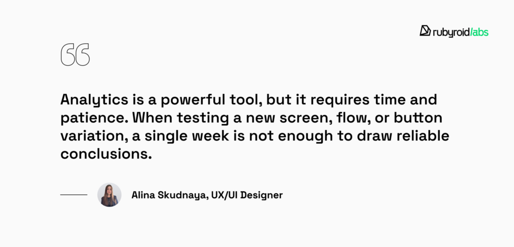
Truly meaningful patterns tend to emerge over a longer period, often two to three months, especially if the product has moderate traffic or a complex user journey. Rushing to act on early signals can lead to misleading results, premature design changes, and wasted effort.
To make informed, data-backed decisions, teams must commit to long-term observation and allow enough time for user behavior trends to stabilize.
Conclusion
By using heatmaps, session recordings, and behavioral data, designers can focus on the parts of the interface that matter most for user experience and business results.
Every functional and visual choice made during a data-driven design process supports key goals like boosting retention, improving conversion rates, and strengthening brand perception.
Ignoring user behavior results in an interface that doesn’t fulfill its purpose and in a decrease in return on investment.
Don’t let assumptions hold your product back. At Rubyroid Labs, we combine analytics with design to craft interfaces that convert, engage, and grow your business.


