


Mobile development
Why we choose React Native for Ruby on Rails ecosystems in 2026-2028
You can build a mobile app on Rails in 2026 two ways: smart or expensive. Go fully native, and you’ll…

You can build a mobile app on Rails in 2026 two ways: smart or expensive. Go fully native, and you’ll…

The rise of Hotwire and React Native frameworks has introduced a hybrid architectural model that demands a new breed of…

Customer support that only answers questions leaves work unfinished. AI agents resolve issues end-to-end. They ask clarifying questions, fetch account…

In 2026, super apps are a practical answer to app fatigue. Instead of forcing users to juggle dozens of downloads,…

For decades, the B2B sector operated under the assumption that high-stakes, complex transactions were the exclusive domain of the desktop…

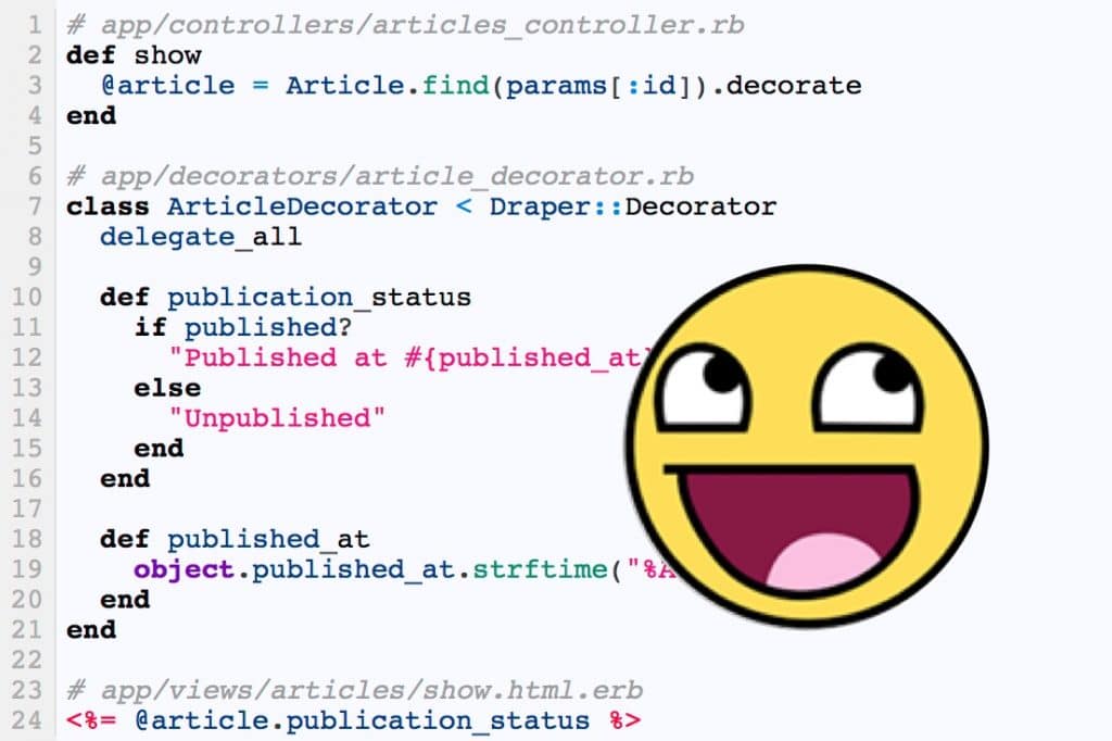
“Don’t touch it if it works” is quite a dangerous way to manage a Rails application.Everything may run fine today,…

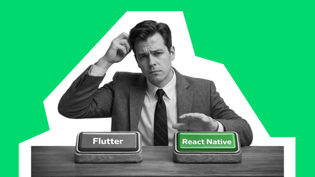
Everyone asks "which framework is faster?" But nobody asks "which one won't trap me with a rare talent pool?" Both…

I give my consent for Rubyroid Labs to process my personal data pursuant to Rubyroid Labs Privacy and Cookies Policy in order to handle my request and respond to it. I am aware that I have the right to withdraw my consent at any time.


70% of new users churn before ever engaging with the app’s core features. Businesses pay for acquisition without getting a…

The era of hiring "just in case" and over-engineering is over. 2026 is bringing the philosophy of lean execution: shipping…

Growth has a rhythm you feel before you see it in the numbers. It shows up when talented people ask…

So you want to add AI to your Rails app and need working code and expert guidance. The good news…
When you decide to build a minimum viable product, you are effectively placing a bet. From this point, your approach…
Every year, the services offered by no-code and low-code development platforms gain more traction and see broader adoption. According to…
Please fill out this form, and our manager will contact you within one business hour. If necessary, we can sign an NDA and begin project discussions.

We'll get in touch with you within 24 hours, excepting requests received on Saturday, Sunday.