eCommerce Website Usability Checklist: Online Store Essentials
Use this eCommerce website usability checklist to boost revenue with your online store.
A study by Hubspot found that 90% of people would leave a website if they didn’t like its design. And the design, in large part, is about how easily desktop and mobile visitors can navigate and buy from a site.
But you can also save money on the development if you tend to eCommerce user experience (UX) and user interface (UI) design first. According to research, UX design can help you cut wasted development time by almost 50%.
So how can you streamline the UX with your online store and build a friendly UI? Use our experience. Rubyroid Labs has built several shopping websites and apps since 2013, so we have seen what works and what doesn’t. We have put together these eCommerce usability tips for you to draw on as you design your online store.
Design Layout
In 2006, an eye-tracking study by Nielsen Norman Group revealed how people read web pages. They spent most of their time on the top line of the page and went down the left side, reading less with each consecutive line of content.
A heatmap showing the F-shaped pattern. Source: Nielsen Norman Group
The F-pattern means that you need to provide the information that’s most important to users at the top of the page and on its left side. It might look like this:
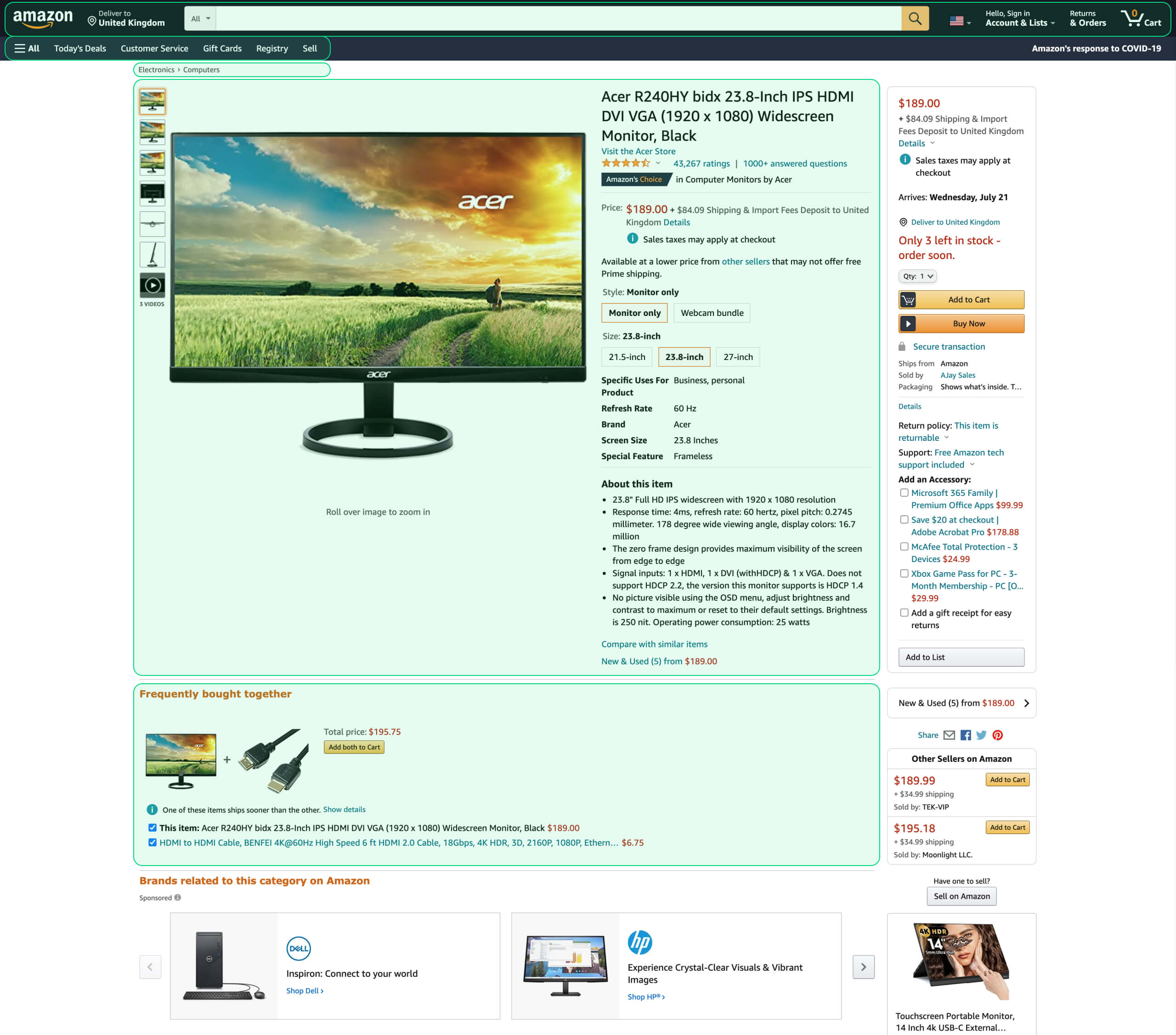
An Amazon product page with focus areas highlighted
People don’t always browse pages in the same way. There are other patterns, like the Z-pattern and the Gutenberg Diagram, but the F-pattern generally applies to how people flick through eCommerce sites.
Page Load Speed
Consider this finding by Kissmetrics: if your online store is making $100,000 daily, a page loading one second slower than normal can cost you an annual loss in sales worth $2.5 million. Participants of that study expected the normal load speed to be somewhere between two and three seconds.
It should come as no surprise then that accelerating your website would be one of the biggest usability improvements.
And don’t forget this: the faster your pages load, the more people will end up shopping on your website. That is because search engines prefer fast-loading sites over sluggish ones.
You can make sure that your pages load fast enough and spot loading issues by using Google’s PageSpeed Insights.
Homepage
Every brick-and-mortar store has a storefront. It’s designed to entice customers with special offers and new and best-selling products, and let site visitors know what they can buy from the store.
Your eCommerce site’s homepage has the same purpose. Show your most popular products on it alongside the latest deals.
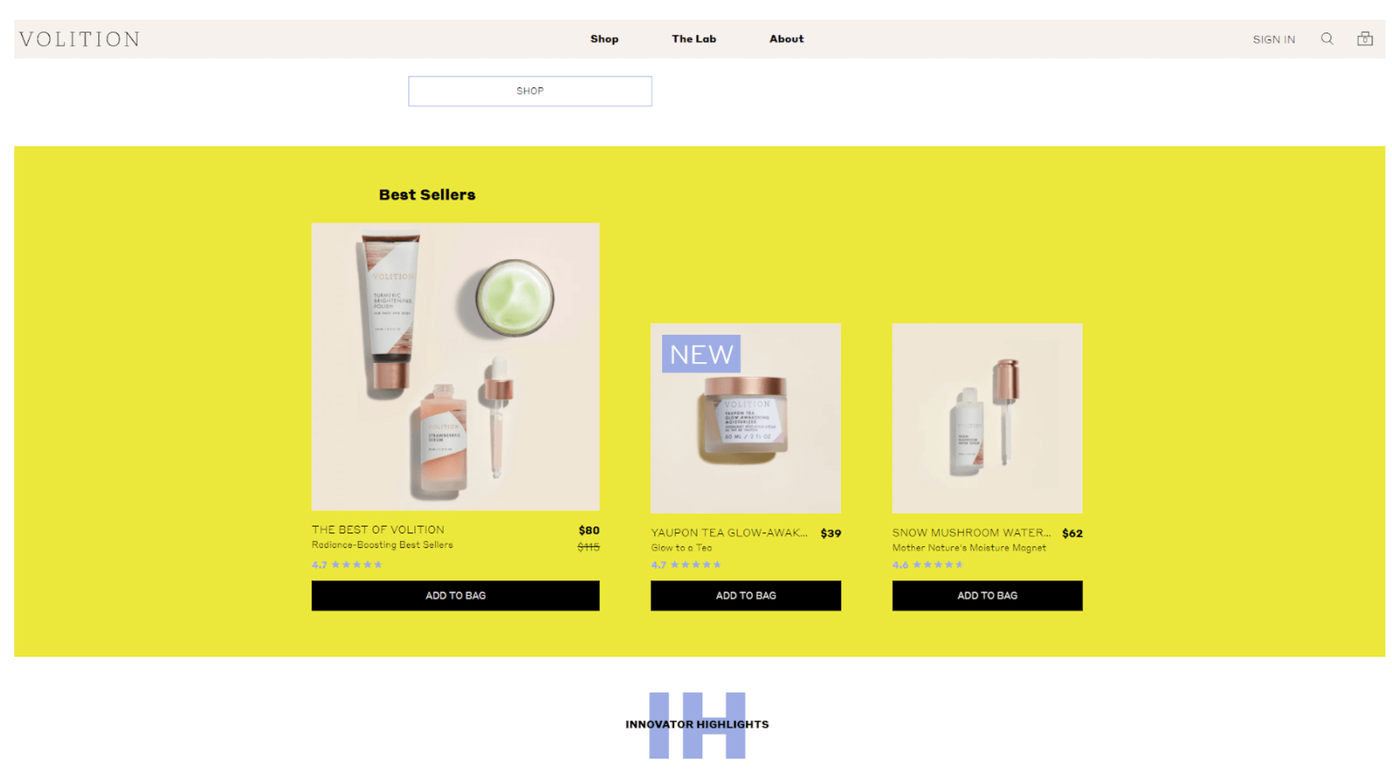
Best-selling products on the homepage of Volition, an online beauty store we helped develop
Make Your Homepage Feel Personal
And don’t forget to personalize the page. Collect the data about each user’s journey through your site and use that data to offer them relevant items. According to Statista, 9% of consumers in the US and the UK used personalized recommendations during shopping all the time, 28% did it sometimes, and 30% would occasionally do so.
Help Customers Navigate Shopping Options
Your website visitors will also need to be able to find their way around the site from its homepage. It should contain direct links to the product catalog’s main sections.
Catalog
Make your catalog structure simple and clear for your target audience.
A beauty shop once took advantage of our Ruby on Rails development services to build an online beauty store. The company wanted to base the catalog on skin types using categories such as normal, oily, dry and combination.
[optin-monster slug=”c0bng4c2kzdfnune5owo”]
But that is where the curse of knowledge came into play. Experts can easily discern those skin types, while non-experts might not know their type and would rather describe their skin as “sensitive” or similar. And the client wanted to sell its products to a broad audience of non-experts.
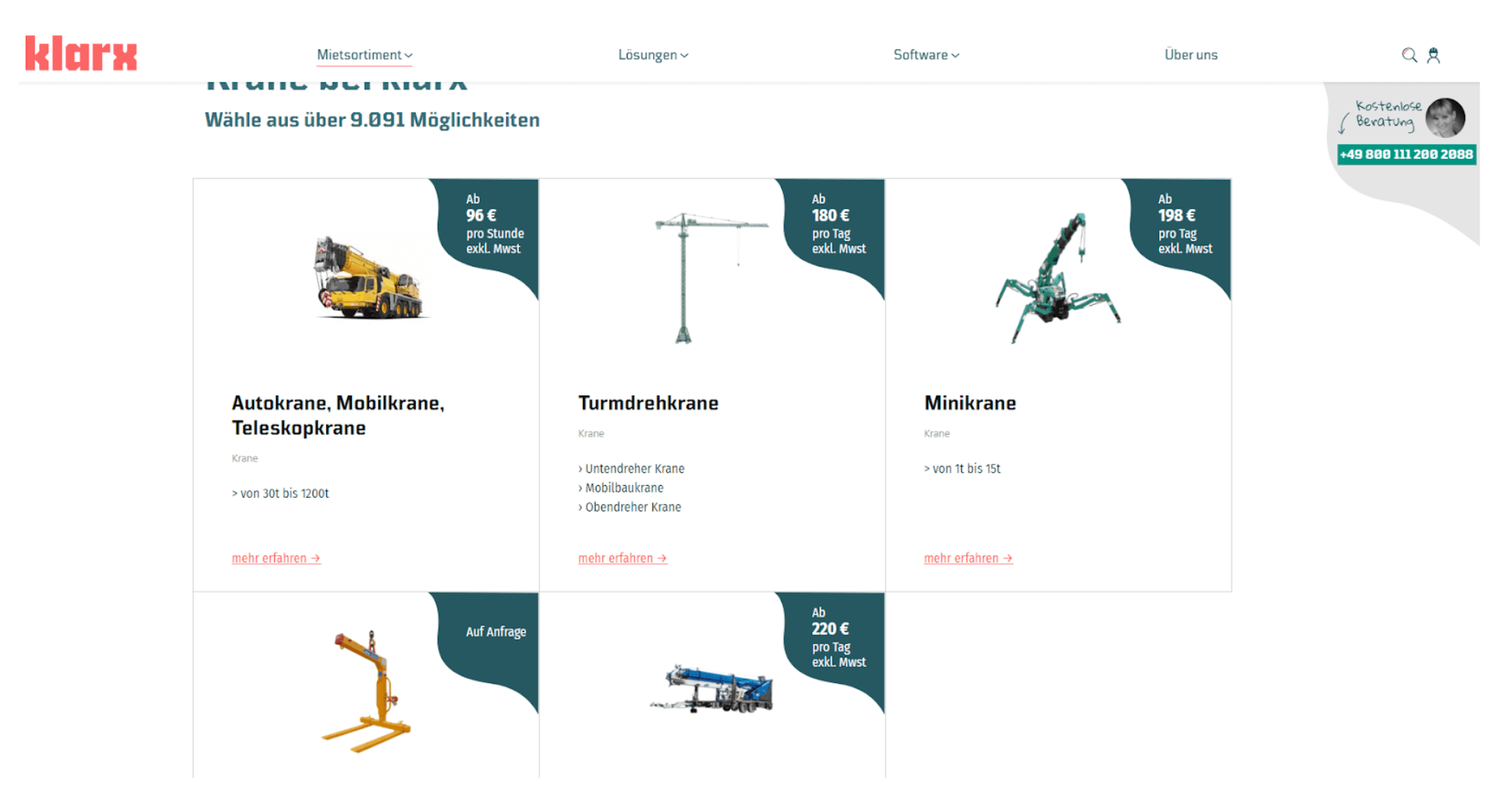
The catalog page of Klarx, an online industrial machine market we helped build
Search
Having the search function and including the search bar in the top part of your eCommerce site is a must.
Research has shown that up to 30% of online shoppers use internal site search and around 14% of an eCommerce’s revenue comes from searchers. In our experience, those numbers could be even higher.
Further, you can improve your search with useful features. Enable customers to upload a picture and let the system find similar items using computer vision. Mobile users will especially love this feature, as well as a barcode scanner.
The scanner will enable your offline store’s visitors to scan a barcode of a dress to check if they could buy it in their size online.
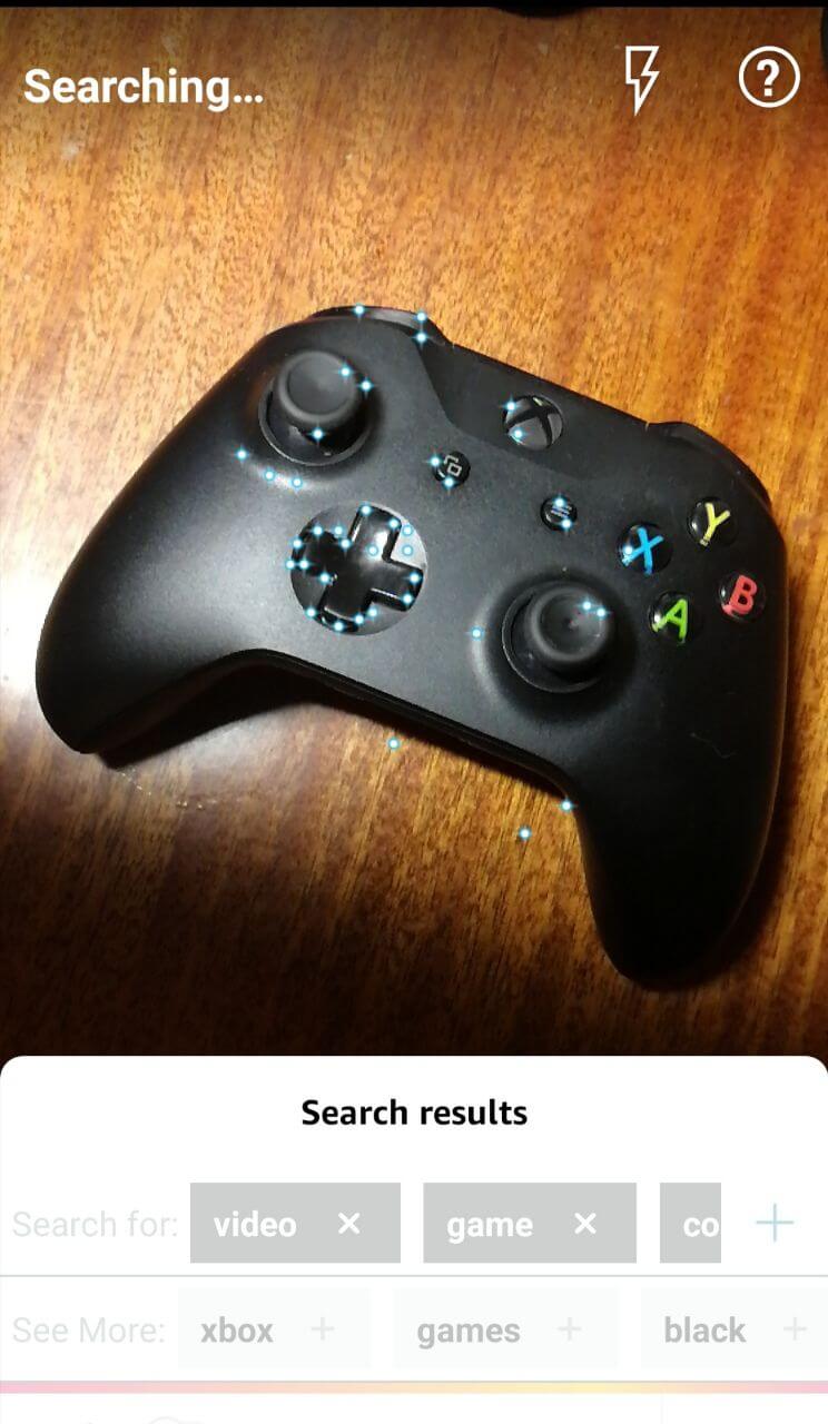
Searching with Amazon Shopping app using a smartphone camera
Sorting and Filtering
Help your customer find the product they’re looking for by introducing the sorting and filtering option.
When your customer chooses a product category from the homepage or search, they will want to narrow down the results by relevant parameters. Those parameters typically include price range, size, color, material and some specific features like memory for digital devices.
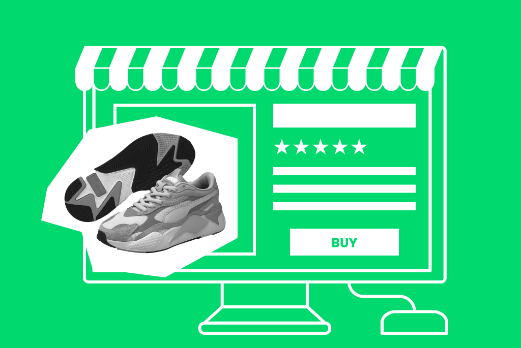
Cart
The shopping cart a.k.a. basket a.k.a. shopping bag should be clearly visible on your website. Place it in the top right-hand corner (remember the F-pattern?) and show the number of items the customer has added to it.
By clicking on the card icon, the user should be presented with a list of items, with item summaries, prices, shipping cost and arrival date estimates. The total cart price should change dynamically as the user adds and removes items.
If a user leaves your website without buying the products in their cart, they will need to see those products there when they come back.
Check Out
Checking out is the final stretch towards a sale. Therefore you should do all you can to streamline this process.
Break Down the Sign-Up Barrier
Many people won’t buy from you if that requires signing up, providing personal data and verifying their email. You can break down that barrier by enabling registration through social accounts like Google, Facebook and Twitter. To simplify things even further, you can allow them to check out without creating an account — just like Walmart does on its website.
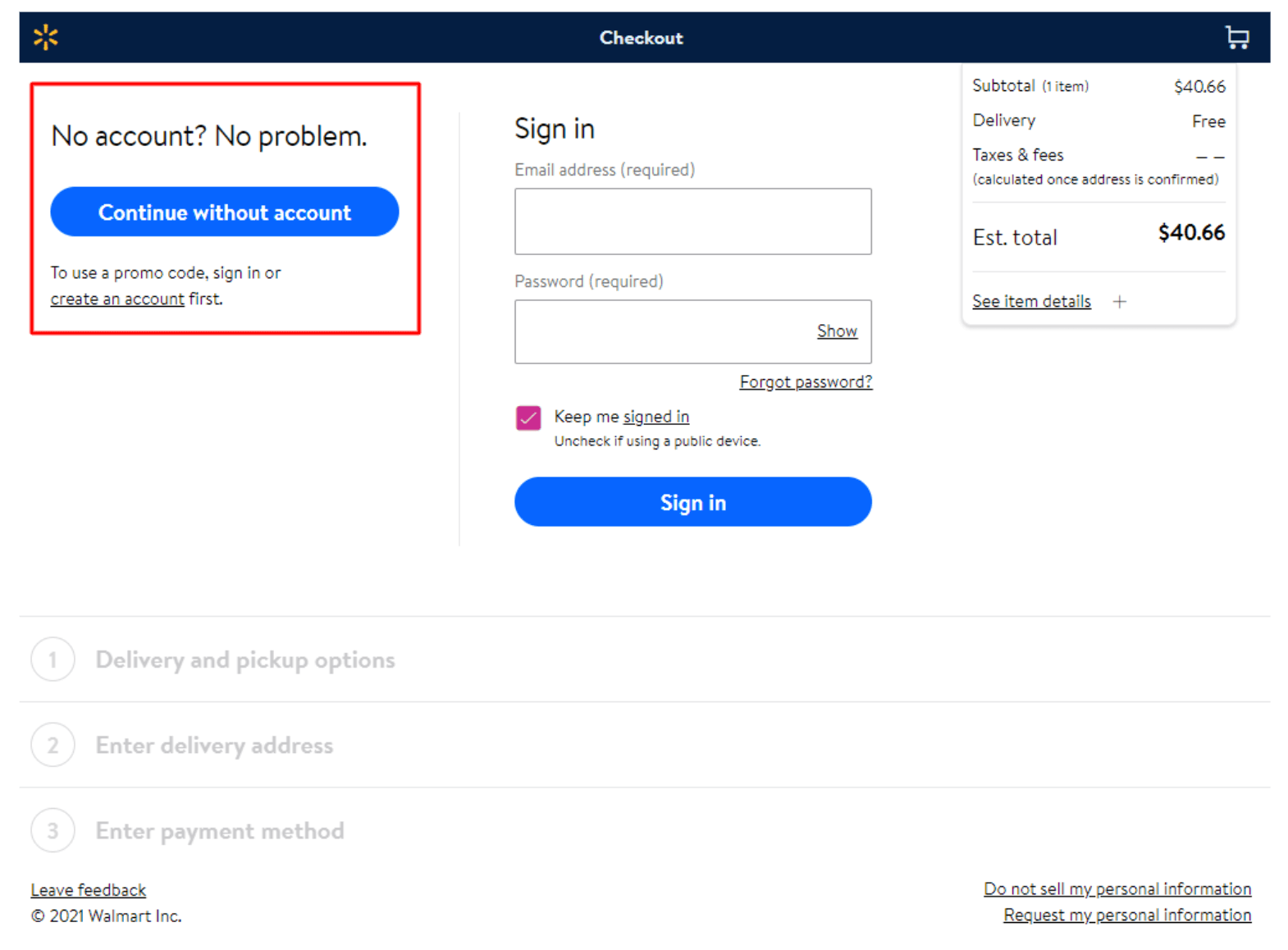
Walmart’s checkout page as seen by an unregistered user
Give Buttons a Voice
Use call-to-action buttons that let your users know exactly what they need to do. For instance, instead of “Next”, name a button “Go to payment”. As the user goes along, you can show them a progress bar to let them know how far they have gone and how little is left until the purchase.
Simplify Filling Forms
You can further make placing an order easier by automatically filling some of the required fields. For example, use location information to suggest a shipping address so that the customer doesn’t have to type in the zip code, country, street, etc.
If they still decide to enter information manually, provide automatic suggestions to avoid mistakes. For phone numbers, use masks. Masks show phone number examples in the format the user should type them in for the system to interpret them correctly.
Anticipate Road Bumps
And even if a customer has made it to the checkout, something might still go wrong. On the check-out page, provide a short FAQ section and the phone number customers can use to contact your call center.
The final touch at simplifying the process could be to integrate your store with Google Pay and Apple Pay. This will allow users to pay in a quick and habitual way.
Product Pages
Your customer will want to learn as much as possible about a product before they decide to give you their hard-earned money. Help them do so.
Present the Product in Detail
Include high-quality photographs, 360º images and videos showing an item from all angles on its product page. Describe the item’s specific features in detail. If your website is a marketplace, provide the seller’s information.
Use Social Proof
You can use social proof by adding a customer review section to your product pages and encouraging shoppers to leave feedback there.
Boost Usability for Emotional Shoppers
Not all customers will meticulously examine the product or leave it in the cart. Some will make emotional buying decisions. To capture that audience, provide the one-click purchase or “buy now” option, allowing people to skip the cart step.
Sell More
Finally, include a similar-products section. Show items that people often buy alongside the given product and similar items the user has previously viewed.
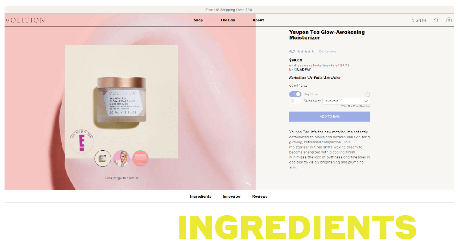
A product page on Volition, the online beauty store Rubyroid Labs took part in developing
Apply These eCommerce Usability Tips in Your UX/UI Design
As you might have noticed, our eCommerce usability tips boil down to the customer-centric approach.
That means you need to use empathy as you design UX/UI for your eCommerce platform. Put yourself in your customers’ shoes and try to look at each step of the user journey with their eyes. Ask yourself questions like ‘What would I as a customer expect to see on this or that page?’, ‘How would I browse the site?’, ‘What could put me off?’ and so on.
And if following this eCommerce website usability checklist feels out of your area of expertise, don’t hesitate: hit us up. A handpicked team of experts will start working on your project in one to two weeks.