Mention inclusivity in design, and many people immediately think about accessibility features for users with disabilities. Even though that is a crucial component, inclusion encompasses much more. It touches each of us, because limitations aren’t always permanent.
In the following sections, our Rubyroid Labs experts in UX/UI design services, unpack the foundations of inclusive design, its connection to accessibility, the business case for inclusivity, and concrete tips for creating digital interfaces that support all users.
Contents
- What Is Inclusive Design?
- Why to Invest in Inclusive Interfaces
- Rules that Help Designers Create for Everyone
- Practical Tips for Designing Inclusive Interfaces
- Conclusion
What Is Inclusive Design?
The objective of every caring designer is to satisfy the needs of the “typical” user, as well as to ensure that everyone, in any circumstance, can interact with the product in a comfortable manner.
And there are two similar terms to describe this approach: inclusive design and accessibility. They sound alike and overlap, but they focus on different aspects of the user experience.
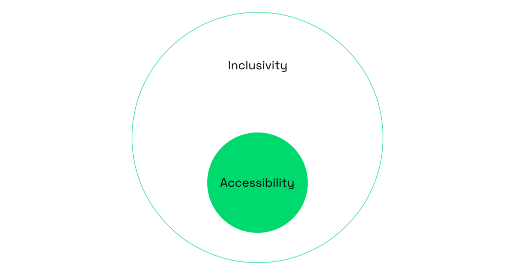
When a product is designed with accessibility in mind, it guarantees that individuals with disabilities may use it without any difficulties. Its objective is to remove obstacles for people with cognitive, motor, auditory, or visual impairments.
A screen reader that transforms text into speech allows people who are blind to navigate websites. Captions and transcripts make video content understandable for people who are deaf or hard of hearing. Voice commands help users with limited mobility operate apps hands-free. These are examples of essential features that guarantee equal access.
Inclusive design is broader. In addition to individuals with long-term disabilities, it also encompasses situational and temporary limitations and the broader range of human diversity. A person with low vision needs inclusive solutions, but so does a commuter trying to use their phone in glaring sunlight. Inclusive design considers culture, language, age, anatomy and identity. Its purpose is to provide multiple ways for people to engage, so no one feels left out.
Inclusivity Matters Beyond Disability
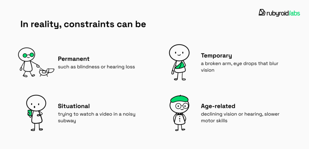
One of the most common misconceptions is that “limited ability” only refers to permanent disability. Inclusive design reminds us that ability is not a fixed state. In reality, constraints can be:
- Permanent (such as blindness or hearing loss);
- Temporary (a broken arm, eye drops that blur vision);
- Situational (trying to watch a video in a noisy subway);
- Age-related (declining vision or hearing, slower motor skills).
| Group | Why interfaces can be challenging | Example situation |
|---|---|---|
| People with disabilities (general) | May have sensory, cognitive, or motor limitations. | Someone with mobility impairment struggles with drag-and-drop actions. |
| Neurodiverse individuals | Can find dense layouts, flashing animations, or complex flows overwhelming. | A user with ADHD abandons checkout because of too many required steps. |
| Older adults (65+) | Age-related decline in vision, hearing, and motor skills. | A 70-year-old finds it hard to tap small touch targets. |
| Color vision deficiency (color blindness) | Cannot distinguish certain colors, which leads to misinterpreted UI signals. | A user can’t tell a red error message from a green success label. |
| Left-handed users | Interfaces often assume right-hand dominance (gestures, button placement). | Navigation drawer always opening on the right feels awkward. |
| Low literacy | Text-heavy UI is difficult without supporting visuals. | Struggles to set up a device due to text-only onboarding. |
| Non-native language users | Subtle terminology or idioms cause confusion. | Misunderstands “Apply” button as “Send request”. |
| People with dyslexia | Harder to scan dense text or distinguish letters. | Abandons a long-form because words blur together. |
| Hearing loss | Misses audio cues or video instructions without captions. | Cannot complete onboarding video without subtitles. |
| Temporary limitations | One-handed use, fatigue, and injury make interfaces harder. | A parent holding a baby can’t type a password easily. |
Try inputting a password while holding supermarket bags with both hands, listening to audio instructions in a packed train, or reading a screen in direct sunlight. Think about elderly people whose motor abilities and vision deteriorate over time, yet they need to press a small button to answer a call on their smartphones. In these situations, using an interface can suddenly become challenging or even impossible.

Design that is inclusive considers and avoids such kinds of issues. A good example is providing both audio and text instructions, so users can follow them whether they are in a noisy subway or in a quiet library where sound is not an option. Features like biometric login or tap-to-authenticate also reflect inclusive design principles, since they allow someone with limited dexterity (or simply full hands) to access their account without typing a password. And of course, inclusive interfaces often let users adjust button size and spacing.
In practice, inclusive design ensures that the same product supports a teenager multitasking on the go, a 35-year-old recovering from wrist surgery, and an 80-year-old learning to use online banking.
If you already have a product but want to reach a wider audience, our UI/UX design audit can help. After a comprehensive review of your interface, you’ll gain valuable insights from our designers on making it more inclusive and user-friendly.

Why to Invest in Inclusive Interfaces
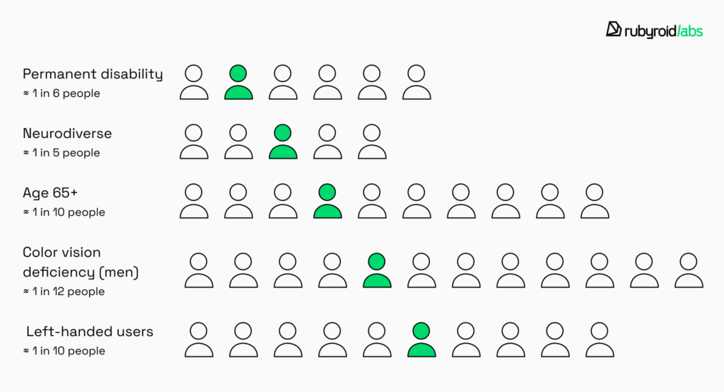
The human argument is simple: digital products should not exclude people. The business case, however, is just as compelling. According to the World Health Organization, almost 17% of the world’s population experience significant disability. That means at least one in six people you might reach with your product will have cognitive, sensory, or physical differences that affect how they interact with technology. In the U.S. alone, over 61 million adults live with a disability — nearly one in four Americans.
But the picture becomes even richer when we include other groups whose needs differ from the mainstream.
- Older adults (65+) currently make up about 9–10% of the global population (nearly 1 in 10 people) and are projected to grow to 16% by 2050. That’s about 1 in 6 users in the coming decades.
- Color-vision differences affect approximately 8% of men. Roughly one out of twelve men may struggle with color-dependent interfaces.
- Left-handed individuals make up around 10–11% of the population, so about 1 in 10 users may find right-oriented interface elements awkward.
- Neurodiverse users (people with autism, dyslexia, ADHD) account for roughly 15–20% of the population. About 1 in 5 people might benefit from interfaces that are clear, predictable, and forgiving.
Statistically, there is a high likelihood that your next customer, client, or employee will face some form of limitation, whether visible or invisible, temporary or lifelong. In addition to helping those people, inclusive design broadens your customer base.
But inclusivity is not only about expanding the potential user base. From a purely financial perspective, inclusive design pays off:
- Higher customer loyalty and retention. When users feel recognized and accommodated, they are more likely to return, complete transactions, and recommend your product.
- Reduced long-term development costs. Building accessibility into the product from the start avoids saves engineering hours, and accelerates feature releases.
- Fewer support requests. Clear navigation, readable text, and intuitive workflows reduce user errors and questions, decreasing customer support costs.
- Lower legal risk. Complying with accessibility standards prevents costly lawsuits and penalties.
- Better SEO performance. Search engines favor accessible websites with proper headings, alt text, and structured content, which improves discoverability and organic traffic.
- Operational efficiency. Simplified interfaces reduce confusion, help users complete tasks faster and lower churn or abandoned actions.
- Enhanced brand reputation. Companies known for inclusivity attract progressive investors, partners, and employees.
- Future-proofing your product. Inclusive interfaces adapt more easily to changing demographics and diverse markets.
Concrete examples from our experience at Rubyroid Labs illustrate these benefits:
- In one e-commerce project, we redesigned the entire marketplace to make it fully accessible. Users could adjust contrast and text size, switch between dark and light modes, and navigate the entire interface using only the keyboard. We also considered racial and cultural diversity by providing flexible input fields for personal information during registration and creating versions in Arabic and Hebrew, with interface elements aligned to the right edge for better readability. These changes improved conversion rates by 39% in the first six months.
- For a banking application, we implemented a voice assistant for users with reduced vision and designed the interface with large, well-spaced buttons. All elements were positioned with sufficient spacing to prevent misclicks, and we introduced a step-by-step, user-friendly workflow with clear textual instructions. The goal was to create an accessible payment app for older adults, and these enhancements reduced customer support inquiries from senior users by 41%.
Jakob Nielsen, one of the most influential voices in usability, describes inclusivity as a natural extension of UX design rather than a separate initiative. He often explains this through the idea of “modalities”.
Thus, a person browsing a website on a large desktop monitor has different needs in comparison with someone browsing on a smartphone. In the same way, we should consider that a blind user listening to content through a screen reader experiences a completely different modality than a sighted user scanning the same page visually. Ideally, each modality would have its own interface tailored to how people process information in that context.
Nielsen’s recommendation — treat accessibility like any other usability problem. That means conducting user testing with people who rely on different modalities, watching where they struggle, and iterating until the design works.
The same principle drives the shift toward hyper-personalization in digital products. If inclusive design ensures that no one is excluded, hyper-personalization aims to give each user an experience that feels uniquely theirs. In our article Why B2B Interfaces Will Go Hyper-Personal by 2027, we take a closer look at why it’s becoming a priority for forward-thinking businesses.
Rules that Help Designers Create for Everyone
Inclusive design is framed by international organizations, laws, and shared standards. A common reference point for the U.S. and Europe is the Web Content Accessibility Guidelines. These guidelines serve as the global benchmark.
Levels of Compliance
- A removes the most fundamental barriers. For example, all non-text content (like images) must have text alternatives so screen readers can describe them. Anchor link text must be clear so that users understand what the linked page is about. A webpage shouldn’t include any content that flashes more than three times per second.
- AA addresses the most common and impactful issues. The majority of disabled users can properly explore and interact with the product if it satisfies AA. Maintaining an adequate contrast between the text and background is one of the requirements. Within a website, a web page must be accessible in multiple ways. All of the text on a website should be resizable by up to 200% without compromising the content or operation of the site.
- AAA represents the highest standard. Giving all taped videos sign language interpretation is one example. The focus indicator’s color must, for instance, have a contrast ratio of at least 3:1 with the colors adjacent to it. The size ought to match the targeted element’s edge in size. For example, if the button’s perimeter is 120 pixels, the focus indicator needs to span an area that is at least as large as this.
Few organizations commit to full AAA because it demands significant resources, but it represents the gold standard of inclusivity. Most legal frameworks require compliance at level AA.
The Principles of WCAG
To reach any of these levels, designers and developers must follow four foundational principles:
- Users must be able to perceive information in a way that works for them. That means text alternatives for non-text content, captions for videos, and interfaces that don’t rely solely on color to convey meaning. If a form field is so faint that low-vision users can’t read it, the principle is broken.
- Users should be able to interact with content using the input method available to them, whether it’s a keyboard, mouse, screen reader, or voice command. A carousel that spins too quickly without pause controls, or buttons that are unreachable without a mouse, makes the site inoperable.
- Content and navigation must be clear, consistent, and predictable. That includes writing instructions in plain language, ensuring that form error messages explain what went wrong, and avoiding designs where a color choice alone signals meaning.
- Content should remain accessible across technologies, browsers, and devices — now and in the future. A design that works only in one browser or fails after a product update undermines this principle.
These rules and guidelines work together to provide a common ground that helps designers construct confidently and avoid supposition. Their primary objective is to guarantee accessibility. However, as we’ve already seen, accessibility is one of the aspects of inclusivity.

Practical Tips for Designing Inclusive Interfaces
Based on our team’s expertise in conducting UI/UX design audits, we have put together useful advice for designing inclusive user interfaces. We’ll look at particular kinds of user needs and provide design techniques to make sure your product is usable by everyone.
Making Interfaces Work for Visual Needs
Vision is central to how most people interact with technology, but it is also the sense most vulnerable to variation. Visual differences can be lifelong or age-related, temporary or situational. It’s important to recognize the many ways in which people see (and sometimes don’t see) the interfaces we create.
Color Vision Differences
It is common to misunderstand color blindness. Most people have trouble distinguishing some colors, and very few see the world in black and white. For instance, red-green color blindness makes it difficult to distinguish between various traffic-light colors or interface states that are solely indicated by red and green. Other types impair color vision entirely or cause problems with blue-yellow perception.
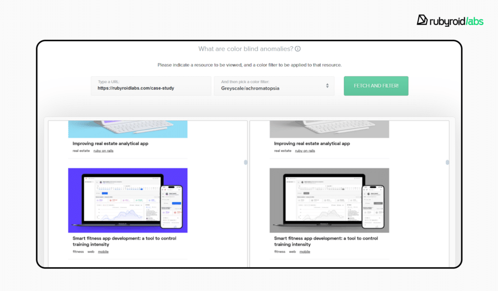
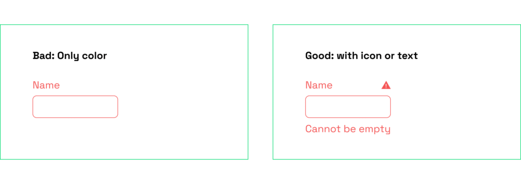
When interfaces rely solely on color to communicate meaning, they can exclude users with these differences. A form that uses only red to highlight an error leaves a color-blind user guessing what went wrong. Better design pairs color with another signal: a symbol, a label, or a change in line style. Tools such as Colorblind Web Page Filter help teams preview how their designs appear to people with various kinds of color blindness.
Central and Peripheral Vision
Central vision is what lets us focus on detail — reading text, recognizing icons, identifying a face in a profile photo. Peripheral vision helps us process the broader scene and notice motion. Both play roles on a screen, especially large ones.
The challenge is that peripheral vision is highly sensitive to movement. A flashing banner on the edge of a page will pull the user’s attention away from central tasks such as reading. Designers can reduce frustration by avoiding unnecessary animation or placing emotionally charged visuals in peripheral zones only when they truly support the experience.
Low Vision and Blindness
For people with low vision, small details can create barriers. Thin typefaces, low-contrast text, or dense layouts increase cognitive load. Providing the ability to adjust font size, line spacing, or color scheme can make content much easier to read. Older users, in particular, often mention that “the internet is unfriendly to people with bad eyesight” — a reminder that scalable, legible typography benefits everyone.
Blind users typically rely on screen readers, which transform on-screen elements into speech or braille. Unlike sighted users, they cannot scan a page at a glance; they must move through content sequentially. A carousel that rotates automatically or a navigation menu without clear headings forces them into a tedious experience.
For some users with severe vision impairments, even the most carefully optimized visual interface may still feel limiting. Voice and gesture-based interfaces offer new ways to navigate digital products without relying on sight. In our article How Voice and Gesture-Based Interfaces Are Reshaping UI/UX, we explore how these technologies work and what designers should keep in mind when making mockups of such interfaces.
Environmental Conditions
Visual challenges are not limited to medical conditions. Bright sunlight can wash out low-contrast designs, while dark rooms can make bright screens harsh. Offering light and dark modes helps users adapt to their environment. Yet dark mode must be designed with care: light text on a black background may blur for people with astigmatism. Using softer dark grays and ensuring sufficient contrast can make both modes more comfortable.

Design Tips for Visual Accessibility
- Ensure color is not the only signal. Pair colors with labels, icons, or patterns.
- Use accessible palettes. Favor combinations distinguishable by most users and avoid common problem mixes like red–green. Check your design with the Colorblind Web Page Filter to see how people with different forms of color blindness perceive your website.
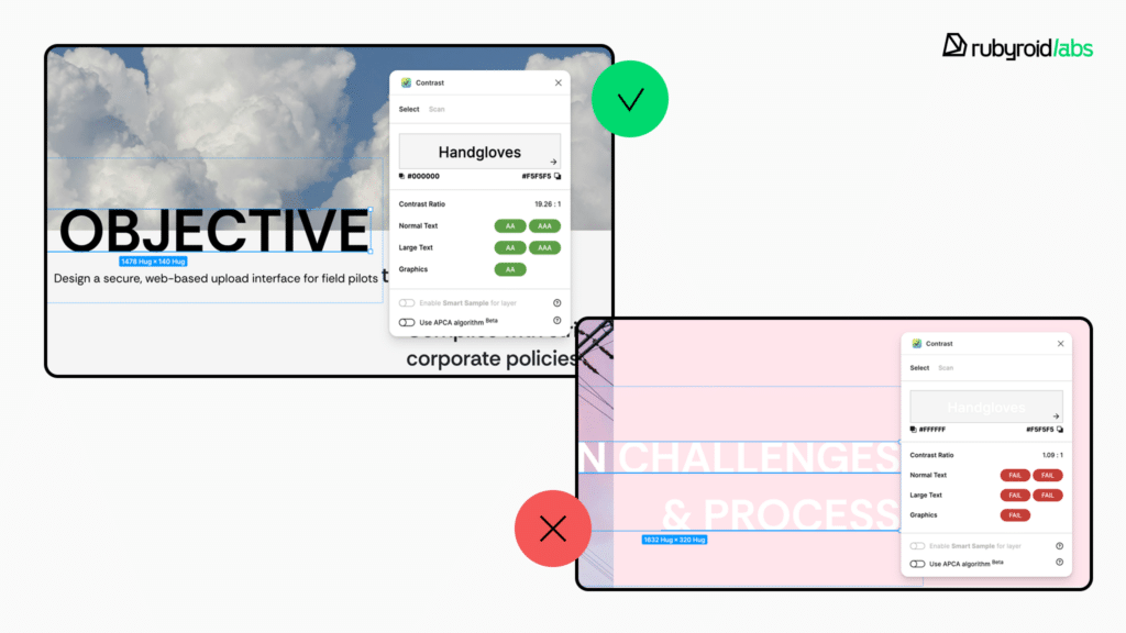
- Maintain strong text contrast. Use the “contrast” feature in Figma or external plugins to check the contrast ratio.
- Support text customization. Allow users to adjust size, spacing, and typeface.
- Provide alt text for meaningful images, structure content with clear headings, and ensure sequential navigation makes sense.
- Avoid distracting motion in peripheral zones. Reduce flickering, auto-rotating carousels, or flashing banners.
- Offer flexible themes. Provide both light and dark modes with thoughtful contrast for different environments and sensitivities. Use shades of dark gray instead of black.
- The CAPTCHA should be presented in multiple forms. It often becomes the end of any scenario for people with visual impairments.
Supporting Users With Hearing Differences
Hearing differences range from complete deafness to partial hearing loss, sensitivity to certain frequencies, or age-related decline. They can also be situational: a noisy subway ride or a crowded café makes it just as difficult to follow audio as a permanent impairment would. For designers, this means that audio should never be the only channel for critical information. Interfaces that rely solely on sound exclude a wide variety of users.
People with limited hearing engage with interfaces in ways that emphasize visual and text-based alternatives. Someone who is deaf from birth may expect captions, transcripts, or sign language, an older user with mild hearing loss may simply need volume controls and clearer audio. Inaccurate captions, low-quality recordings, or alerts delivered only as sound create barriers that frustrate users and make services less trustworthy.
Design Tips for Hearing Accessibility
- Provide visual and tactile alternatives to sound. Pair every audio notification with vibration or a flashing light. Avoid sound-only signals such as beeps to confirm an action.
- Make media accessible with accurate captions and transcripts. Always add closed captions to video content and provide transcripts for audio clips and podcasts. Ensure subtitles are written in plain, simple language.
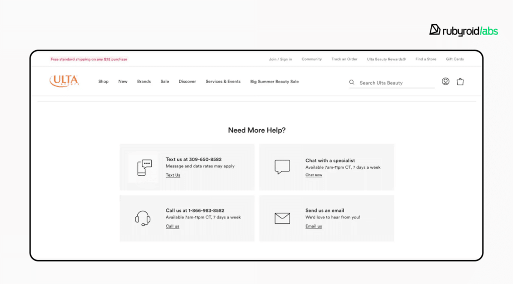
- Offer flexible communication methods. Do not force users to call a phone number. Many people with hearing loss prefer live chat, email, or text messaging systems.
Reducing Cognitive Load
There is a wide range of cognitive differences. They include situational states like stress, exhaustion, or information overload, as well as diagnosed problems like ADHD, autism, dyslexia, or anxiety disorders. Although accessibility rules tend to focus more on physical impairments, cognitive problems should also be taken into account. They have an impact on how people read, concentrate, recall information, and make choices.
For example, users with ADHD may find it difficult to concentrate on cluttered layouts or interfaces that demand constant switching between tasks. Someone on the autism spectrum may struggle with ambiguous wording or unexpected changes in design patterns. People with dyslexia may find long pages of dense text discouraging.
Even users without diagnosed conditions experience similar friction in stressful situations. For example, anxiety can make it hard to process information, causing them to reread text repeatedly, skip important details, or misclick during critical actions like making a payment. These challenges point to a shared principle: reducing cognitive load makes products more inclusive.
Design actions to support users with cognitive differences
- Simplify navigation and orientation. Provide sitemaps or breadcrumb trails so users can see where they are and what steps lie ahead. Avoid hidden or unpredictable menus that require memorization.

- Make content scannable and easy to read. Use short paragraphs, clear headings, and bulleted lists. Choose high-information words for links instead of vague phrases like “click here”.

- Keep interfaces stable and predictable. Don’t move or redesign buttons without strong reason. Preserve familiar color schemes and layouts.

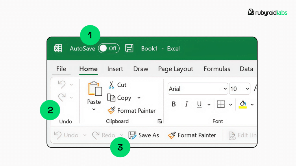
A grayed out button is a familiar design convention, signifying an unavailable action.
- Create a sense of safety and control. Allow users to edit before final submission, undo actions, or go back a step. Use a neutral, non-dramatic tone in instructions.
- Reduce sensory and emotional overload. Limit distracting animations or pushy emotional copy. Provide calm visual design and avoid overloading with pop-ups or urgent alerts.
Designing for Diverse Needs and Contexts
Inclusive design means acknowledging the wide variety of human diversity: physical, cultural, and linguistic. If a button is pleasant for a right-handed user, it should be similarly comfortable for a left-handed user. When a form requests a patronymic or middle name, it shouldn’t presume that every culture uses one. It should be easy for a layout created for English to adapt to languages that are read from right to left.
When we design with this range of differences in mind, we avoid creating small but meaningful barriers that can make people feel excluded or unwelcome.
Motor and Mobility Differences
Some users live with reduced dexterity or strength, others face temporary or situational challenges (typing on a crowded train with one hand). Interfaces that require fine motor skills, multi-key shortcuts, or drag-and-drop-only actions can become obstacles. Accessible designs offer alternatives: large and well-spaced buttons, full keyboard navigation, and the ability to trigger all actions without relying on complex gestures.
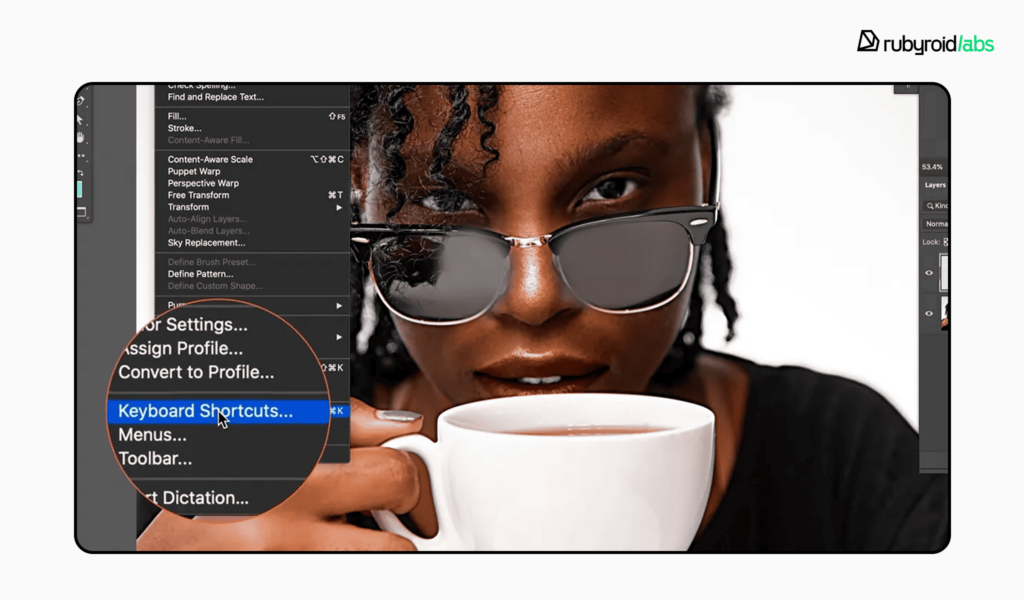
In Photoshop, for example, users can customize keyboard shortcuts to suit their comfort. This flexibility is important because default combinations may be physically uncomfortable or difficult for some. The ability to remap controls is a step toward more inclusive interfaces.
- Provide clearly labeled, large buttons that are easy to tap or click.
- Ensure all interactive elements are reachable via keyboard or alternative input devices.
- Offer the ability to customize keyboard shortcuts and remap controls.
- Avoid relying solely on drag-and-drop interactions for critical functionality.
Left-Handed Users
Most interfaces don’t explicitly consider handedness, yet placement of key controls often favors right-handed interaction. Left-handed people may find it less natural to reach primary actions if they’re locked to the right side of the screen. Adaptive layouts and customizable toolbars help ensure comfort for both groups.
- Allow customization of toolbars and control placement.
- Keep essential actions centrally located or provide mirrored layout options.
Language and Writing Systems
Interfaces built for left-to-right languages must also accommodate right-to-left languages such as Arabic or Hebrew. Navigation menus, progress indicators, and alignment of text should flip accordingly without breaking the design.
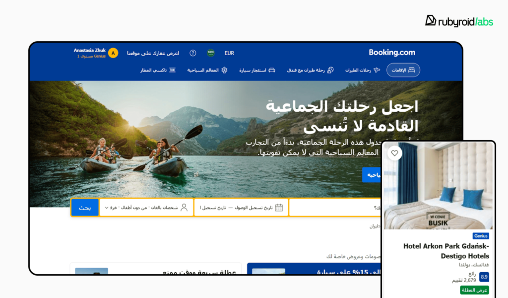
- Ensure text alignment, flow, and interface elements adapt dynamically to the language direction.
- Test layouts with multiple languages.
- Support proper character encoding (Unicode/UTF-8) to display all characters correctly.
Cultural Norms
Global audiences bring varied naming conventions. Some cultures use two surnames, others none. Patronymics exist in some countries but are unknown in others. Asking for nationality or ethnicity should account for multiple identities or provide an option to skip. When these nuances are ignored, forms can alienate users or force them to enter inaccurate information.
- Provide flexible fields for full names and allow users to enter names in the format they prefer.
- Use dropdowns or multi-select options for nationality or ethnicity, but allow skipping if not relevant.
- Ensure forms do not impose restrictions on special characters, accents, or multiple-word names.
Representation and Inclusivity in Visuals
Illustrations and imagery that present only one skin tone, body type, or hairstyle can feel exclusionary even if unintentionally. Modern brands increasingly diversify their imagery to reflect real audiences.
- Use a variety of skin tones, body types, ages, and cultural markers in illustrations and photos.

Conclusion
As we’ve seen, inclusive design is a broader, more empathetic approach that encompasses accessibility. It acknowledges the vast spectrum of human diversity, from ability and age to culture and context.
It opens your product to a massive, often overlooked audience — over 1.3 billion people globally with disabilities, plus even more with temporary or situational constraints. Investing in inclusivity is a direct investment in market growth, customer loyalty, operational efficiency, and brand integrity. It future-proofs your product against an aging global population.
This mission, however, requires expertise and commitment. Rubyroid Labs stands out as a premier partner for this important work. Our team can start the design audit of your product upon request.
