If your e-commerce store looks good but isn’t profitable, you might as well not have one. You’re wasting time and money. To find the exact “breaking point” that’s killing your conversions, you need a data-driven UI/UX audit.
Rubyroid Labs, experts in UI/UX audit services, explores how user experience drives conversions, how to prepare for a UX/UI review, what to check on each key page of your site, and how to summarize findings.
Contents
- Why the quality of user experience is crucial in e-commerce
- Signs of a well-designed UX in e-commerce
- How good UX impacts conversions
- When your online store needs a UX/UI audit
- How to prepare for a UI/UX audit of your e-commerce website
- What to check on each page of your e-commerce website
- How to summarize and act on your audit findings
- Conclusion
Why the quality of user experience is crucial in e-commerce
E-commerce user experience (UX) is the holistic perception and emotional response a user has while interacting with an online store. From the instant a user lands on a site, they begin to form an impression of how easy, useful, and efficient the shopping journey will be. Every micro-interaction contributes to this overall perception.
This understanding reveals a profound connection between user experience and brand equity. A brand is ultimately the sum of all perceptions and feelings a customer holds about a company. Since every UX interaction directly shapes these perceptions, the quality of the user experience becomes a primary vehicle for brand building.
A common and costly error in e-commerce is to invest heavily in a visual redesign (UI) without first addressing fundamental problems in the user journey (UX). UX strategy must precede and inform UI design. If the site’s navigation is confusing and search function is ineffective, making the buttons look more appealing will not solve the root cause of user frustration or poor conversion rates.

Signs of a well-designed UX in e-commerce
Effective e-commerce user experience is built upon a foundation of core principles that prioritize the user’s needs, expectations, and psychological state at every stage of their journey. We organize these principles into a strategic framework, an E-commerce UX Hierarchy of Needs.
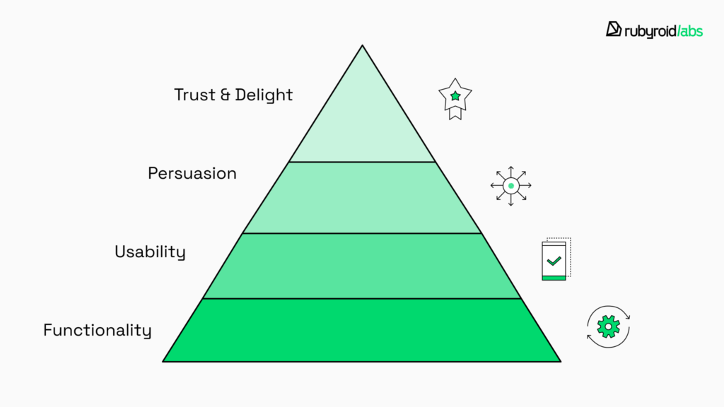
Level 1. At the most basic level, the website must be functional. It needs to work correctly and reliably across different devices and browsers. Furthermore, it must possess utility, meaning it offers products or services that genuinely meet the needs of its target audience.
Level 2. The site must be usable. The experience must be intuitive and accessible to the widest possible audience. Achieve this by removing unnecessary complexity, using clear language, designing a frictionless path to purchase, and implementing an effective on-site search.
Failure at this level manifests as high bounce rates and low user engagement, as users cannot locate the products they wish to purchase.
Level 3. At this level, the experience must effectively convince the user to make a purchase. Key elements include compelling visual merchandising (high-quality product images and videos), persuasive and benefit-oriented product descriptions, and powerful social proof (customer reviews and ratings).
Low add-to-cart rates, which occur when users find products but lack the motivation to purchase them, are the outcome of a breakdown at this level.
Level 4. At the pinnacle of the hierarchy is the creation of a secure and delightful process. This is achieved through transparent communication regarding all costs, clear and accessible policies for shipping and returns, and the prominent display of trust signals like security seals and reliable payment provider logos.
The main reason for high cart abandonment rates is failure at this stage. Motivated customers abandon the transaction because they don’t trust the seller.
A truly well-designed e-commerce UX meets all four levels of this hierarchy.
How good UX impacts conversions
User experience quality directly dictates commercial success. The most powerful case for investing in UX is its exceptional return on investment (ROI). According to a well-established finding from Forrester Research, every dollar invested in UX yields an average return of $100.
This return is realized through a combination of factors:
- more intuitive interface → reduced burden on customer support channels → lower operational costs;
- improved user satisfaction and loyalty → increased customer lifetime value and reduced churn;
- increased conversion rates → higher top-line revenue.
To learn more about this topic, we explored the impact of UX on business metrics in our article The Importance of User Experience (UX) in Web Development.
A well-structured experience removes friction from the buying journey and keeps users engaged from start to finish. When websites are intuitive, fast, and trustworthy, customers buy more often and spend more per visit.
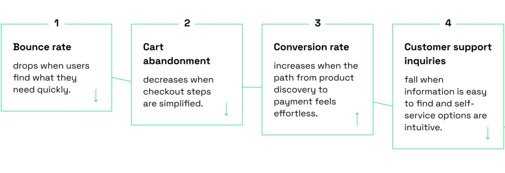
UX directly affects key performance metrics:
When your online store needs a UX/UI audit
Some warning signs are easy to spot. Our Head of Software Design, Hanna Maroz, has outlined the most common ones observed across e-commerce projects.
- You’ve never conducted an audit before. Just like inventory checks, UX audits should be a regular part of store maintenance. If you’ve never done one, now is the time to start.
- You’re seeing stagnant user engagement. Short average time on site or a low number of pages viewed per session suggest that the experience is not compelling enough to hold the user’s interest or encourage exploration.
- You’re getting negative feedback or recurring support requests. Questions like “How do I track my order?” or “Where can I find product details?” indicate usability issues that need attention. It’s a sign that your design isn’t intuitive enough for users to navigate on their own.
- Your internal teams spend too much time explaining how the system works. If staff or support agents regularly guide others through the platform, it’s a sign that your design isn’t intuitive enough for users to navigate on their own.
- Your store has expanded quickly. When new categories, filters, or checkout features are added on the fly by developers, the user flow often becomes inconsistent. A UI/UX audit ensures that rapid growth doesn’t come at the cost of usability.
- Different designers or teams have contributed to the site over time. If visual styles or interactions feel inconsistent across pages, an audit helps realign everything under a cohesive design system.
- Your design is more than three years old. Design trends, devices, and user expectations evolve. A layout that once looked modern might now feel outdated or poorly optimized for mobile, where most e-commerce traffic happens today.
- You’re unsure whether your store is equally user-friendly on all devices. Many legacy designs were created with desktop in mind. A UI/UX audit can reveal where the mobile or tablet experience falls short and how to fix it.
How to prepare for a UI/UX audit of your e-commerce website
In our previous article, we explored a UI/UX audit process step by step and noted that designers at Rubyroid Labs follow four stages: preparation, UX analysis, UI analysis, and providing recommendations. In this chapter, we’ll take a closer look at the first stage, preparation, through the lens of e-commerce.
As we wrote in our Step-by-step guide on how to conduct a UI/UX audit, everything starts with understanding your motivation. Do you want to:
- Increase the number of completed purchases?
- Reduce cart abandonment?
- Improve engagement with product pages?
- Optimize performance on mobile devices?
Write down what success looks like: “Reduce checkout abandonment by 15%”, “Boost the number of completed wishlists”, or “Increase newsletter sign-ups”.
Once you’ve defined the goal, start gathering data that gives context to user behavior. This includes:
- analytics (shopping habits, device preferences, purchase frequency, seasonal trends);
- demographic insights;
- sales reports;
- customer feedback your support team receives.
Numbers will show where users drop off, real feedback will explain why. Tools like Hotjar AI or Microsoft Clarity Copilot can surface patterns like repeated rage clicks on a product filter or hesitation before completing a payment.
Consider how many user roles interact with your store (buyers, guest visitors, returning customers, B2B clients) and how their experiences differ. Mapping out user journeys for each group helps pinpoint where friction occurs.
If you use session recording platforms, AI-powered summarization features can save hours of manual review. You can rely on automatic summaries that highlight the most common friction points. At Rubyroid Labs, we often use FullStory AI Alerts to detect anomalies in user journeys or LogRocket’s Galileo AI to categorize errors and prioritize what needs immediate attention.
Sometimes the issues lie in specific areas. If your time or budget is limited, prioritize high-impact paths first.
If you’ve already developed user personas, revisit them. Their needs might have shifted since your last design update. If not, AI-driven research tools such as Dovetail or UserBit can help you build personas from customer reviews, surveys, and support tickets.
Benchmark your store against direct and indirect competitors in order to identify best practices worth adapting. Tools like UXtweak or Pixelay allow you to visually compare interfaces, analyze flows, and identify design patterns that perform well in your category.
If you work with an external partner, share your goals, analytics access, and target audience details. The clearer your inputs, the more precise and relevant the audit findings will be. Having conducted UX/UI audits for more than 12 years, our team has witnessed how early client-design team alignment may reduce audit time by half.
That said, you don’t have to prepare everything alone. Many e-commerce companies request a UI/UX audit from Rubyroid Labs to get an unbiased, structured review of their digital store. The resulting report includes clear, prioritized recommendations that can be implemented either internally or with external support.

What to check on each page of your e-commerce website
Every e-commerce project is built on a common set of pages:
- Homepage;
- Category & product listing pages;
- Product detail page;
- Shopping cart;
- Checkout;
- Thank you page;
- Customer account portal.
Hanna, our Head of Software Design, will present each of these core pages using examples from our e-commerce case Binto, explain what to look for during a UX/UI audit, and show examples from our own projects. Use this overview as a practical starting point to evaluate your store’s design.
Site-wide elements
Before analyzing pages, start with the site-wide elements: the header, footer, and pop-ups. During a UX/UI audit, these components deserve special attention since they directly influence navigation, conversion, and overall shopping experience.
Header & navigation
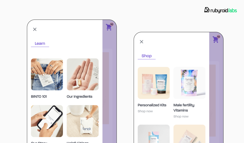
The site header is the user’s primary navigational tool, which provides constant, predictable access to the platform’s most critical functions: brand identity (logo), product discovery (navigation and search), and purchase progression (cart and account).

Best practices and pitfalls
- The company logo must always function as a link back to the homepage, being a reliable escape hatch for users who feel lost in the site’s hierarchy.
- The main navigation menu should be uncluttered. Aim to limit the number of top-level menu items to the “magical number” of seven, plus or minus two. Overcategorization can obscure product discovery.
- The search field should be made immediately obvious through prominent placement and high-contrast design. A central location in the header is optimal. Search functions must also support auto-suggestions and filtering capabilities. They shouldn’t return “no results” for a common synonym or a product that is actually in stock.
- The shopping cart icon must be located in the top-right corner of the header, and display the number of items currently in the cart. This confirms that the item was added successfully.
Footer
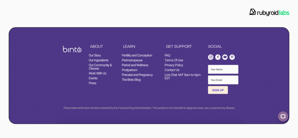
Footer is a crucial trust-building resource. When users are actively looking for important, decision-influencing information (shipping details, return policies, customer service contacts) they instinctively scroll to the bottom of the page.
Best practices and pitfalls
- Group all footer links into semantically logical sections with clear headings. Common variants include “Shop”, “Customer Service”, “Our Company”, and “Policies”. Thus, users can quickly identify the relevant section.
- Footer is the standard place for essential legal links like the privacy policy and terms of service, as well as the copyright notice. It also effectively houses secondary elements like a newsletter signup, partner logos, security badges, and social media links.
Pop-ups
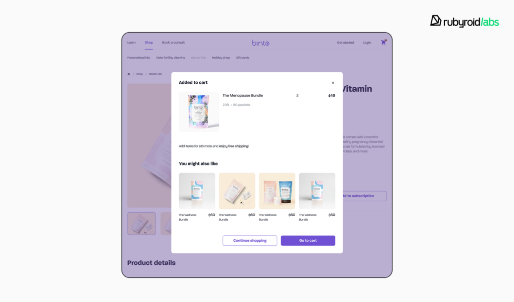
Pop-ups are a high-risk tool. Poor execution is a direct cause of site abandonment. They are interruptive by nature, and their design must be approached with extreme caution and a user-centric mindset.
Best practices and pitfalls
- Avoid intrusiveness and respect user intent. Pop-ups that appear immediately upon page load, before the user has had any chance to engage with the content, are universally despised.
- Trigger based on behavior. Exit-intent detects when a user’s cursor moves towards the top of the window to close the tab. Triggering a pop-up at this moment provides a final opportunity to present an offer to prevent site or cart abandonment. The time on page trigger displays a pop-up when a user has spent a significant amount of time on a page or has scrolled to a certain percentage of it.
- The design should feature a prominent close button.
- Respect the user’s time and privacy by asking for the minimum amount of information necessary. For a newsletter signup, an email address field is sufficient.
Homepage
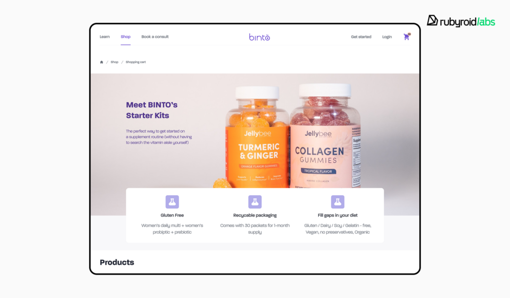
The homepage must immediately answer three questions for a new visitor: “Who are you?”, “What do you sell?”, and “Why should I care?”. Its primary purpose is to establish the brand’s value proposition, effectively communicate the breadth of its product catalog, and provide intuitive pathways for product-finding journeys.
Best practices and pitfalls
- Represent at least 40% of your top-level product categories on the homepage. When a site that sells a wide variety of goods only displays a narrow selection on its homepage, users misinterpret the site’s offerings and assume it has a limited catalog.
- The primary value proposition should be clearly stated “above the fold” (the portion of the page visible without scrolling). The main call-to-action, such as “Shop New Arrivals”, should be the most visually prominent element in this area, using a combination of size, color contrast, and surrounding white space to command attention.
- Use static content sections that users can explore at their own pace by scrolling. Flashy advertisements and auto-rotating carousels frustrate users when a slide changes just as they are about to click it, sending them to the wrong page.
- The homepage must serve as a clear launchpad for the three primary methods of product discovery: browsing via category navigation, direct searching, and exploring curated pathways like “Best Sellers”, “New Arrivals”, or seasonal gift guides.
Product category & listing pages
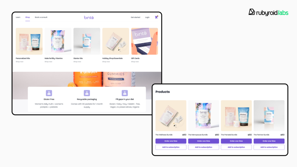
Category and product listing pages enable users to browse a large catalog and to narrow down thousands of potential products into a manageable selection of relevant items using filtering tools. When a user applies a filter and receives irrelevant results, they are forced to undo their action and try again. Each failed attempt increases their frustration.
Best practices and pitfalls
- Provide filters that are specific to the product category.
- For desktop, filters perform best when placed in a persistent left-hand sidebar. On mobile, they should be easily accessible via a prominent button at the top of the product list.
- Users must be able to sort the results by a standard set of criteria: Price (low to high / high to low), User Rating, and Newest.
- Provide users with the choice to switch between a grid or list view. A grid view is optimal for visually-driven products. A list view is better for technical or spec-driven products, as it provides more space for descriptive text and comparative details.
- Each product card must display the essential information needed for a user to make an initial assessment without clicking through to the Product Detail Page. This includes a clear, high-quality thumbnail image, the full product name, the price, and the average user rating along with the number of reviews.
Product information page
The fundamental purpose of this page is to provide a user with all the information they need to click “Add to Cart”. Every element on this page must work in concert to answer questions and build desire.
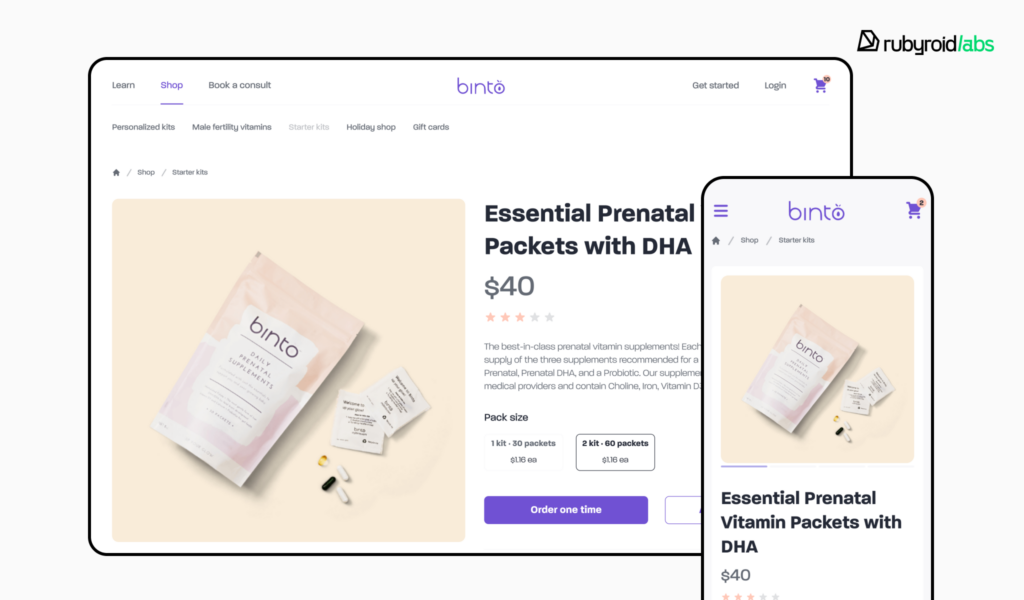
Best practices and pitfalls
- Use a minimum 5-8 high-quality images and a short video or interactive 360° views. They must show the product from multiple angles and demonstrate scale. The image gallery should feature a robust zoom function.
- The product description should be benefit-oriented. Structure the content for easy scanning by using bullet points. It’s recommended to provide each feature with its own small image or icon and a short paragraph of text.
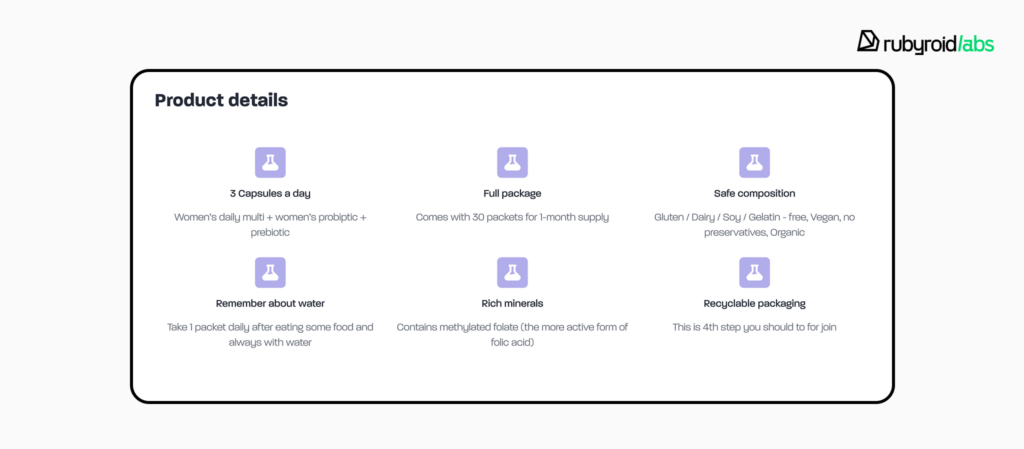
- The “Add to Cart” button must be visually dominant, placed high on the page, and use a unique, high-contrast color that is not used for any other secondary buttons on the page.
- Button selection is better than dropdown menus for products with size or color options since it reduces the number of clicks and displays all possibilities at once.

- Display the average star rating and the total number of reviews directly below the product title. Customers largely rely on social evidence from customer reviews, particularly those that contain user-generated images and videos.
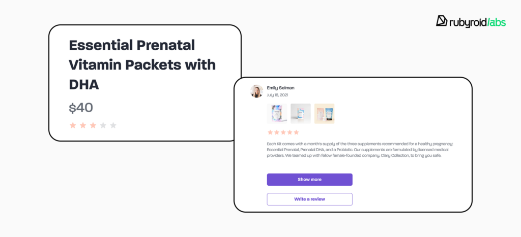
- Display concise information about shipping and return policies. Giving a consumer an estimated shipping cost or delivery date before they add an item to their cart has a significant impact because unexpected shipping prices are a major cause of cart abandonment.
Shopping Cart
The shopping cart page allows users to review their selections and make final adjustments. The user must feel in complete control of their order at this stage. A poorly designed cart can introduce doubt and lead to abandonment.
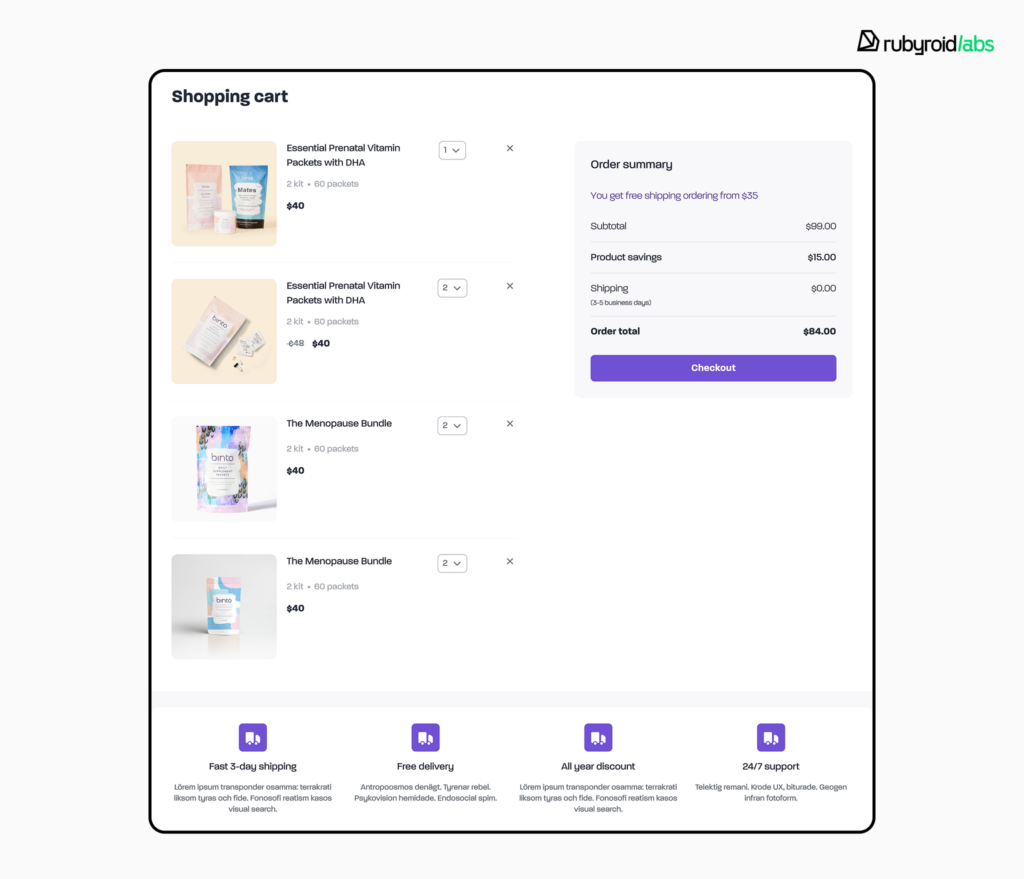
Best practices and pitfalls
- The cart must provide a product thumbnail image, the full product name, any selected variants (like size and color), the unit price, and the quantity.

- It must be effortless for users to modify their order. Provide intuitive quantity controls, such as + and – stepper buttons.
- The cart page must display a full, transparent cost summary that includes the item subtotal, all applied discounts, estimated shipping costs and taxes. The “Total Price” must be displayed as the final and most prominent figure.
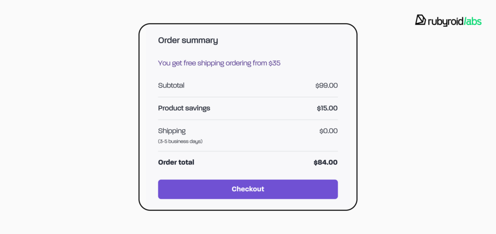
- The visual hierarchy of the page must guide the user toward proceeding to checkout. The CTA button must be the most visually dominant element on the page.
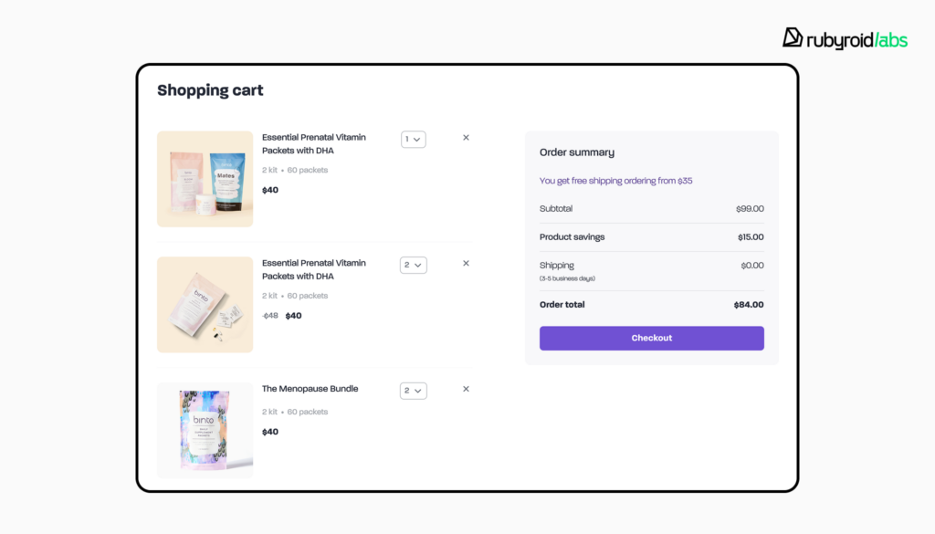
- Secondary actions, such as “Continue Shopping” or “Save for Later”, should be available but visually subordinate. Present them as simple text links to not distract from the primary conversion path.
- Show trust signals and logos of accepted payment methods (e.g., Visa, PayPal, Apple Pay).
- This is also an appropriate place to suggest relevant complementary products, but these recommendations should be subtle and not visually overpower the main order summary.
Checkout
The checkout process is the final and most sensitive part of the customer journey. The sole purpose of the checkout design is to collect the necessary shipping and payment information as quickly, easily, and securely as possible.
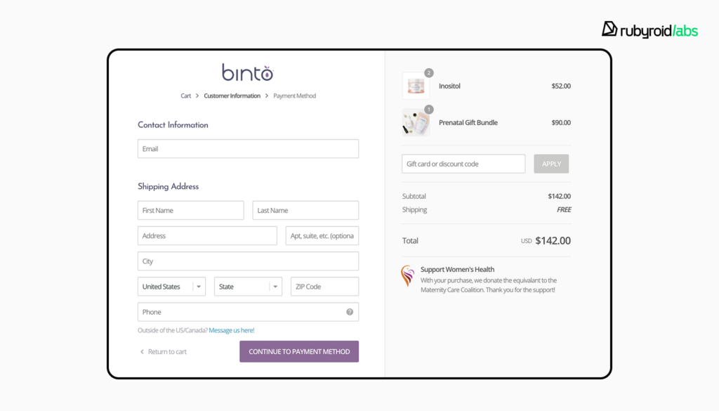
Best practices and pitfalls
- The “Guest Checkout” option should always be presented as the easiest path forward. The best practice is to delay the option to create an account until after the purchase is complete, on the “Thank You” page, and then offer to save their just-entered information by simply adding a password.
- Eliminate every single form field that is not absolutely essential for processing the order. A too long checkout process is responsible for 18% of abandoned carts.
- Use a single-column layout, as it is easier for users to scan than a multi-column one.
- Enable browser autofill for addresses and payment information. Implement an address lookup API (e.g., Google Maps) to reduce typing and errors. Use real-time inline validation to provide immediate feedback if a user enters information incorrectly.
- Use a progress bar at the top of the page to show users exactly where they are in the process and what is coming next. A user should never be sent backward in the flow.

Thank You Page
The thank you page, or order confirmation, marks the successful completion of a transaction. Its primary purpose is to provide reassurance that the order was processed correctly and to leverage the moment of highest customer satisfaction.
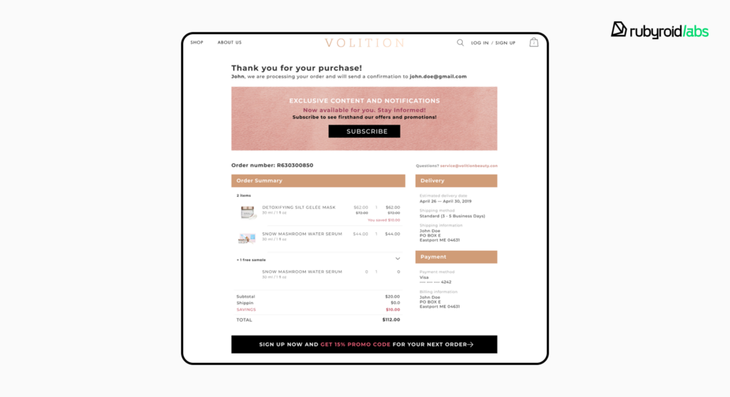
Best practices and pitfalls
- The page must confirm the success of the transaction and display an order confirmation number. This instantly alleviates any user anxiety about whether the payment went through.
- The page should provide a complete summary of the order, including the items purchased, total cost breakdown, and the shipping and billing addresses.
- Clearly state what the customer can expect to happen next. Inform them that a confirmation email has been sent, provide an estimated delivery date, and ideally, offer a link to track the order’s status.
- Leverage the completed purchase data to seamlessly convert the user into a returning customer. Offer a one-step account creation (just set a password) by framing it as a value-add: “Save your details for faster checkout and order tracking next time”.
- Include a short, simple survey to gather feedback on the shopping experience. Asking one or two targeted questions can provide valuable insights for future improvements.
Customer Account Portal
This page is often labeled “My Account” or “Your Profile”, and it serves as the self-service hub for returning customers. Its usability encourages repeat purchases.
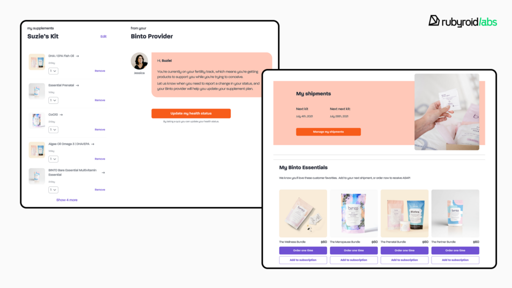
Best practices and pitfalls
- Always provide direct links to seven core features: the Account Dashboard, Order History, Saved Addresses, Payment Methods, Profile Details, Password Management, and Communication Preferences.
- Users must be able to easily view a detailed history of past orders and track the status of current, in-progress orders.
- It should be simple for users to edit their personal details, update or add multiple shipping addresses, and manage saved payment methods. Create an “Edit” flow that guides the user to delete the old card and add a new one.
- Provide a one-click “Re-order” button next to a past order. It drives repeat sales with minimal friction.
Once you’ve examined every key page and site-wide element, you should have a complete picture of how effectively your website serves its users. The audit doesn’t end here. The insights you’ve gathered need to be transformed into an action plan.
In the next stage, we’ll look at how to document findings, prioritize them, and prepare for collaboration or further design improvements. Save and print the full UI/UX audit checklist.
How to summarize and act on your audit findings
Collect everything in a single, structured report that clearly explains what you discovered. You can compile the report directly in Figma, this is a format most teams find convenient for commenting and discussing specific design elements.
Prioritize issues based on severity and impact. Start with the ones that block users from completing key actions, then move to those that affect clarity or visual consistency. Use AI-driven tools at each stage to speed up the process. We described how in the article Leveraging AI for Smarter UI/UX Audits.
When the report is ready, don’t let it gather dust. Turn insights into tasks and assign them to the right people. If you have an in-house designer, you can handle many of the fixes internally. If your team lacks design capacity or is suffering from tunnel vision after working on the same product for too long, consider bringing in an external specialist.
If you decide to collaborate with a design partner, come prepared. Provide them with your audit report, product analytics, and any existing design documentation. This will help them quickly understand your challenges and propose an accurate scope of work. Look for a partner with a proven track record in e-commerce redesigns. Experience in your niche often determines how quickly they grasp user behavior patterns.
Conclusion
Every friction point in your e-commerce store costs you revenue, engagement, and customer loyalty. A UI/UX audit reveals these hidden barriers, shows exactly what works, what doesn’t, and what can be improved.
Here’s a quick recap of the key takeaways:
- Every interaction shapes user perception and brand trust. Prioritize usability before focusing on visual design.
- Low engagement, recurring support questions, inconsistent design, and rapid growth are signals that your store needs a UX/UI audit.
- To prepare for an audit, define goals, gather analytics and feedback, map user journeys, and use AI tools to detect patterns in user behavior.
- Check every page and element.
- Compile findings in a structured report, highlighting critical issues first.
- Decide between in-house fixes or hiring an external design partner. Choose a company with proven e-commerce experience for faster, more accurate solutions.
The sooner you address usability gaps, the faster you will boost conversions, strengthen your brand, and convert passive visitors into active customers.
