
Effective product pages boost sales, but you need to consider many user experience (UX) aspects. No worries: we have outlined our eCommerce product page UX best practices for you.
This post continues our series about eCommerce website usability.
A product page, also known as a product detail page (PDP), is where you can convert your website visitors into customers. They may have come from a search engine or a section of your digital shop or marketplace. However they’ve arrived, there are things they need and expect to see in order to make a decision on whether to purchase from you or go elsewhere. And those aspects are plentiful.
Rubyroid Labs has built more than 70 eCommerce websites since 2013. We’ve seen what works best in PDP design and are happy to help you develop your online store — just drop us a line. Or keep reading and tap into our experience.
Contents
We have put together a product page checklist for you. Use it to create a unique template that factors in all the vital details specific to your needs.
Heading
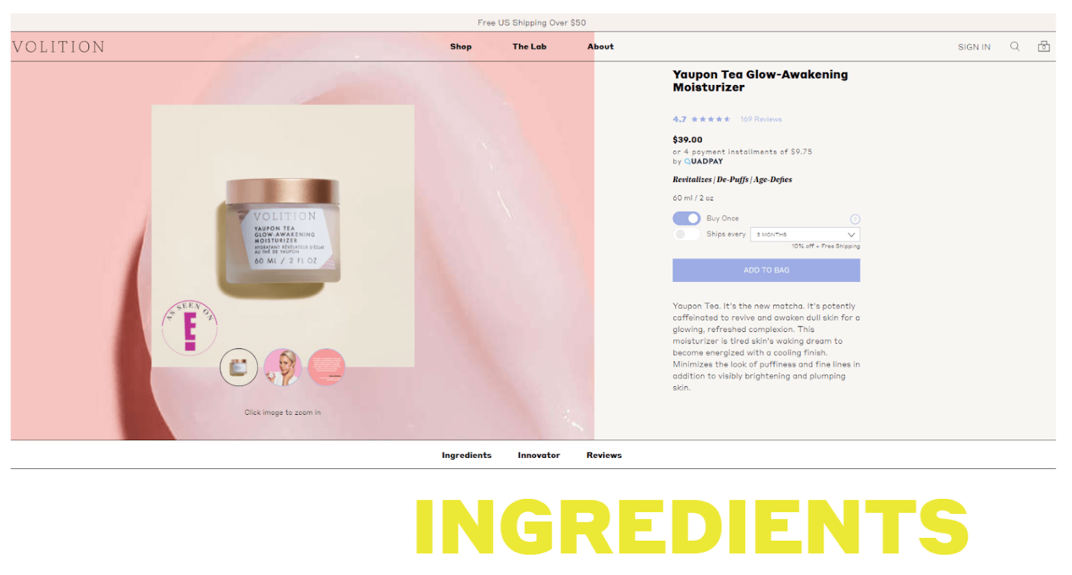
High-converting product detail page design starts with a sharp heading. Add one that gives a clear idea of the brand, the product and its purpose.
Breadcrumbs
Breadcrumbs show the path that led the user to the product page. Add this usability feature to help the user go back to any part of that path quickly and easily.

Summary
Place product summary in the top left-hand corner beneath the heading.
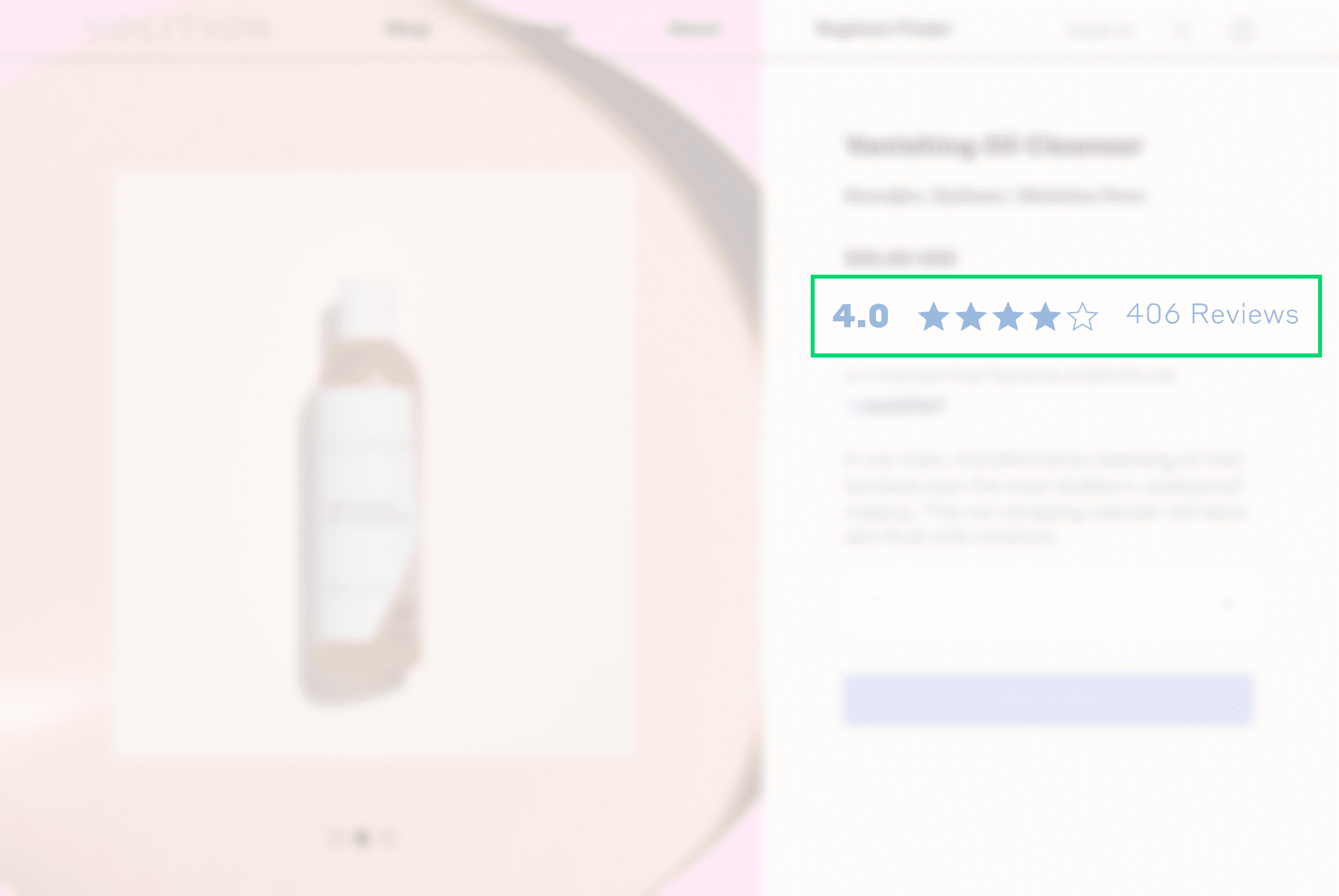
Rating
Enable users to rate products and include ratings in the product summary. Present it as a number of voices accompanied by stars showing the overall score. Be sure to make ratings interactive, so your online store visitors can simply click and see more detail, like reviews.
Images
Place the main product image next to the summary. Further images will depend on the type of the product and its specifics. Here’s what to consider:
Show the Product
Here’s what you need to know about providing effective product images:
- Ensure high-quality photographs.
- Enable users to zoom in on the product so they can see the smallest details.
- Add photos taken from different angles and 360-degree photos, especially if the product is a garment, accessory, interior item, footwear, etc.
- Show the product in use: if it’s a lamp, show it in the bedroom settings; if it’s a garment, provide a photo of a person wearing it; etc.
- Add 3D images whenever possible (this is also important for items where appearance matters, like clothes and shoes).
If an item is accompanied by several images, some merchants show they are there by placing dots under the main image preview or in a similar fashion. But this is a mistake, since a user could easily overlook such elements.
Instead, try to present additional images as smaller previews under the main image preview.
We can help you introduce all types of product images and make them load as fast as possible. Write to us today and get a pro team working on your eStore.
Provide More Details
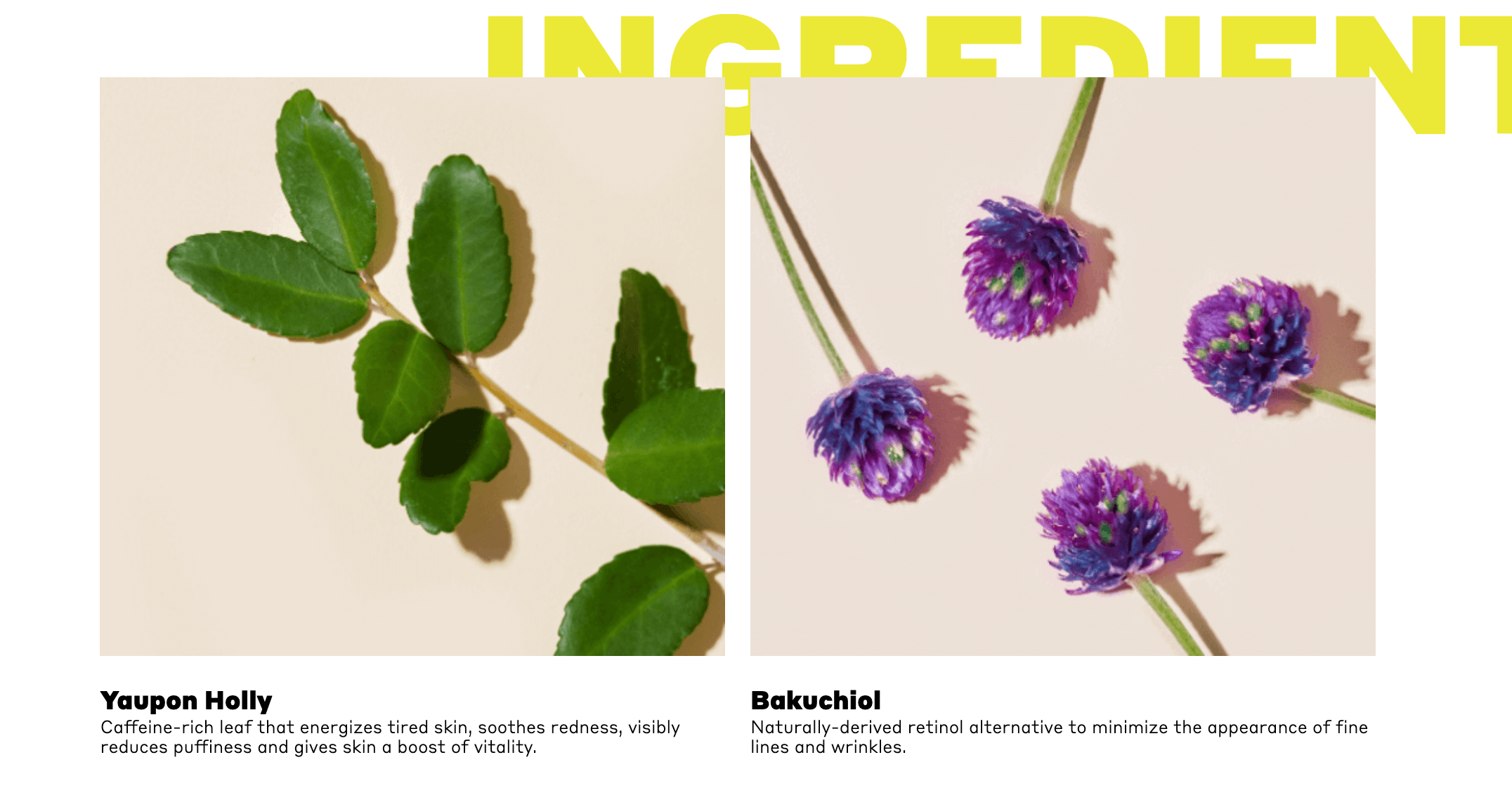
Images are important for eCommerce UX. Product page best practices, however, say pictures aren’t enough. You may want to add graphics describing measurements of furniture, specific parameters for sound systems and similar characteristics.
A product could have specific qualities that are important for customers, like being vegan friendly, cruelty-free or sulfate-free. In these cases, you will need to place a relevant mark over the product images. If a mark is not easily identifiable to the customer, add a note. You can make it available through a tooltip or a click.

Finally, if an item consists of several components, you will need to show each of them. Specify what comes with the purchase and don’t include optional accessories in the images.
Demo Videos
Some items benefit from being accompanied by a demo video. With clothes, for example, a photograph alone may not suffice, because length or editing could distort colors and actual measurements.
Another great product page idea is to get video testimonials from customers, where they show the item and describe what they like about it. This will help shoppers learn about the item and its properties from a user’s perspective.
However, remember that videos could slow a page down. So don’t make them too long or too heavy. You may also decide to store videos on a different platform, placing them as preview links. And we know how to present your videos best — just request our help.
Price Tag
If you are offering a product at a reduced price, the page should feature:
- the regular price
- how much lower the current price is
- how much the shopper will save if they buy it now
Your shoppers may wish to buy more than one unit. Add the quantity feature and show how much a selected quantity will cost.
Availability
Avoid misleading shoppers — don’t let them think a product is available for purchase when it’s not.
If the product is unavailable, add a line stating as much. Also, provide estimates for when it might be back in stock. Better yet, offer a pre-order feature with an extended delivery date. Some people won’t mind waiting a little longer, and you don’t want to lose their business letting them think otherwise.
 Rubyroid Labs can suggest the most elegant way to show product availability alongside other information on your site and bring the entire concept to life. Just send us a message briefly describing your eCommerce product or product idea.
Add to Cart / Buy Button
Make your main call to action, the add to cart or buy button, immediately visible.
For desktop viewing, be sure your page uses color, size and positioning to make the button really stand out in a desktop resolution. For a mobile view, show it on the first screen whenever possible. If, for some reason, you can’t do that, place the button a little lower down, making sure it still catches the eye.
Some products might come with different parameters/choices involved, like color, size, set up, etc. You will need to enable users to specify preferences for these products. There are two options: a dropdown menu or buttons. We don’t recommend using the dropdown because it hides the options and makes the user take an extra step in clicking to see them.
Website visitors will also want to know how soon they can receive their purchases. You can inform them by adding delivery date and price estimates next to the button.
Once the user has added an item to their cart, one of the three things should happen:
- They should get an alert message on the page.
- They are sent to the cart page and offered to choose whether they want to continue shopping or proceed to checkout.
- The caption on the “add to cart” button should change to “added to the cart.”
Product Description
The shopper must learn all about the product from its description — ideally, they should have no questions after reading it. So, be sure to list all manufacturer-specified parameters, materials, ingredients and exact measurements. Also important: always specify the measurement units.
Here are some tips for different types of products:
Multicomponent Products
For products that include several components, you will need to specify the overall size alongside measurements for each of its individual parts. If it’s a tent, for instance, the shopper will want to know how much sleeping space is provided.
You should also specify what each measurement stands for. For example, if you describe the size as 50x60x90, explain what’s behind each of those numbers.
However complex your products may be, Rubyroid Labs can help you present details in an easily digestible way to your customers. Stop racking your brain and reach out for expert help from our designers now.
Technically Sophisticated Goods
Technology is all about various parameters, some of which might not be clear (or useful) to your audience. Assume that your shopper is a layperson and replace technical jargon with plain and simple words.
One of the eCommerce design best practices is to present product specifications by splitting the description into sections. Describe the most important parameters in a brief summary and, directly beneath that description, list all the parameters, including those listed in the summary.
And make the parameter list easy to read. Use alternate background colors, icons and divider lines. This will help the customer connect the name of a parameter with what it means for the product. Also, avoid describing specifications in multiple columns because reading those could be difficult.
 For electronics, compatibility matters. Always provide relevant information, like which memory cards or hard drives a notebook is compatible with and so on.
Product Highlights
Almost every product has something that makes it stand out, its unique selling proposition or a super feature. You will need to highlight those features by dedicating separate sections to them, including an image accompanied by a description.
Reviews
Providing customer reviews is not just another eCommerce UX best practice. It’s a must-have.
Enable reviewers to attach a photo, describe their experience and rate the item. Shoppers should be able to decide what to see first: the most popular reviews, reviews with a photo, etc. If a product has too few reviews, it makes sense to hide the filter.
And don’t forget to enable website admins to reply to reviews. This will help mitigate negative comments and show you care.
Finally, present the total rating and number of votes at the top of the review section.
The reviews feature might sound complicated. But you don’t need to figure out how to put it together by yourself. Our developers have built multiple features like this and will do the same for you in the most effective way possible. Request our help.
Cross Sales
Each product page is an opportunity to sell — and not necessarily sell the product that specific page is about selling. The cross-sales section will help you execute this.
The section shows related products. There could be two types: products that are similar to the one the page is about, and other items that could complement it. Try to display the two in separate subsections.
According to product page best practices, related product previews should include the following:
- a product image that isn’t too small
- more photos displayed at pointing the cursor at the main product
- product name, price, rating and specifications. Electronic devices should be accompanied by the full name (e.g. Samsung Galaxy Tab S7 FE 128GB Green [T735]).

Of course, the way you upsell on your product page will depend on the type of your product. If you build your digital store with Rubyroid Labs, we will suggest the most aesthetically and functionally suitable option.
Order and Shipping Information
The shopper should be presented with answers to all their questions about payment and delivery. Do you ship to my country? Can I pay via PayPal? and similar questions all need to be addressed.
If they don’t get answers right away, they might go to another site page looking for them. Eventually, they’ll get distracted and forget about what they wanted to buy in the first place.
You may not be able to answer all questions on a product page. But you can provide a contact to support or a live chat plugin.
Ready to Apply eCommerce Product Page Design Best Practices?
You need to consider a lot of details when planning and structuring pages to display items for sale. The eCommerce product page design best practices are there for a reason: anything can affect your sales.
Forgetting to highlight a product’s unique features means your website visitors might disregard it as yet another pair of trainers or just another table lamp. Ignore product availability, and you will infuriate shoppers who have made it all the way to the point where — after they’ve converted and are buying — you tell them they’re not getting the item. Every detail matters.
If you’re not sure whether you could factor them all in, or have little time to work through that checklist, we’re here to help. Contact Rubyroid Labs, and we will build your eStore, taking care of everything, down to the smallest detail.


