When designing a website, it’s tempting to focus on standing out with bold, original visuals that “wow” your audience. But is that always the best approach? Do users really need to be surprised by every design choice, or is it more important for them to quickly find what they’re looking for? Striking the right balance between creativity and usability can make or break a website’s success. This brings us to a crucial distinction: the relationship between user interface (UI) design and UX (user experience). While UI is about how a site looks, UX determines how it works, and the latter might matter more than you think.
According to the Mordor Intelligence UI/UX Market Report, e-commerce businesses lose up to 35% of potential sales due to poor user experiences. Experts estimate that optimizing user experience can boost website conversions by 400%. Marketing can bring first-time shoppers to your site, but it’s the engaging UI and intuitive UX that keep them around.
For 12 years, Rubyroid Labs has been offering UX/UI design and development services to help our clients make their websites better. Upon request, our designers can conduct an audit of the website to identify areas for improvement or design a brand-new site that’s easy to use and helps grow your business.
Now we invite you to read about the importance of UX design in web development. We’ll also explore current trends, and share valuable tips we’ve gained from years of experience.
Contents
- What is User Experience (UX) in Web Development?
- Steps of the UX Process
- Challenges in UX Design and Web Development
- The Impact of UX on Business Metrics
- Peak–end Rule in UX
- UX Best Practices for Websites
- To Sum It Up
What is User Experience (UX) in Web Development?
User experience (UX) is about how people use and navigate a website, and how they feel during this process. A UX designer’s goal is to think like the user, anticipate needs, and remove friction. UX design goes beyond the visual look of a page. It includes gathering data, analyzing it, structuring the information, and presenting it in a clear way. Every decision should be made with a purpose, based on real data and logic.
Instead of just talking about it, let’s look at an example. Picture yourself shopping on your favorite online store’s website. Why is it your favorite? Maybe because of the wide selection of products. But if the site felt slapped together with no thought, your loyalty would vanish instantly. Let’s take a look at some seemingly small details — things you might not consciously notice when they’re present but would definitely miss if they were absent.
- Fast loading times. Before you even finish checking a notification on your phone, the page is already loaded. Speed matters. Nobody likes waiting, even for a few seconds. According to a Google study on page load time, as the page load time increases from 1 second to 10 seconds, the likelihood of a site visitor bouncing rises by 123%.
- Intuitive navigation. You land on the homepage and instantly feel at ease. Not because you’ve visited the site a hundred times, but because the layout just makes sense. Product categories are exactly where you expect them — on the left or right, or maybe tucked under an icon (three stacked lines, for example).
- Currency switcher in the header. When you need to change the currency, your eyes naturally go to the header because that’s where you’ve found it every other time.
- Easy profile access. To log-in you click the profile icon, a small figure, sits conveniently in the top right corner of the header, right where it should be.
- Hassle-free login. You see login fields, but there’s no need to remember your password. The site offers autofill, sign-ins via other accounts like Google, or phone number verification, making the process fast and painless.
- Personalized recommendations. Tailored recommendations mean you don’t have to scroll through ten pages to find something you’ll love. You spot it almost immediately and can buy it with one click or add it to your cart to think it over. A small confirmation pops up in the corner, letting you know the item is added. It doesn’t block the entire screen, but it’s clear enough to assure you the button worked.
- Effortless checkout. When it’s time to pay, your saved card is already linked to your profile. No need to type in a string of numbers. All it takes is a glance at your phone for code to confirm it’s really you — not your kid ordering a new chandelier for the living room.
- Flexible post-order options. Order confirmed! But wait — you realize you picked the wrong address. No problem. You can cancel the order while it’s still being processed or edit the address on the spot. Even better, you can select the nearest pickup point using a map, rather than scrolling through a long, tedious list of addresses.
- Mobile optimization. On your phone everything works just as smoothly as on a desktop. Buttons are tap-friendly, text is legible, and images scale perfectly.
These are just a few common examples of how thoughtful user experience design makes interaction easier. Although users don’t always notice these small details, business owners need to take into consideration their customers’ pain points. The importance of having a UX designer on board is undeniable. They carefully analyze the target audience and offer customized solutions for each specific case.
If you want to check your application’s interface for usability, engagement, and ease of interaction, our in-house designers provide UI/UX design audits. It’s a great way to identify design and usability issues, get recommendations for fixing them, and create a modern user-focused interface that users truly love.
Steps of the UX Process
The work of UX designers is time-consuming and requires significant effort. It involves multiple stages, and skipping any of them can immediately impact feedback. Let’s take a closer look at each step.
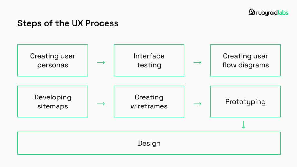
Creating User Personas
Firstly, a designer must grasp the needs of the target audience.
- Who are they?
- What do they need?
- Why will they visit the website?
- What matters most to them?
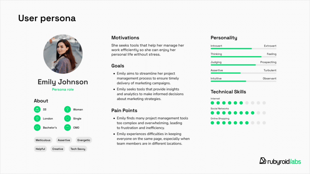
To answer these questions, designers create user personas — fictional characters that represent common traits of real users. These personas include information like age, gender, marital status, nationality, occupation, interests, preferences etc. Creating personas includes examining web analytics, as well as carrying out interviews and surveys.
Interface Testing
The designer evaluates what’s wrong with an existing website. They explore it, test various features, and take note of both strengths and weaknesses. There are also specialized tools that simplify this process by providing ready-made analytics. Good examples are Google Analytics, Hotjar, Smartlook, Fullstory, Mouseflow which offer insights into audience demographics, traffic sources, behavior, site performance, and even real-time activity. This data helps identify problem areas and opportunities for improvement, enabling designers to make informed decisions.
Creating User Flow Diagrams
User flow diagrams demonstrate the user’s journey on a website, show which page they land on and where they go next. They highlight whether users reach the final destination or leave the site due to difficulties along the way.

Developing Sitemaps
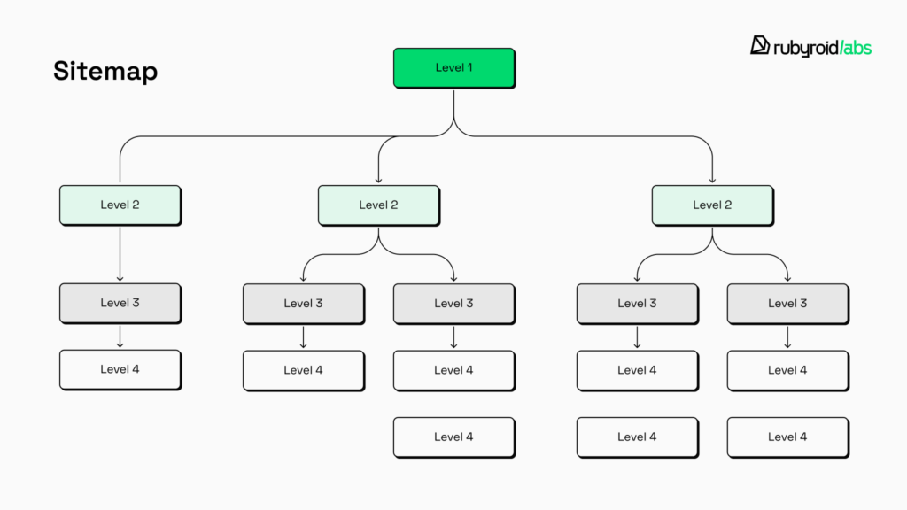
Sitemaps are diagrams that show the structure of a website and how different pages are connected. This step helps you visually assess how smoothly the site will function. For example, the registration process might be too complicated or lengthy and could benefit from streamlining. Users might face dead-ends with no clear way forward. A well-designed sitemap eliminates the need for unnecessary screens, saving both time and money on designer and developer services.
Creating Wireframes
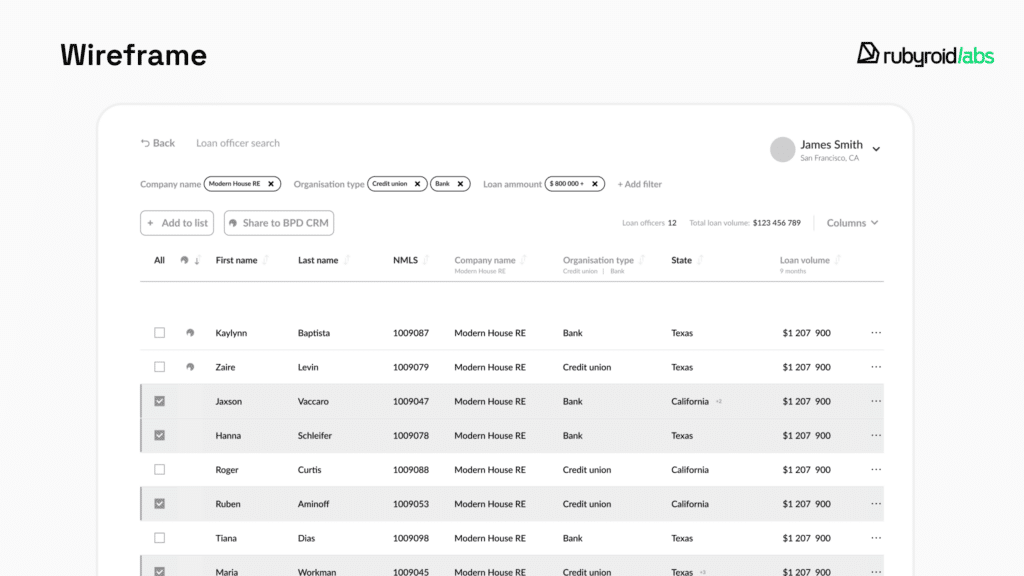
Wireframes are essentially the skeletons of a webpage. There are three types: low-fidelity, mid-fidelity and high-fidelity, depending on how detailed they are. High-fidelity wireframes look almost identical to the final pages, but they lack color and graphics — like an empty coloring book. However, they’re detailed enough to convey what the page will look like. If the client isn’t satisfied with something, they can make adjustments at this stage, saving both time and money.
Prototyping
This stage can either precede the design or be done on already completed mockups. Prototypes are interactive models created to present to the client. This way, they can not only see and imagine how a button will work, but also click on it themselves.
Design
The moment when it’s time to “fill in the coloring book”. This is the choice of fonts, colors, photos, illustrations, and styles. In reality, this process is more complex than it might seem. The designer’s job isn’t just to “bring the wireframe to life” but to organize all the elements and design decisions to hand it all over to the developer.
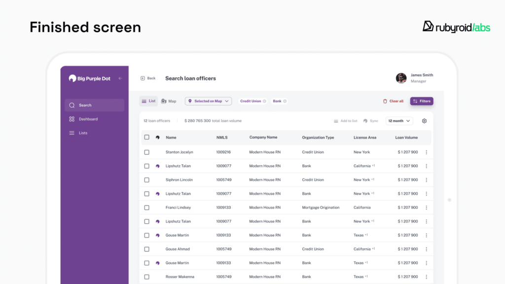
As we can see, it all starts with user experience, it’s the foundation of a successful design project. Good UX design is like a smart wallet — it saves you money up front and keeps paying you back with happy customers.
Challenges in UX Design and Web Development
Rubyroid Labs has been specializing in web development and design for 12 years. Here are the challenges we consider most common:
- Striking the right balance between what users want and what the business needs. Users want smooth and intuitive experiences, and businesses often focus on generating leads and making money. It’s important to remember that overwhelming ads might generate revenue but could also frustrate users.
- Users access websites from smartphones, tablets, laptops, and desktops. Each platform has its own set of design requirements. Ensuring a cohesive and responsive experience across all devices adds layers of complexity to the design and development processes.
- Emerging design trends can quickly render existing designs outdated. Staying current requires constant learning and adaptability. However, adopting new technologies too quickly without proper research can lead to usability issues. Designers at Rubyroid Labs strike a balance between innovation and reliability, ensuring that new solutions enhance rather than hinder user experiences. Here’s what our Head of Software Design, Hanna Maroz, has to say on the matter:
Trends should be followed with long-term relevance in mind, making sure they can be easily updated or replaced if they become outdated. When deciding which trends to follow and which to avoid, we consider factors such as the industry, product purpose, development plan, and target audience. The longer a project’s lifecycle, the less likely micro-trends will remain relevant
- Implementing best UX practices demands significant resources — time, money, and expertise. Similarly, tight deadlines can limit the ability to explore creative solutions or refine designs. In such cases, our designers prioritize key user experience elements and make strategic trade-offs to deliver functional and user-friendly products within constraints.
The Impact of UX on Business Metrics
Conversion Rates
Good UX boosts conversion rates. According to statistics, firms that champion UX design witness a return on investment (ROI) reaching up to 100%. When people visit a website that’s easy to use, looks good, and works smoothly, they’re more likely to take the actions you want. Simple navigation, well-placed call-to-action buttons, and a quick checkout process help minimize hesitation.
User Retention
UX doesn’t just attract users, it keeps them coming back.

Returning customers not only make repeat purchases, but they’re also more inclined to recommend your service to others. By focusing on user retention through UX design, you create a foundation for long-term relationships.
SEO
Good UX has a ripple effect on search engine optimization (SEO). Search engines give preference to user-friendly websites. They look at things like low bounce rates, longer visits, and high engagement. By improving your site’s user experience (UX), you naturally boost these metrics, which can help your site rank higher in search results. Plus, features like mobile responsiveness and fast loading times, essential parts of good UX, are direct ranking factors that can further improve your visibility.
To help our clients improve their business metrics through better user experience, we conduct UI/UX design audits.
Peak–end Rule in UX
The peak-end rule says we remember the most intense moments and the ending of an experience, not every detail. Instead of recalling events as a sequence, we think of them as highlights. Nobel Prize-winning psychologist Daniel Kahneman proved this in an experiment. He tracked the pain levels of two patients during a procedure. Patient B suffered three times longer than Patient A, but both had the same peak pain. Surprisingly, when asked about their experience, both patients based their feelings on the peak and the ending, not the duration or total amount of pain. This rule doesn’t just apply to pain, it works for pleasure and other emotions too.
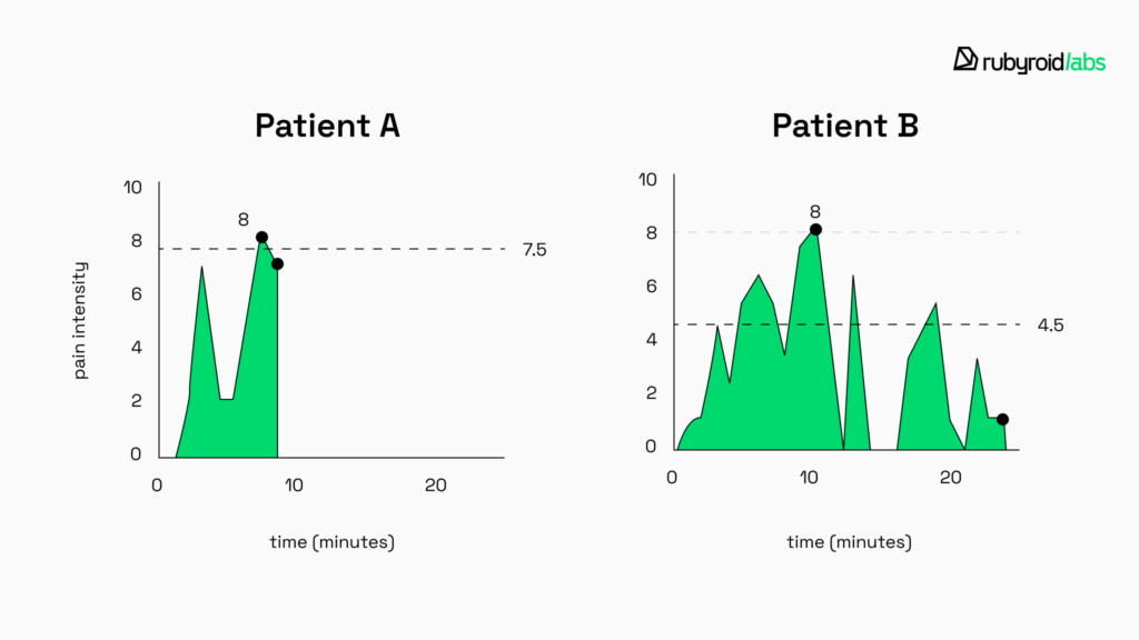
So, what does this mean for UX design? Users judge their experience based on standout moments and how it ends. But don’t forget the beginning! First impressions matter. If users leave right away, they’ll never reach the peak or the ending.
Creating Positive Peaks
You don’t need to reinvent the wheel to make users feel good. Everyone loves being praised, recognized for their efforts, or rewarded. This approach is especially popular with learning platforms like Duolingo and Quizlet. These apps make users feel a little better and more valued by acknowledging their progress.
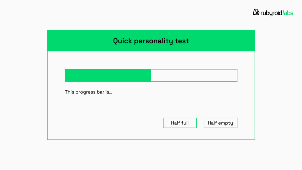
And what about loading bars? A few years ago, we had to stare at them, willing them to move faster. Now, waiting doesn’t feel as boring. Developers have started adding fun comments, explaining why the wait is worth it, and even including animations or mini-games. These small touches turn dull moments into enjoyable ones.
Creating Positive Ending
If, after placing an order, we’re taken to a confirmation screen with suggestions for related products, it feels thoughtful. Someone anticipated that if we’re buying a new tea set, we might also need tea to go with it. Similarly, a person might read an interesting article and close the tab, or they might see a list of related articles at the end, sparking their curiosity and encouraging them to stay longer. But it’s done in a gentle way — not like those annoying pop-ups that say “Leaving so soon?”.
Experience and memory are closely connected, but they’re not the same. A designer’s job is to focus on both to maximize success.
UX Best Practices for Websites
Our designers share their best practices to ensure a website is usable and intuitive for everyone which is good for conversions. Take a closer look at any case-study to notice that they are seamlessly integrated into the process, setting our work apart.
Comprehensive Research
Mordor Intelligence reports that businesses using user-centered design see a 50% increase in engagement and satisfaction compared to those that ignore user experience.
To understand how to improve the user experience on websites, it’s important to know how they behave. Interviews help build detailed personas. Surveys are a fast way to gather feedback, but you need to phrase questions carefully to avoid bias. Usability testing lets you watch how users interact with your design to spot problems and areas for improvement. A/B testing compares different design options to see which works best. Web analytics gives numbers like task times and feature usage, and when combined with qualitative insights, it gives you the full picture.
Clear Homepage
The homepage should immediately communicate its purpose. Avoid overcomplicating things or experimenting too much with the layout. Otherwise, users may feel lost and choose a competitor’s site instead — which, let’s face it, is just a couple of clicks away.
Below is a look at how our designers created the homepage for the beauty web store Volition. At the top, we have a clean, uncluttered menu with key tabs, a registration button, search, and a cart — all the essentials for an online shopper. The homepage highlights the latest season’s products, with links to each item.

Simple Checkout Process
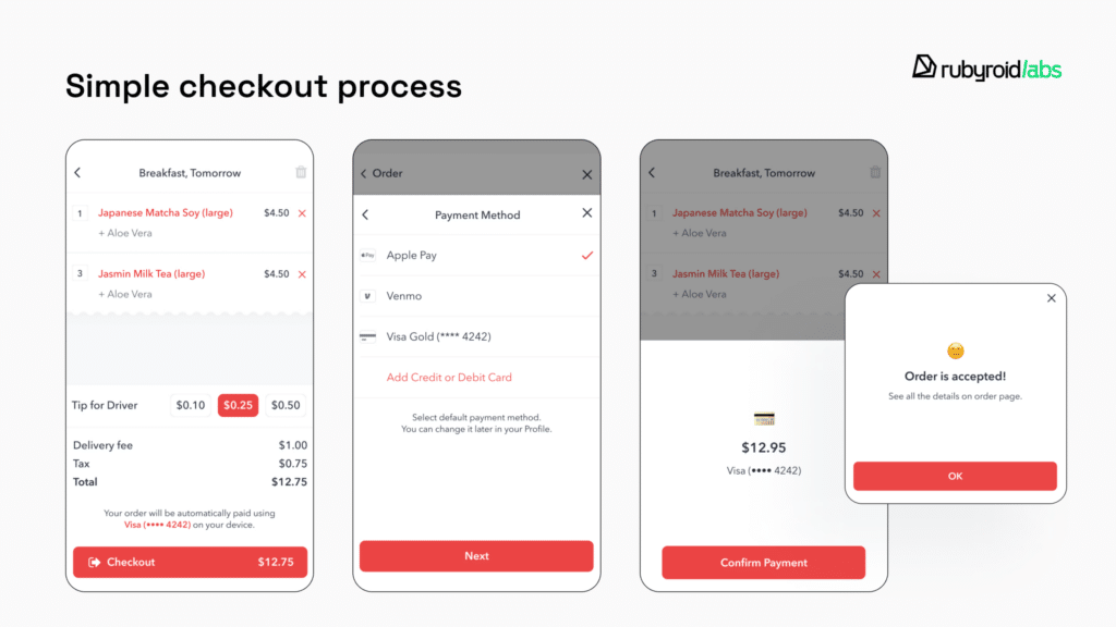
Users should always know where they are and how many steps are left. Uncertainty can be frustrating — just like having to complete a dozen steps to order a pizza. Respecting users means valuing their time. Only ask for what you really need and keep the process as simple as possible.
In the redesign project for food delivery app Fullkitchen we created a superfast and clear payment process. A user should simply check the cart, choose payment method and confirm.
When the photo editing service Path Edits approached us for a website redesign, our specialists immediately identified an issue with the lengthy order placement process. It consisted of seven steps, which hurt the site’s conversion rates, as many customers abandoned their orders before completing them.
We streamlined the process, reducing it to three steps. This eased the burden on users and cut the time required to place an order. The simplified flow helped Path Edits improve retention and boost their overall conversion rates.
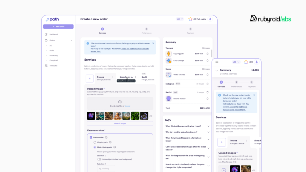
In both cases, the client’s request was to make their website easier to use. We successfully tackled these challenges.
Intuitive Navigation
Users shouldn’t have to hunt for hidden features, they expect a familiar layout that feels intuitive and reliable. They should always have the option to go back a step if needed. Call-to-action elements shouldn’t be hidden; they need to be in plain sight and stand out from the rest of the content so users can’t miss them.
Consistency in Everything
Using the same fonts, colors, and buttons across the website helps maintain a unified appearance. Similar functions should operate consistently across pages, ensuring predictability. A consistent voice and tone in messaging, from error notifications to homepage content, also impact on a seamless experience.
Responsive Design
Over 60% of website traffic comes from mobile devices, so ensuring a smooth experience across all devices is essential. Mobile-first design is crucial, as phones are always within reach. It’s important to make sure content fits smaller screens and that buttons are easily tappable.
Below is an example of how we adapted the page for the mobile version of the cosmetics online store Yelz.

To Sum It Up
User experience (UX) isn’t just another feature of a website, it’s the key to its success. It attracts and keeps customers, improves your website’s SEO by driving conversions, enhances your brand image, and always pays off.
Rubyroid Labs has been specializing in design since 2013 and knows exactly how to improve your website or create a successful one from scratch.


