UX/UI improvement for a photo editing service
- UX/UI review
- Redesign
- Order flow optimization
about
Path is a professional photo editing and design studio that provides image editing solutions for e-commerce businesses, including Amazon sellers, top brands, as well as photo content agencies and freelance photographers.
The platform performs all types of image services, from background removal and color changing to photo retouching. The company is a leading service in its niche and has over 7,000 5-star reviews on Trustpilot.com.
4 months
UK
photo editing & design
- 2 UX/UI designers
- project manager
results
-
Enhanced
modern, and professional interface
-
Optimized
order flow enabled faster completion times
-
Streamlined
order process from 7 to 3 steps
challenge
The client addressed us to improve the interface of their service website. As the platform was rapidly growing, the business owner recognized the need for improvements.

UX/UI review
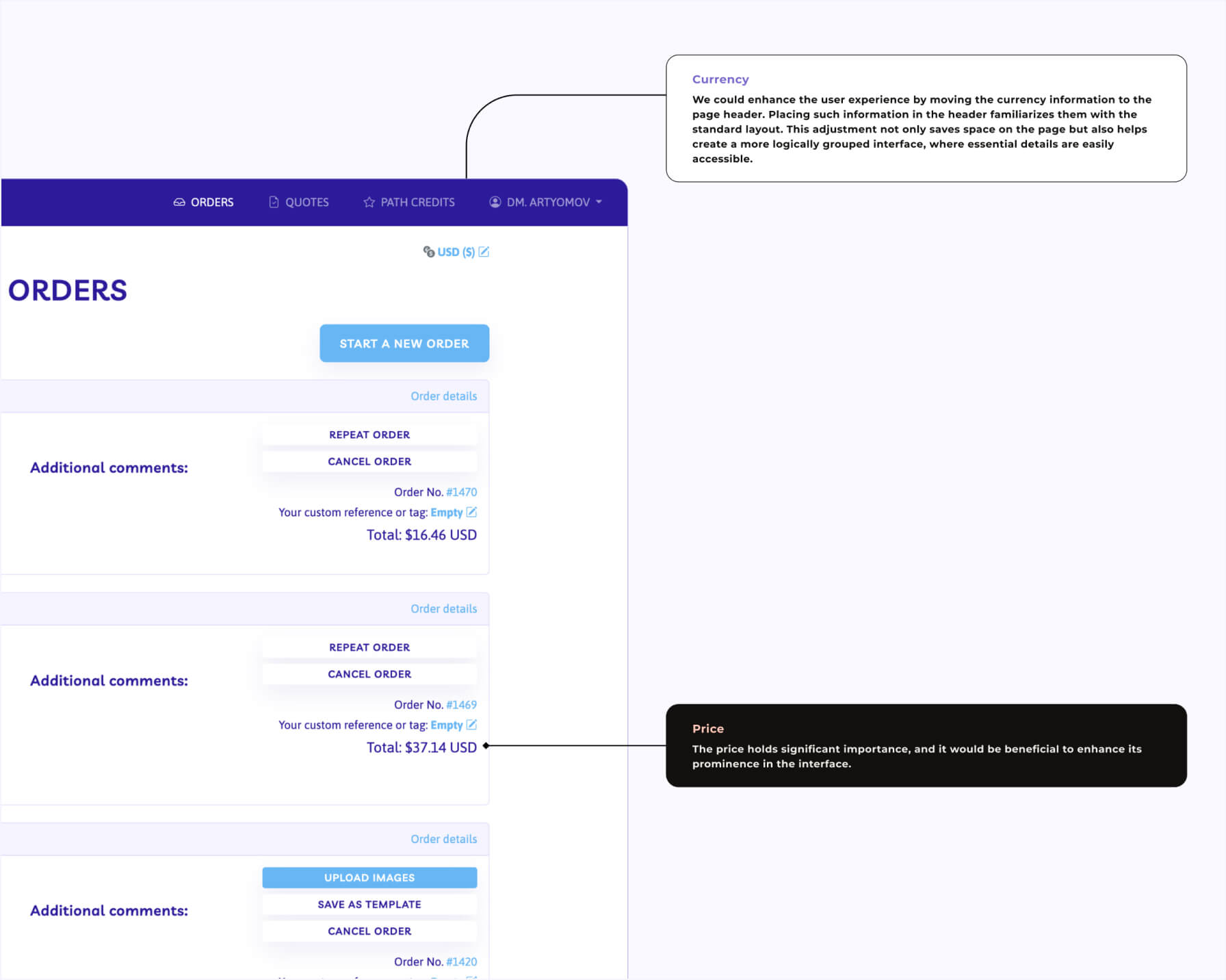
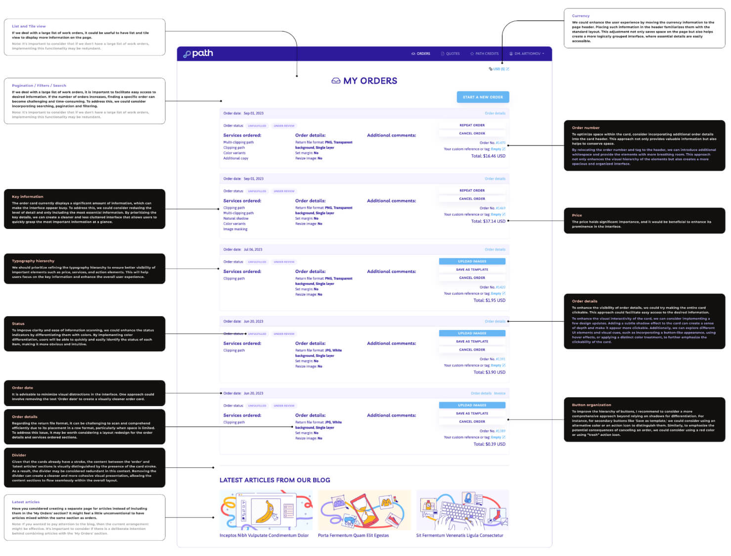
We conducted a comprehensive UX/UI review of the platform’s registered users area. As a result, over 150 issues were identified.
Most of them were related to poor user experience, which reduced user engagement.
Some pages were overloaded with the important information, making the website difficult to use.
The typography hierarchy, margins, padding, visual representation, and buttons did not follow modern design standards. Additionally, some blocks and sections on the platform lacked consistency. Users struggled to perceive information, felt frustration and abandoned orders.
The designers proposed solutions for each issue.
redesign of the registered users area
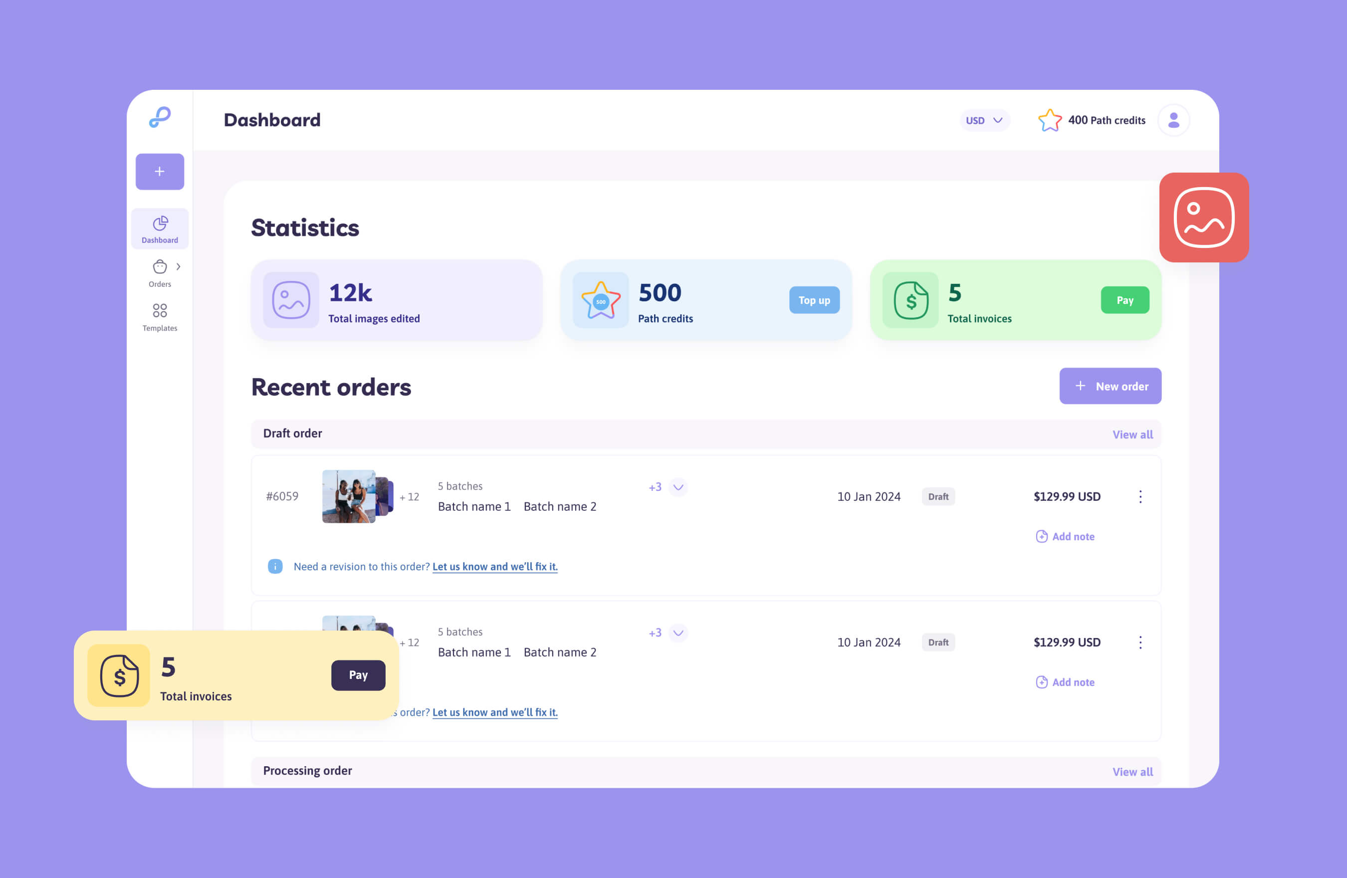
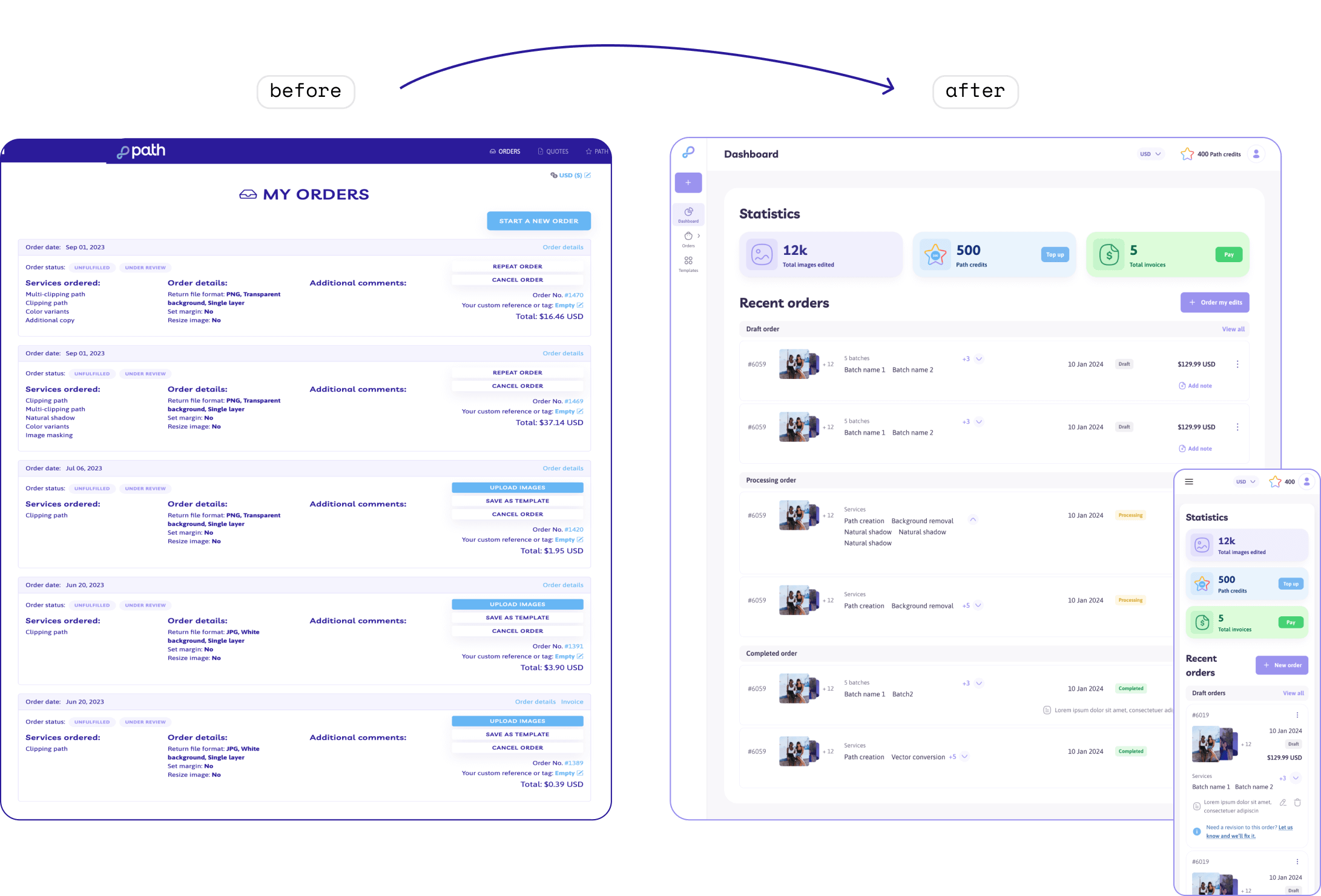
Based on the UX/UI review of the platform’s registered users’ area, we made a full redesign of this section, making the interface more intuitive for users to navigate.
Our UX/UI designers created a new typography hierarchy by improving font sizes, colors, and styles to help users focus on the key information. We redesigned the page layout by placing more visual elements. Additionally, we added system warnings and notifications to inform the users about various actions, such as exiting the page or prompting guests to create an account.
The updated design boosted usability, readability, and content comprehension. The new visual aspect met current trends and styles.
order flow optimization
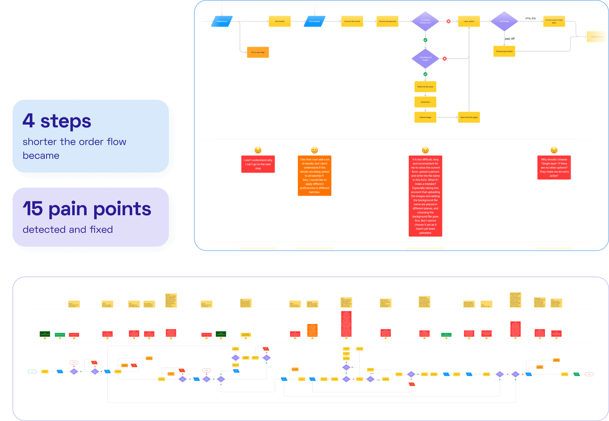
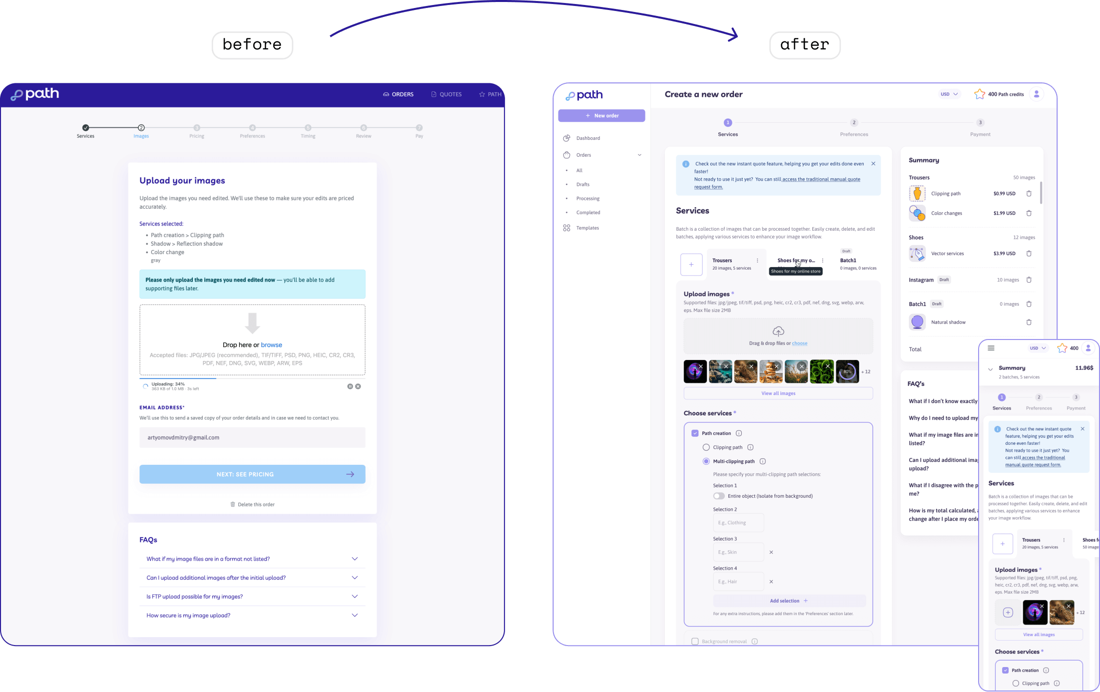
The reorganization of the order placement flow was one of the key elements of the project. Initially, the flow consisted of seven steps and was too complicated for users. This reduced the conversion as many users left the website without completing their orders.
Our UX/UI designer identified key pain points and simplified the order process, reducing it from seven steps to three. These improvements enhanced the user journey and boosted the conversion rate.
delivered features
- UX/UI design audit
- redesign of the registered users area of the website
- visual concept update
- intuitive and user-friendly interface
- streamlined user journey
communication
The team maintained close communication with the client. After the designers handled an UX analysis of every 2-3 pages, they held meetings with the project owner to discuss the details of the completed sections. These meetings took place via Google Meet once or twice a week.

result
The client got a new design ready for implementation. With the refreshed interface and optimized user flow, the platform now offers a faster, more streamlined user journey, boosting order completion rates and improving user loyalty and satisfaction.
Through meticulous collaboration with the client, Rubyroid Labs delivered significant service enhancements, helping to strengthen the client’s market position.

Estimate your project
Please fill out this form, and our manager will contact you within one business hour. If necessary, we can sign an NDA and begin project discussions.

Thank you.
Your message has been sent successfully!
We’ll get in touch with you within 24 hours, excepting requests received on Saturday, Sunday.