

december 2020 – june 2021
Denver, USA
mining and metallurgy
- 2 Ruby on Rails developers
- 2 UX/UI designers
- 1 QA
- 1 PM
challenge
performance issues
The client has a Mining Forum Platform for hosting online meetings between investors and the administration. They came to us with a problem: the system was outdated and slow. Our developers conducted a technical review and concluded that a code refactoring was necessary.
authorization & confirmation
The audit revealed several usability and design issues, including oversized elements, unclear link titles that don’t provide users with proper guidance, readability concerns due to poor contrast, and the use of pop-ups that create unnecessary friction in the user experience.
informational architecture & navigation
The informational architecture and navigation were not optimal. Numerous related pages could have been consolidated into logical sections or a single page with tabs, improving clarity. The lack of a clear section organization made navigation more difficult and the overall site structure less intuitive for users.

notifications
It was noted that the Requests Received link lacked a label indicating pending meetings, and the system did not notify users when their invitations were accepted.

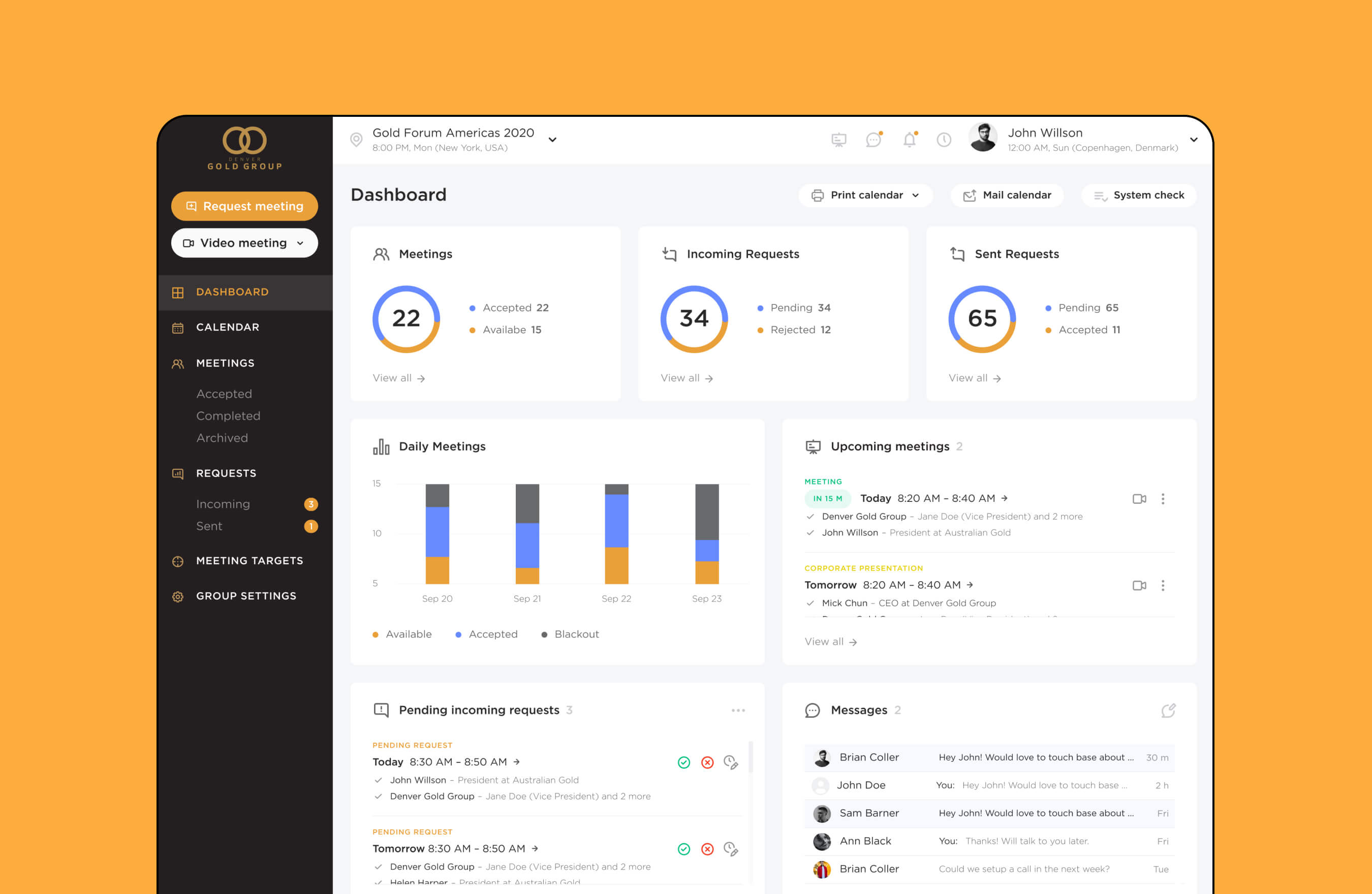
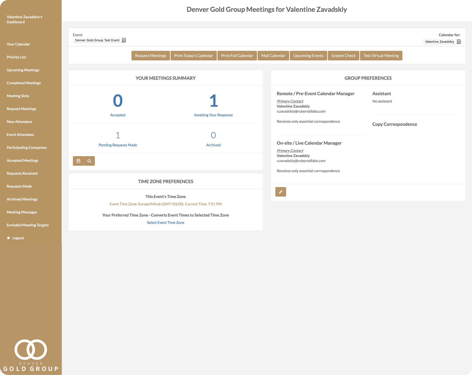
dashboard
The dashboard was found to be uninformative. Its structure required revision to prioritize essential content, such as upcoming meetings, pending requests, messages, and relevant statistics. Group preferences needed relocation to a less prominent area while maintaining easy access.
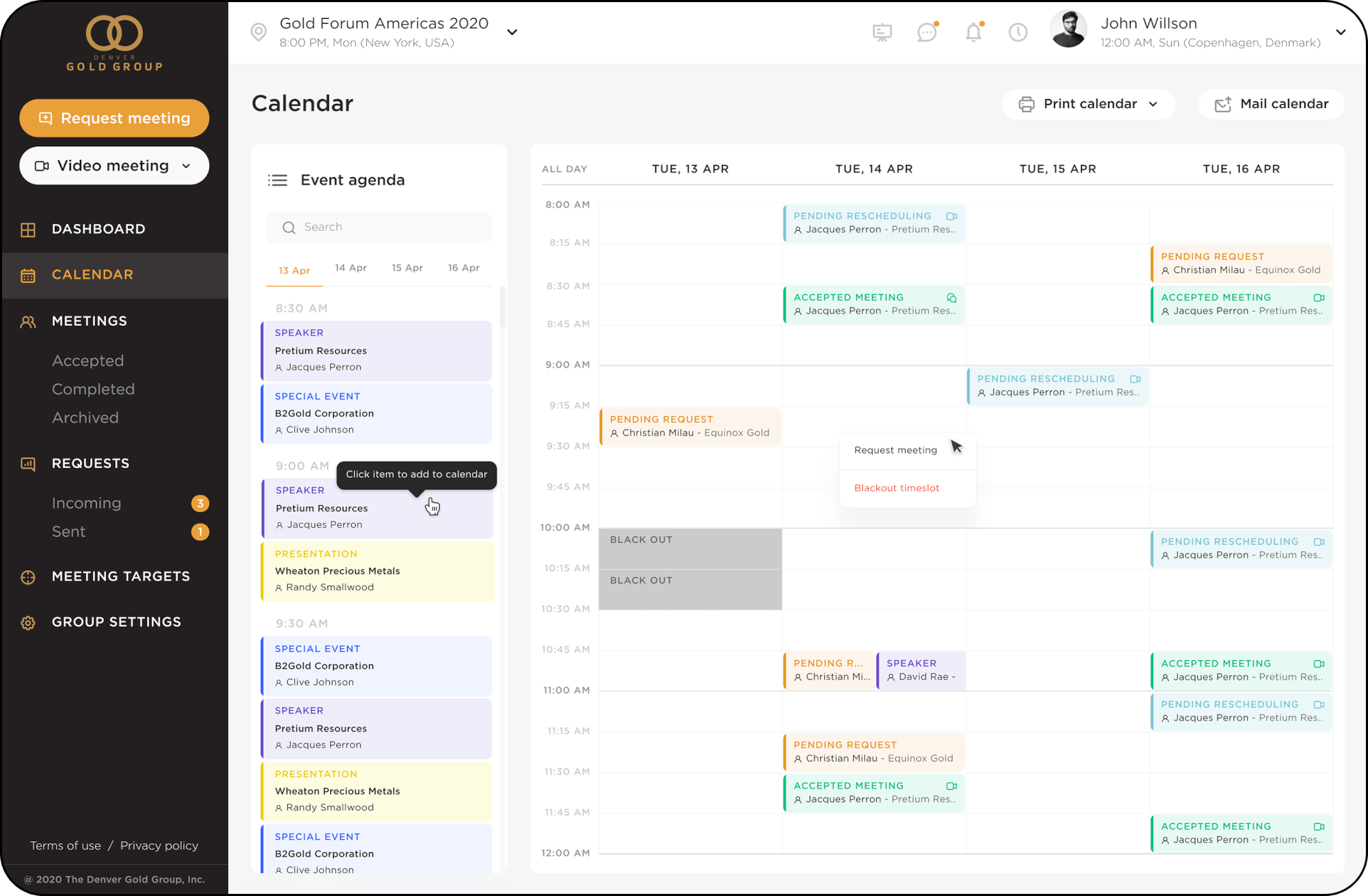
calendar
The calendar had usability issues, making interactions unclear and reliant on text instructions instead of intuitive design. It also took up too much space, requiring users to scroll to see the full schedule while leaving unnecessary gaps between events.
filters
Inconsistent filter behavior led to unexpected data loss. The functionality of certain buttons did not align with user expectations, affecting the overall usability.
misuse of icons
Icons were used inconsistently, leading to unclear interactions. For example, the calendar icon performed different actions in different places, making it difficult to understand its purpose without labels. Similarly, the star icon did not clearly indicate its function and needed to be replaced with a more intuitive symbol or label.

visibility of certain elements
For instance, the statuses were hard to locate and distinguish, as accepted and pending meeting requests looked similar.
bulk actions absence
Users couldn’t apply actions to multiple items at once, which made handling requests and meetings less efficient.
outdated design
The design felt outdated and inconsistent with the brand’s style.
solution
code refactoring for boosting performance
By optimizing the codebase, we ensured smoother online meetings, improved user experience, and a future-proof system for investors and administrators.

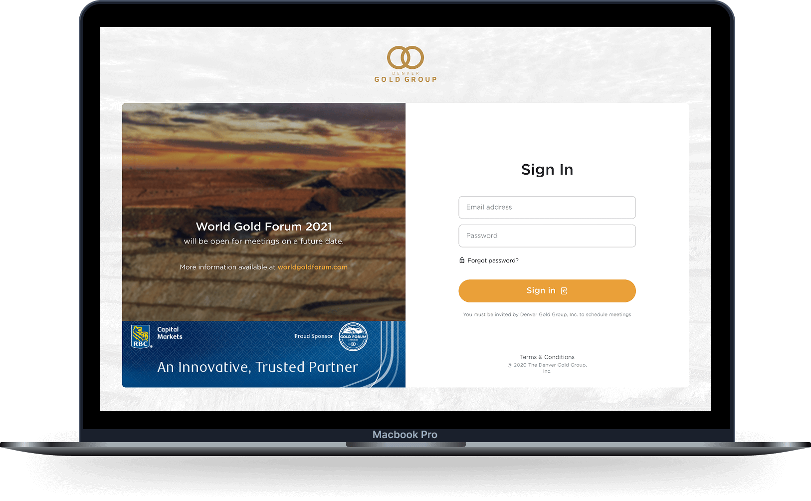
enhance usability in authorization & confirmation
We improved the authorization and confirmation flow by addressing key usability and design issues. Elements were resized for better balance, link titles rewritten for clarity, and contrast adjusted to enhance readability. To reduce friction, intrusive pop-ups were replaced with seamless interaction patterns.
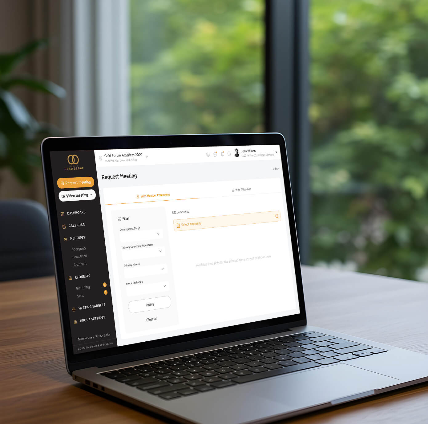
informational architecture optimization
We optimized the informational architecture by consolidating related pages into well-structured sections and introducing a tabbed layout where appropriate. This enhancement improved clarity, reduced unnecessary navigation steps, and made the overall site structure more intuitive. Now users can easily find the information they need.
fix the notification system
To address the identified issues, we proposed to implement a robust notification system. Automatic notifications will be sent to users when their invitations are accepted, keeping them informed and engaged throughout the scheduling process.
dashboard revision
The dashboard has been redesigned to improve informativeness. Essential content, including upcoming meetings, pending requests, messages, and key statistics, is now prioritized for quick access. Group preferences have been relocated to a less prominent yet easily accessible section. Additionally, a drag-and-drop feature has been implemented, allowing users to customize the dashboard layout to their preferences.

redesign the calendar
A redesign was carried out to make it more compact and efficient. The layout has been optimized to reduce unnecessary gaps and minimize scrolling, ensuring users can view their full schedule at a glance.
configure filter operation
We have ensured that filter behavior remains consistent, preventing unexpected data loss. Buttons functionalities have been refined to align with user expectations.

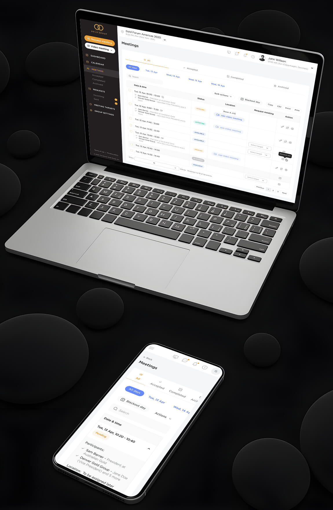
improve clarity & consistency in icon usage
We standardized the use of icons to ensure predictable interactions.
color indicators for better visibility
It was suggested to use color indicators for better differentiation. Additionally, it was recommended to add a "New Registrant" column with check marks to clearly highlight new entries in the table.
introduce bulk actions
We introduced bulk actions where appropriate to make work more efficient.
update the design
We gave the platform a modern refresh while staying true to the brand guidelines. The core colors — gold, black, and white — were kept, with an accent of orange added to enhance the boldness and reinforce the gold’s impact. We applied contemporary styles across all design elements and pages, updating fonts and refining the UI.
technology stack

Backend
Ruby Ruby on Rails PostgreSQL Sidekiq Redis Docker
Frontend
Jquery
communication
We maintained clear and efficient communication with the client through Slack for daily updates and quick feedback, and Email for formal documentation and approvals. This helped us stay aligned at every stage of the project.
Estimate your project
Please fill out this form, and our manager will contact you within one business hour. If necessary, we can sign an NDA and begin project discussions.

Thank you.
Your message has been sent successfully!
We’ll get in touch with you within 24 hours, excepting requests received on Saturday, Sunday.